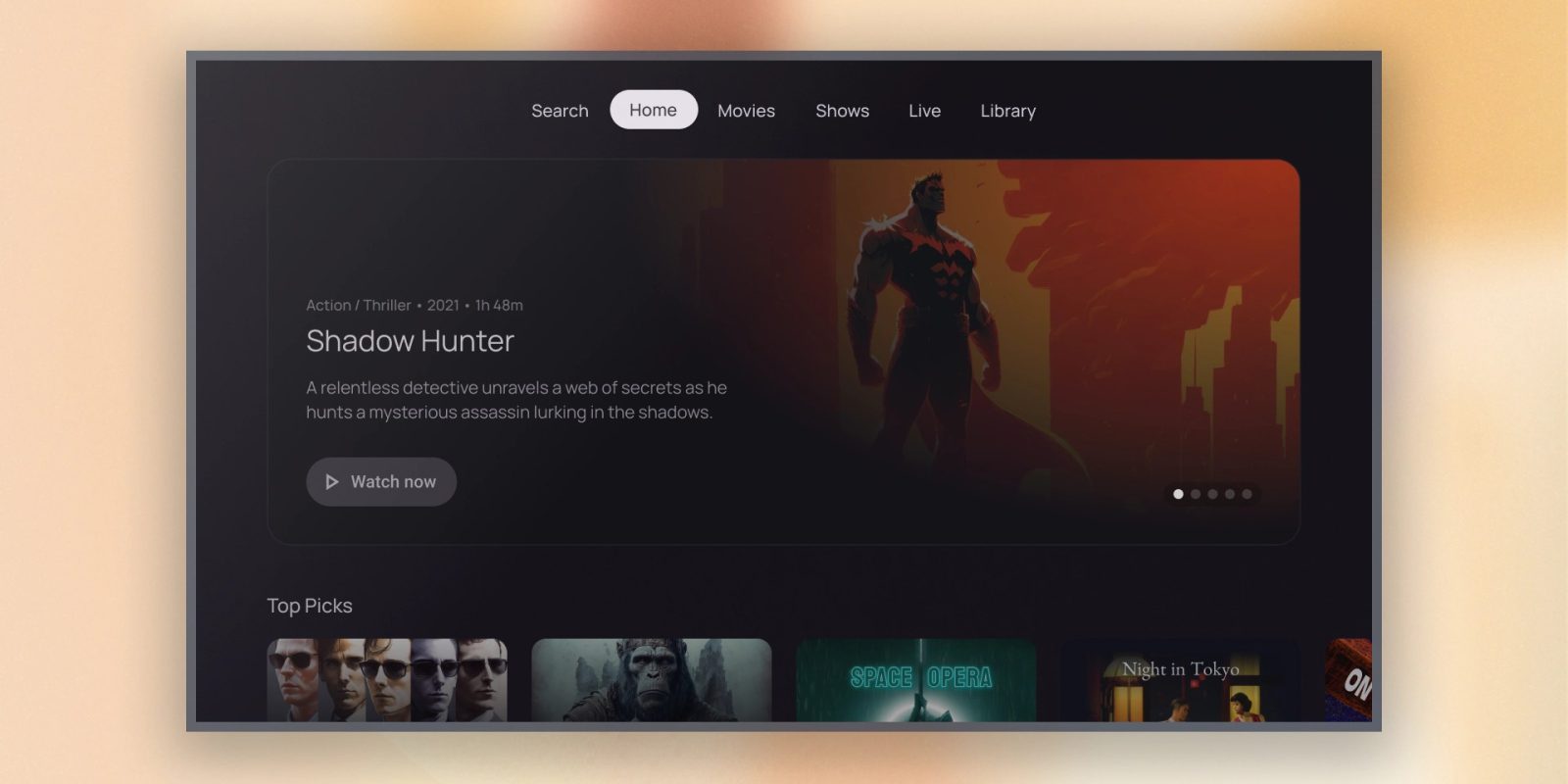
When Android TV debuted back in 2014, many apps on the platform shared the same design language, but that disappeared over time as that UI became dated. Now, at I/O 2023, Google is introducing a new set of components for app developers to speed up developing apps for Android TV OS that brings a new look for those apps.
Google is introducing a new set of design guidelines for apps built for Android TV OS – the underlying platform for Android TV and Google TV. The new guidelines give developers a point of reference when designing for the platform and include a few key elements:
- Buttons
- Cards
- Featured carousel
- Immersive lists (with visual content)
- Lists (with text content)
- Navigation drawer
- Tabbed interface
The short version of what this new guideline actually looks like is that it’s basically Google TV’s homescreen. The entire UI is full of rounded cards and buttons, with an easy-to-understand and navigate grid of content. And, really, that makes sense, given Android TV did the same thing with app guidelines back in 2014.
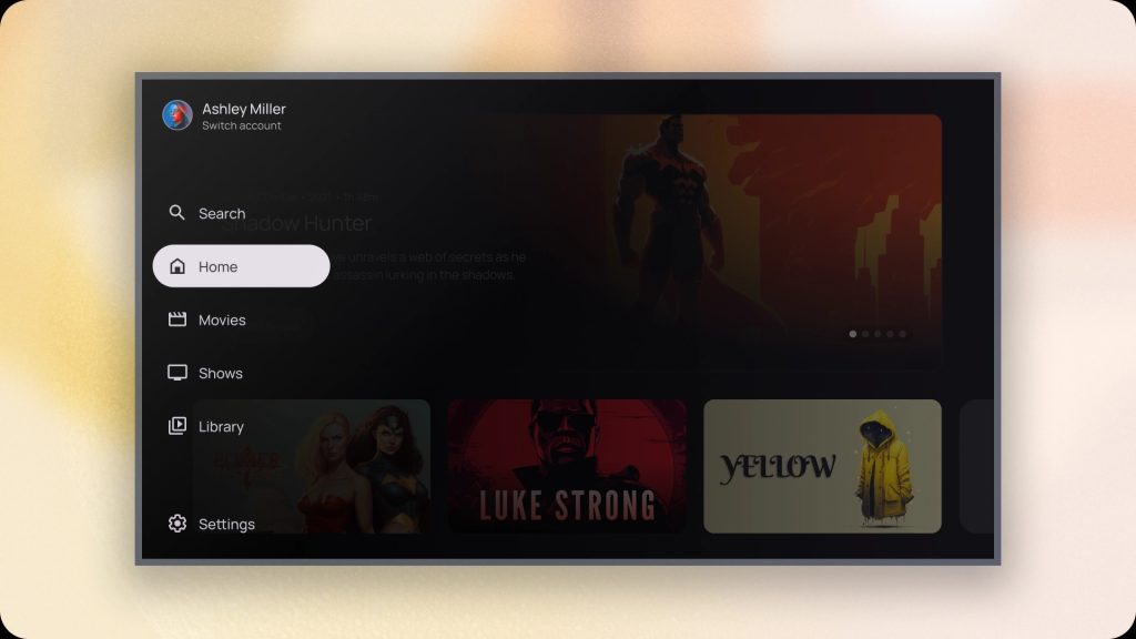
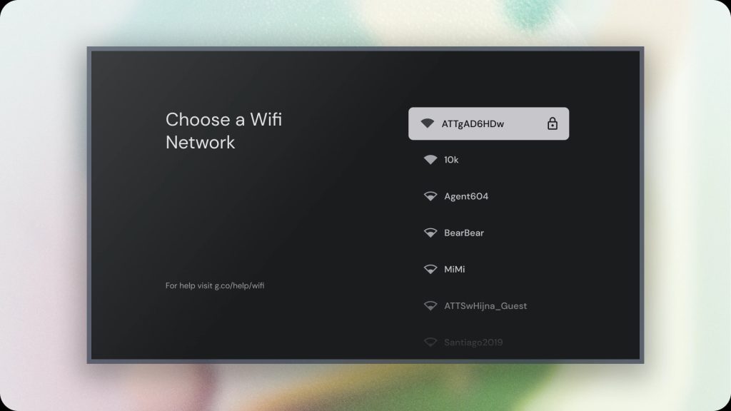
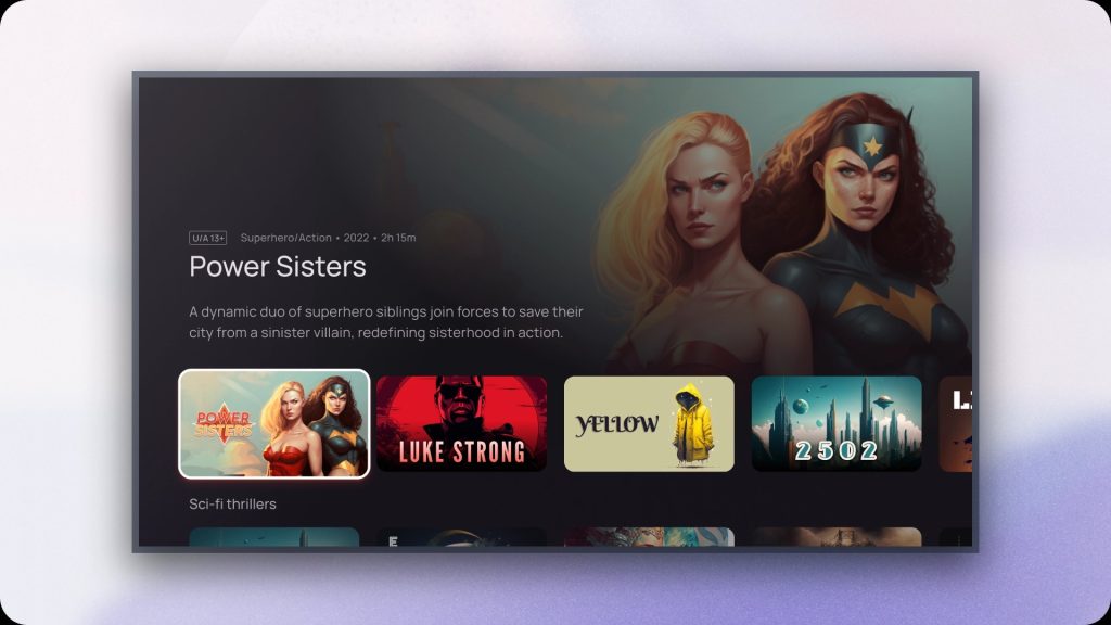
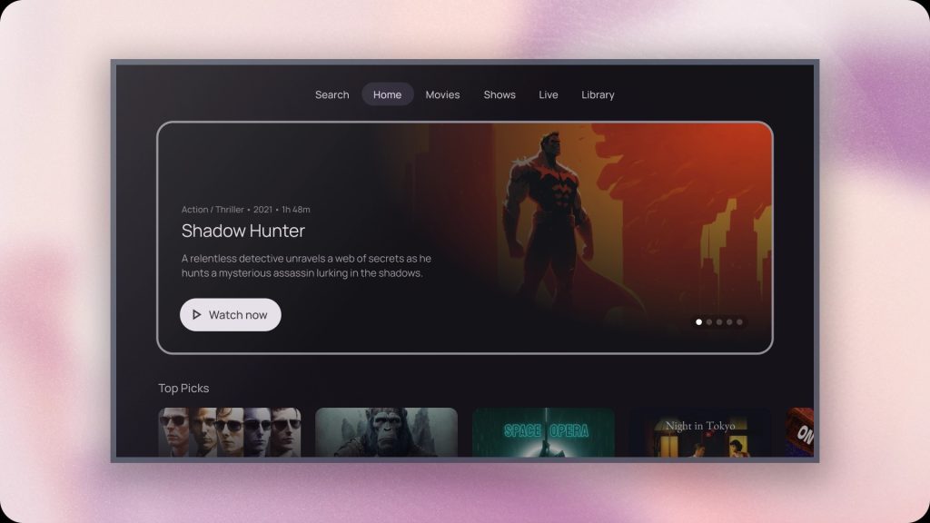
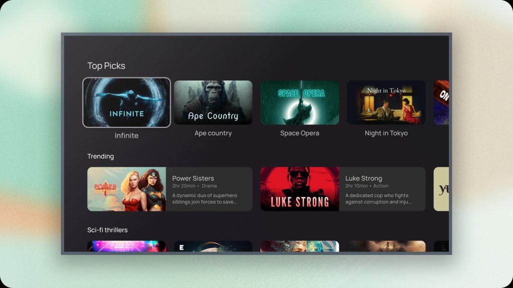
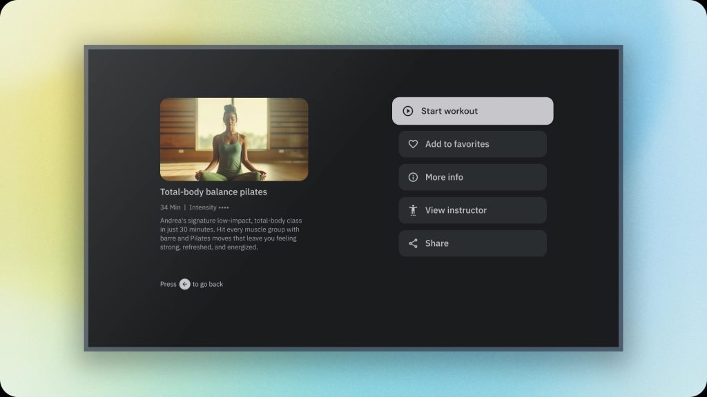
To assist in bringing these new designs to life more quickly, Google is bringing all of the core elements to Compose for TV.
This new design language won’t be a requirement for Android TV OS apps going forward, but it’s reasonable to expect we’ll be seeing some apps, especially from Google, adopting the new look over time.
More from Google I/O 2023:
- Google announces Pixel 7a powered by Tensor G2 chip, face unlock for $499
- Google announces Wear OS 4, Gmail and Calendar for watches, more
- Google Home app redesign leaves beta with new Wear OS and tablet features
FTC: We use income earning auto affiliate links. More.


Comments