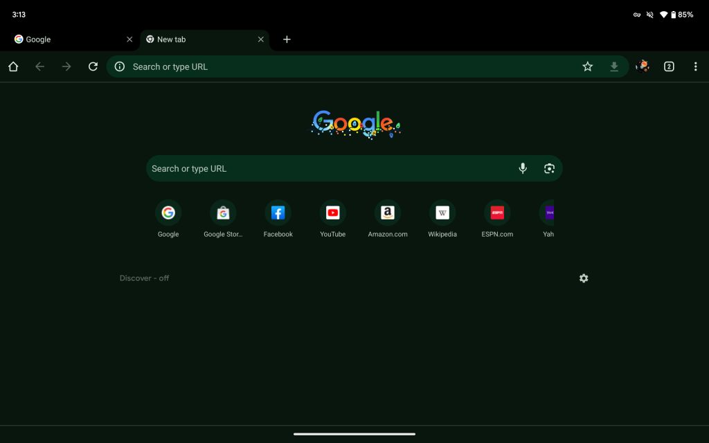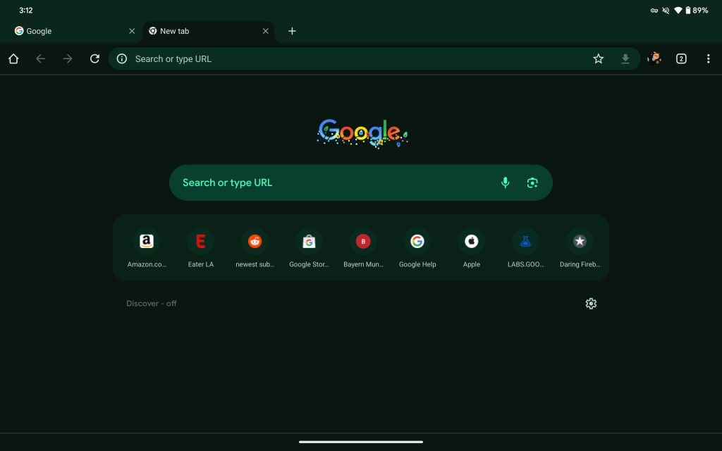
Last month, Chrome on Android started rolling out more Material You for the New Tab Page (NTP), and that work continues with a carousel, as well as a key application of Dynamic Color on tablets.
Google has long shown eight favicons, as well as search queries, on the NTP. That 4×2 grid was placed in a rectangular container with rounded corners as part of the Material You redesign that introduced a thicker search bar and other changes.
Chrome 120 is now testing a version of the New Tab Page where the favicons are housed in a carousel with four to five visible at a time. This seems like a waste of space, especially for users who turn off the Discover feed. It also introduces unnecessary scrolling when there’s plenty of space.
A similar change was made on the desktop to where favicons are now displayed in a row if your screen is wide enough.
On Android, the company last explored this idea in mid-2022 but abandoned it at the time. Google has not yet rolled out the Material You revamp of the NTP to all users.
Meanwhile, a recent change on Android tablets makes it so that the status bar above the tab strip features Dynamic Color theming. In the dark theme, it was previously just black. There are no changes in light mode.
Old vs. new
More on Chrome:
- Chrome’s 3rd-party cookie deprecation is called ‘Tracking Protection,’ testing starts January
- Chrome now defaults to desktop mode on ‘premium’ Android tablets
- Google redesigns bookmarks in Chrome for Android [Gallery]
FTC: We use income earning auto affiliate links. More.


Comments