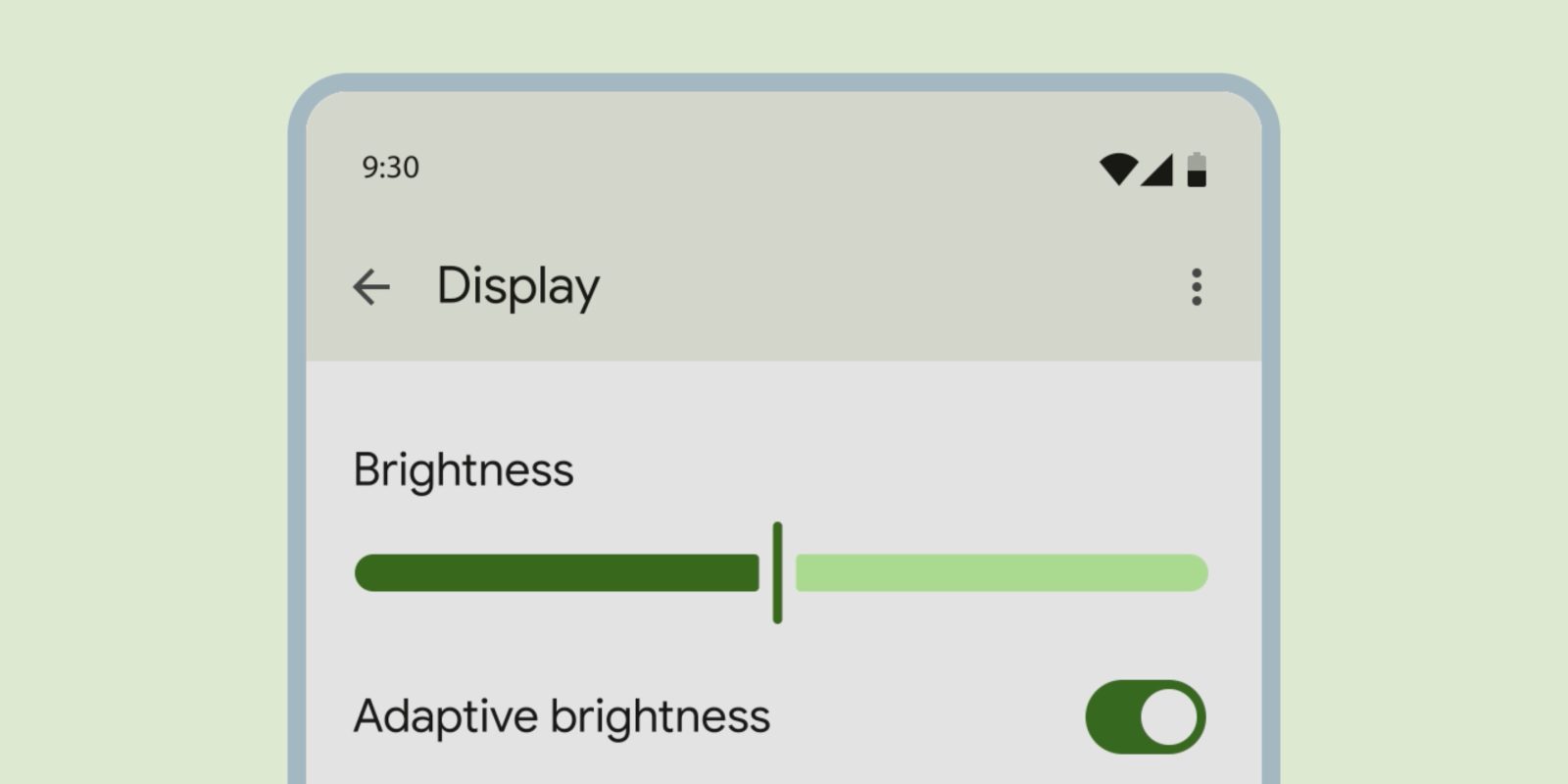
In addition to new progress bars, Material You has redesigned sliders that are thicker and should be easier to interact with.
Sliders allow users to view and select a value (or range) along a track. They’re ideal for adjusting settings such as volume and brightness, or for applying image filters.
Sliders today are thin lines with circular scrubber heads. In December, Google introduced a “new shape for slider tracks and handles.” The line, or active track, is now pill-shaped, while you have a vertical line as the handle.

Similar to the new progress bar, there is a physical gap between the slider handle and the active/inactive track. That handle also “adjusts width upon selection” to become a very thin line. Similarly, “slider tracks adjust in shape when sliding to the edge.”
In Material 3, sliders are available in four configurations. The variant with dots (or predetermined values) is a discrete slider, while you can have a value appear when the handle is pressed or dragged.
- “Centered sliders have the starting value in the middle of the slider.”
- “Continuous sliders can be freely dragged to any value in the range.”
- “Discrete sliders snap to predefined values, marked with stop indicators.”
- “Range selection sliders have two handles that set the minimum and maximum of a range.”
While the new progress indicator has been implemented in Google Photos and the Play Store, this redesign of the slider is not yet live.
The Material 3 guidelines show mockups of the new slider being implemented in Android’s Settings app. It would certainly change the nature of the Sound & vibration page:


More on Material You:
- Chrome New Tab Page getting more Material You on Android
- Yes, search bars in Gmail and other Google apps have gotten bigger
- Google Messages rolling out new contacts page with Material You carousel
FTC: We use income earning auto affiliate links. More.


Comments