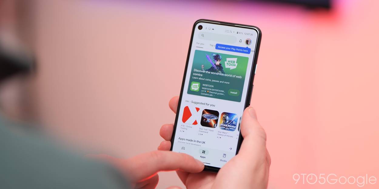
Google is rolling out a new form factor switcher for screenshots and reviews on Play Store listings, while a second splash screen of sorts is appearing when launching the app.
The Play Store has long featured a static splash screen. After that logo, Google is now showing what’s effectively a secondary splash screen before the home feeds appear. It features a miniature Google Play logo in the top-left corner followed by a notification bell that’s marked by any available alerts and your profile picture.
That logo is replaced by the existing search bar when everything (content feeds, bottom bar, etc.) fully loads. There’s no such thing as a second splash screen in Android, so this intermediary UI that appears for just a second should be a bug.


The logo in the corner is something used by the Play Store on foldables, tablets, and Chromebooks. We could somehow be seeing a remnant of that on phones. Another possibility is that Google is actually going ahead with adding a “Search” tab to the bottom bar. This design brings the corner logo to phones.
This extra splash screen started appearing in the last week or so, and often appears after a cold launch of the Play Store.
Meanwhile, Google has introduced a way to jump to screenshots and reviews for a specific form factor inside app listings. First tested in November, we’re now widely seeing a device category switcher. On apps you haven’t downloaded, it appears right below the Install button.
It’s much faster than scrolling all the way left to access watch, tablet, Chromebook, and car screenshots.


More on Google Play:
- Google Play is not showing available system app updates
- Google Play will allow more real-money gaming apps, planning to add service fee
- Google will pay $700 million, simplify sideloading to settle Play Store antitrust suit
FTC: We use income earning auto affiliate links. More.


Comments