After rolling back the last Library redesign in 2022, Google Photos is trying again with a new tab called “Collections.” The goal is to make “finding content easier than ever.”
That previous attempt had a grid with 10 recent albums, including Favorites and your Camera roll. Everything else can be sorted by the carousel of filters at the top: All, Your albums, On device, and Shared albums. It was briefly rolled out before Google pulled the design.


Previous vs. attempted Library redesign in 2022
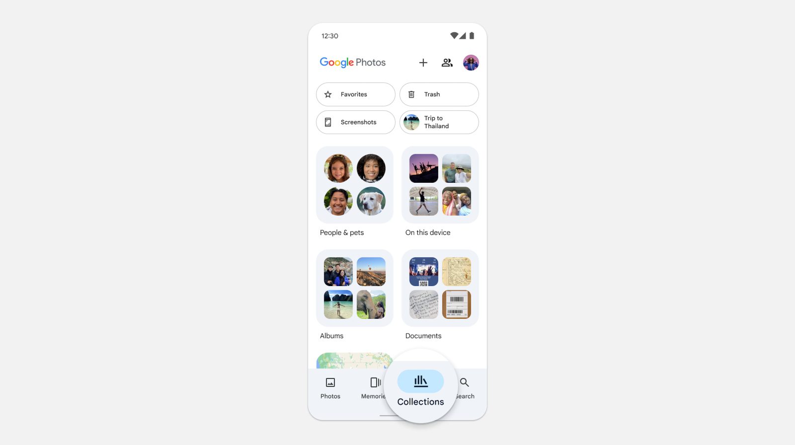
Instead of Library as the third tab in the bottom bar, you have “Collections,” which uses the same icon as before.
There’s quick access to Favorites and Trash at the top with new pill-shaped buttons. The rest of the 2×2 grid is dynamic and “based on the items you navigate to the most,” like Screenshots and Archive in the example below. However, Locked Folder will not appear as a tile given user complaints.
The big change is how the “Photos on device” carousel has been replaced by a folder called “On this device.” This takes you to a grid view of all your local albums. This might take some time to get used to as accessing your camera roll is now an extra step.


Meanwhile, the rest of this tab is no longer your grid of cloud albums. Instead, you get an “Albums” folder that you have to first tap through. Your view options are grid or list, while you can “Sort by” Last modified, Album title, and Most recent photo.
We’ve heard you loud and clear that with the previous experience, finding shared albums was difficult. With the Collections view, you can access private and shared albums, all under one roof
Google
Collections is also home to a “People & pets” folder, Documents, and Places.
We want to streamline how you can find your content with an interface that makes albums and groups we’ve created for you more intuitive and accessible.
Top comment by Andrew Lee
Typical Google. Changing things for the sake of change and never making any sense. Now people are gonna ask where are my local photos..
Library is used to refer to what exists.
Collections is used to refer to what's user-created.
This is followed by a list with Favorites, Screenshots, Videos, Recently Added, Archive, Locked, and Trash.


Meanwhile, Google Photos has removed the Utilities folded and moved those tools to:
- Locked Folder: Tap Collections. At the bottom, tap Locked.
- Import photos: At the top, tap Create +. Under “Get photos,” tap Import from other places.
- Make a new creation: At the top, tap Create + and then the type of creation you want to make, such as a new album, collage, highlight video, cinematic photo, or animation..
- Free up space: At the top, tap your Account profile photo or Initial and then Free up space on this device.
- Move photos to archive: Select a photo. Tap More and then Move to archive.
- Manage photo frames: At the top, tap your Account profile photo or Initial. Tap Photos settings and then Apps & devices. Tap Photo frames
Meanwhile, the Search tab has been redesigned — presumably ahead of the Gemini-powered Ask Photos — to be just a list. After the search bar, you get “Recent” queries and that’s followed by “Suggestions,” like Screenshots, Selfies, and Menus.
This Collections and Search redesign is more widely rolling out to Google Photos for Android (version 6.93) and iOS.
The Collections view is starting to roll out now to all users in the Android and iOS Google Photos app. If you can’t find the Collections view yet, check back over the coming weeks.
FTC: We use income earning auto affiliate links. More.
Comments