The Android 15 QPR1 Settings app redesign on Pixel moves the “Google” menu to the top of the list. All other devices are now seeing a big Material You overhaul of “Google services.”
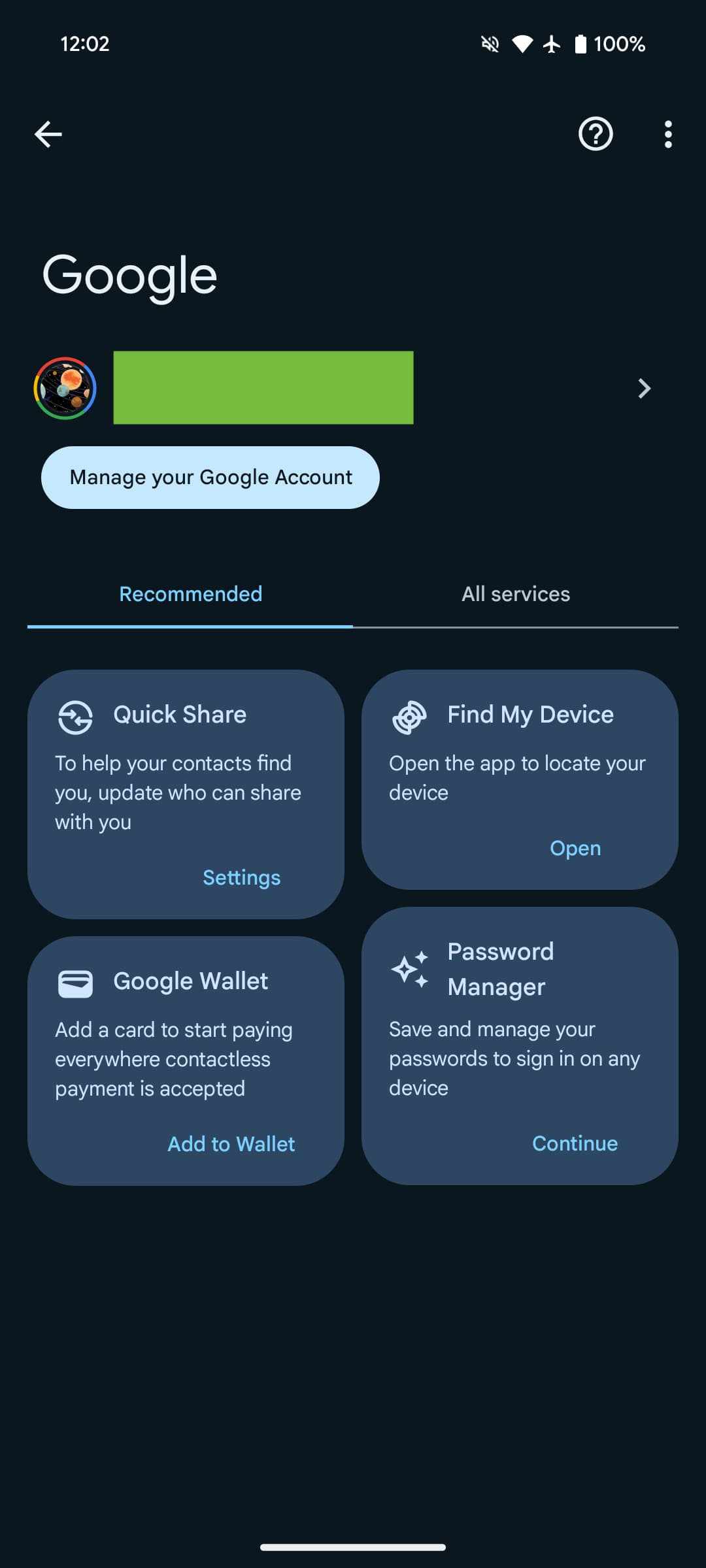
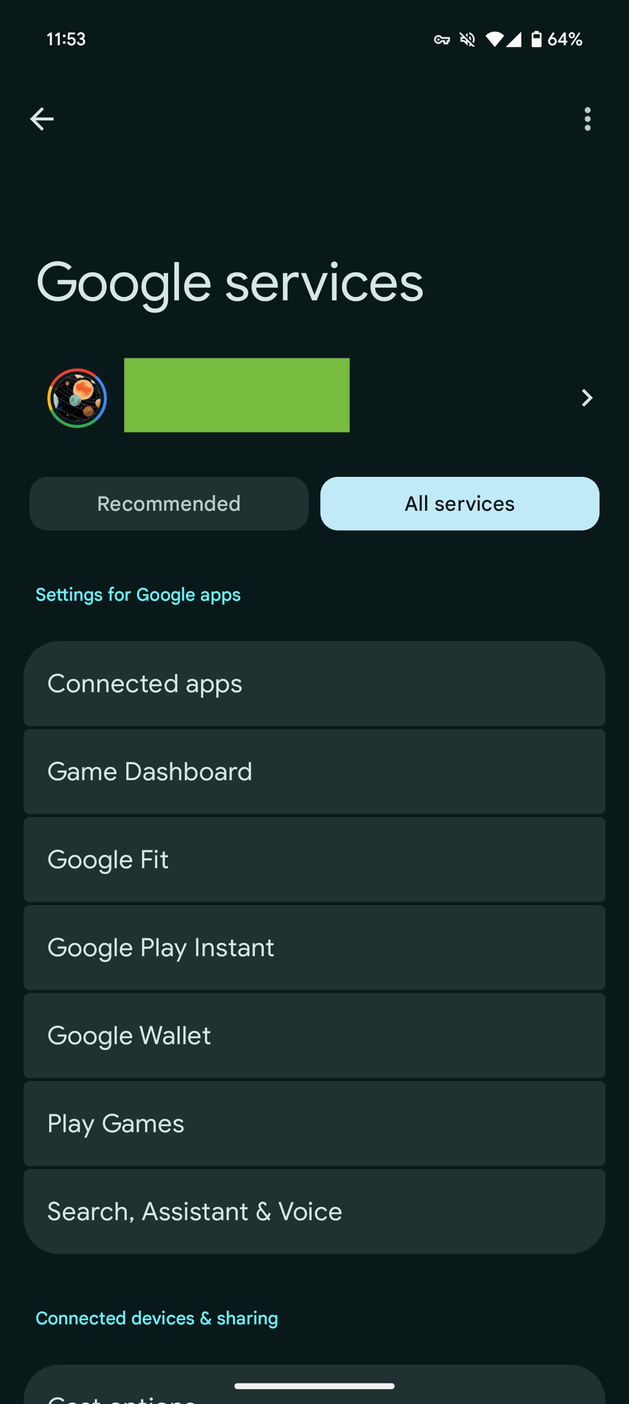
Settings app > Google is now titled “Google services. Instead of tabs, you have two buttons for “Recommended” and “All services,” though you can still swipe between them.
The grid of cards with Backup, Quick Share, Find My Device, Google Wallet, and Password Manager is unchanged.
Old vs. new


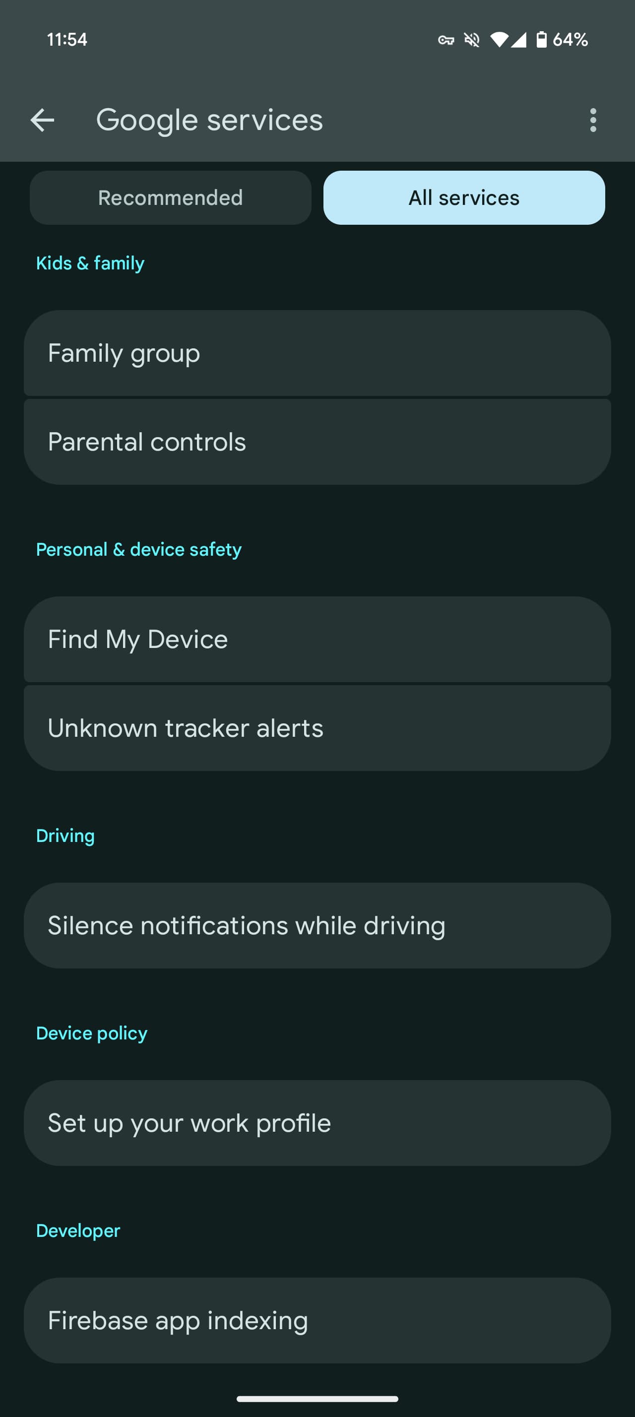
However, All services is now one long list, with “Settings for Google apps” greatly elevated. Instead of a menu list in alphabetical order, Google is now prioritizing certain items, including Connected devices & sharing, Privacy & security, and Autofill & passwords.
All items are placed in cards. Overall, this UI is slightly more overwhelming, but easier to browse.
This Google settings redesign is rolling out with version 24.37.34 of Play services.


- Settings for Google apps
- Connected apps
- Game Dashboard
- Google Fit
- Google Play Instant
- Google Wallet
- Play Games
- Search, Assistant & Voice
- Connected devices & sharing
- Cast options
- Chromebook
- Cross-device services
- Devices
- Matter devices
- Quick Share
- Privacy & security
- Ads
- Device Plans
- Personalize using shared data
- Phone Number Verification
- Usage & diagnostics
- Autofill & passwords
- Autofill with Google
- Passkey-linked devices
- Phone number sharing
- SMS verification codes
- Backup & restore
- Backup
- Google Contacts sync
- Restore contacts
- Set up nearby device
- Kids & family
- Family group
- Parental controls
- Personal & device safety
- Find My Device
- Unknown tracker alerts
- Driving
- Silence notifications while driving
- Device policy
- Set up your work profile
- Developer
- Firebase app indexing


FTC: We use income earning auto affiliate links. More.


Comments