
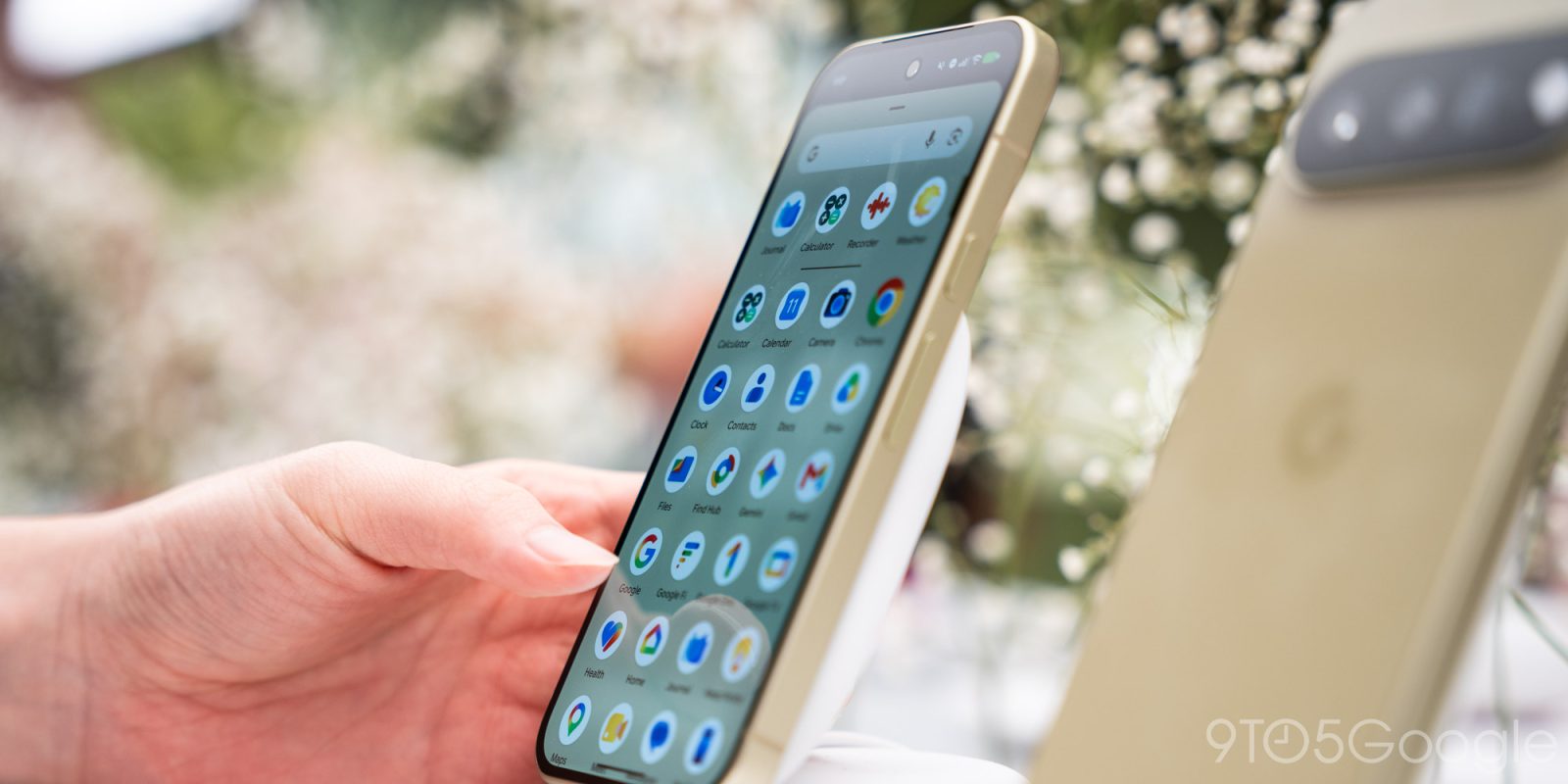
With the launch of the Pixel 11, Google has updated a handful of Pixel app icons to better align with its latest design language.
The biggest update is to Pixel Camera, which still mostly takes after a DSLR. The body is a rectangle with corner flash and centered viewfinder. Besides the updated shape, there’s a new color palette in Pixel blue. The gradient reflects how ML and AI have long been part of the Pixel Camera experience. This update coincides with a big update to the actual in-app viewfinder.

The primary change to Pixel Weather is going from a blue background, which fittingly represented the sky, to a plain one. Besides the icon, we haven’t noticed any major changes to the app itself.
Top comment by matteventu
For once, I'm not really happy about some of these.
The white background is awful.
The most beautiful version of the "round" icons are the "adaptive icons" that originally launched with Pixel in 2016 - where the whole inside of the circle (or square, or squircle - whatever the icon shape) would make up the whole icon.
Now, they're just standard icons in a white container.
Even worse, if we look at the new Clock icon, which follows the redesign of the YouTube Music icon from a couple of years ago: a circle within a circle.
At this point, I'm expecting Chrome to go that way too.
What's even worse is that if you flip to dark mode, the white background of each icon remains (unlike for instance for instance on iPhone where the icon background goes dark too).
If someone wants to use dark mode in the dark to avoid being blinded or making too much light in the room, this is a huge regression, as the previous style of icons (i.e. "full shape" icons, which had the entire content of the icon shape coloured) were much tamer on the eyes, in either dark or light mode.
Sorry, not good. At all.
Similar to Weather, Pixel Recorder drops the background color for a red waveform that is less detailed than before and a bit more stylized.

Google Calculator also drops its background to place the minus, multiplication, plus, and equals symbols in green (dark and light) circles.

The last change is to the Google Clock app, with Material 3 Expressive fully leveraged to illustrate the app’s name. It takes after a design first introduced on Wear OS.

Overall, these new icons make for nice modernizations that match the likes of Pixel Journal and Screenshots. Recorder, Calculator, and Weather not going all blue is a nice bit of differentiation.
- Pixel 11: Google Store | Amazon | Best Buy
- Pixel 11 Pro: Google Store | Amazon | Best Buy
- Pixel 11 Pro XL: Google Store | Amazon | Best Buy
- Pixel 11 Pro Fold: Google Store | Amazon | Best Buy
- Pixel Watch 5: Google Store | Amazon | Best Buy


FTC: We use income earning auto affiliate links. More.


Comments