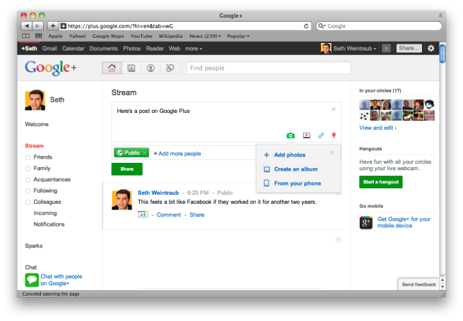
So why does Google+ look so good? It’s simple; it was designed by some who used to work at Apple. Wired’s Steven Levy is reporting that Andy Hertzfeld, one of the designers from the original Macintosh, played an essential role in the design of Google+.
With colorful animations, drag-and-drop magic, and whimsical interface touches, Circles looks more like a classic Apple program than the typically bland Google app. That’s no surprise since the key interface designer was legendary software artist Andy Hertzfeld.
Google+ design really is excellent. It is invite-only at the moment. We’re taking notes in the mean time.
FTC: We use income earning auto affiliate links. More.
You’re reading 9to5Google — experts who break news about Google and its surrounding ecosystem, day after day. Be sure to check out our homepage for all the latest news, and follow 9to5Google on Twitter, Facebook, and LinkedIn to stay in the loop. Don’t know where to start? Check out our exclusive stories, reviews, how-tos, and subscribe to our YouTube channel


Comments