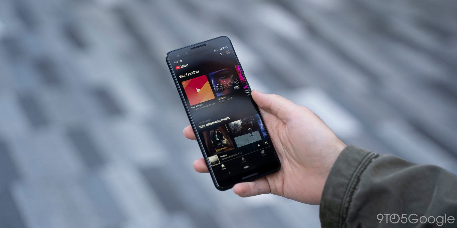
YouTube Music has been testing redesigned artist profiles for quite some time now. This revamp now looks to be more widely rolling out to Android and iOS today.
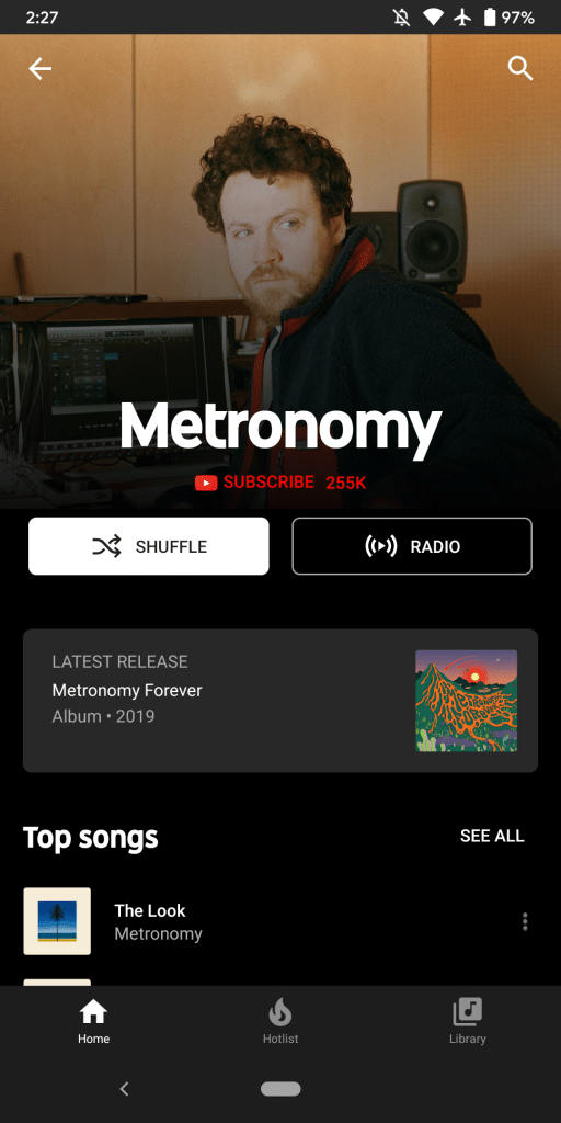
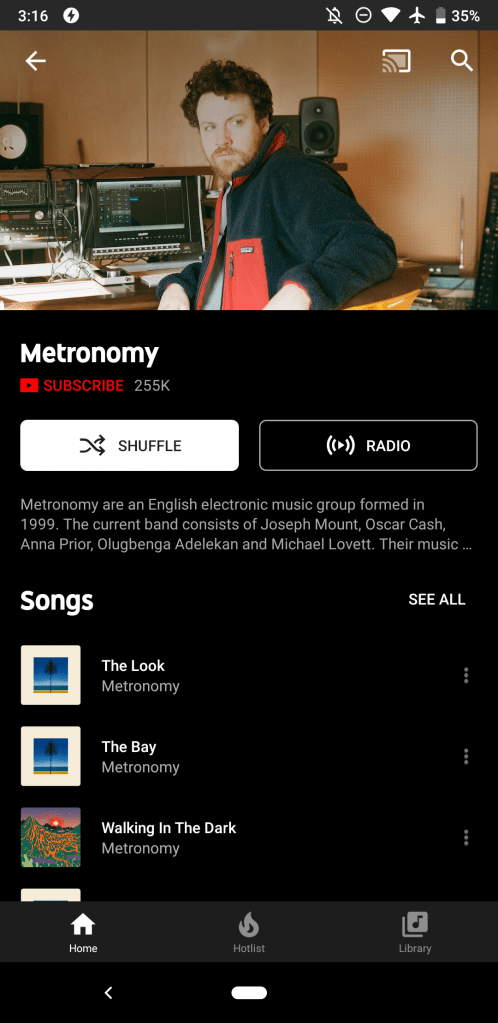
This YouTube Music artist redesign starts with a larger cover image that has a closer crop. As the photo begins to fade, the musician name prominently appears, while the “Subscribe” button with follower count is now centered.
A useful “Latest release” card that invokes the Material Theme has been added to note the latest album or single with preview art. Meanwhile, the “Songs” list has been renamed to reflect how these are “Top songs.”
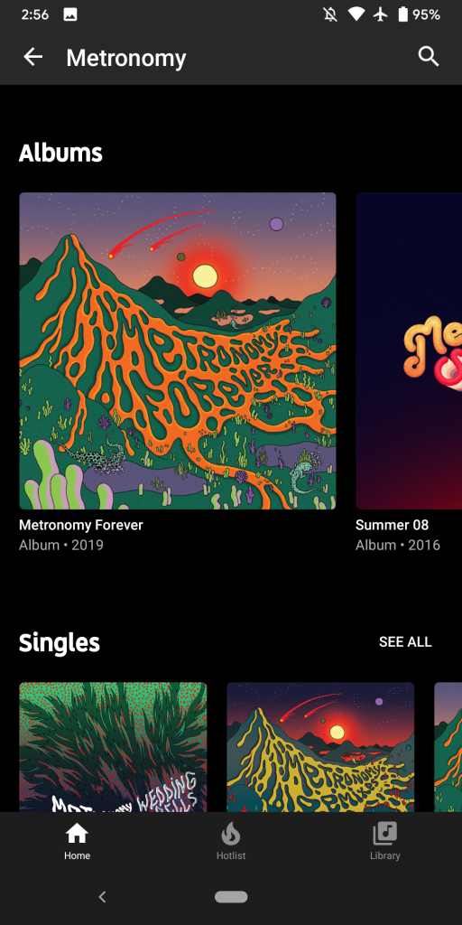
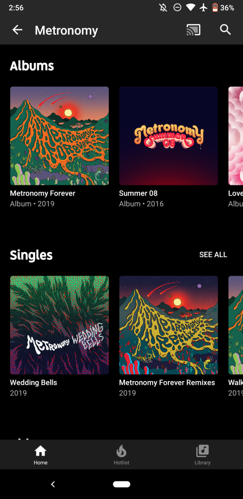
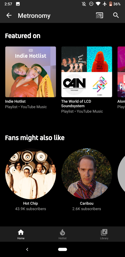
“Albums” feature significantly larger cover art so that only one full work is listed at a time. This makes for a beautiful browsing experience. Carousels for “Singles,” “Videos,” “Featured on,” and “Fans might also like” are unchanged.
Redesign
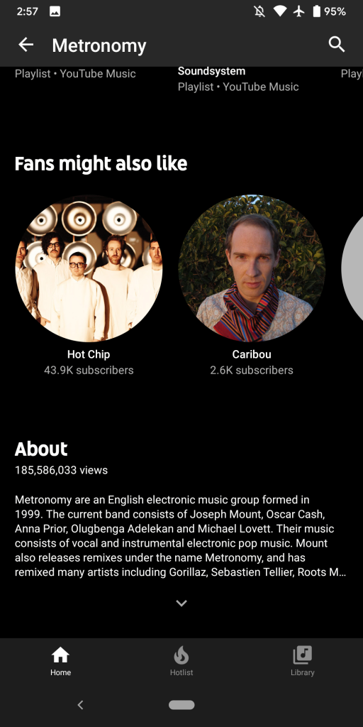
The very bottom of the YouTube Music artist redesign is home to the “About” section that was previous above. You can tap the chevron to expand, while a total view count is now included.
This artist page redesign is rolling out via server-side update if you’re running an up-to-date version of YouTube Music (currently 3.37). It was not available for me earlier this morning, but hit my Android and iOS devices this afternoon.
A similar revamp is in the works for the desktop web player, but it’s not rolled out at this time.
Previous
More about YouTube Music:
- YouTube app promoting new YouTube Music song recommendations
- YouTube Music offering some subscribers free Google Home Mini
- YouTube Music now preinstalled on Android 10, replacing Google Play Music
FTC: We use income earning auto affiliate links. More.


Comments