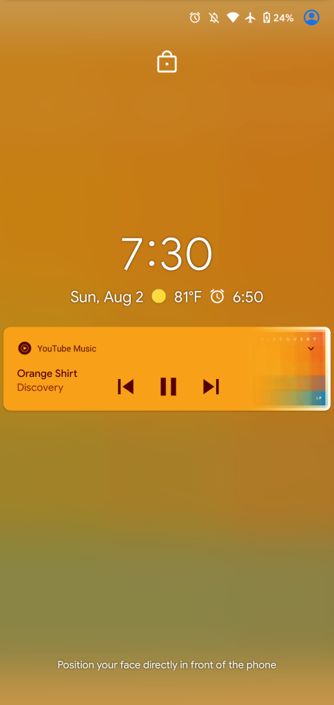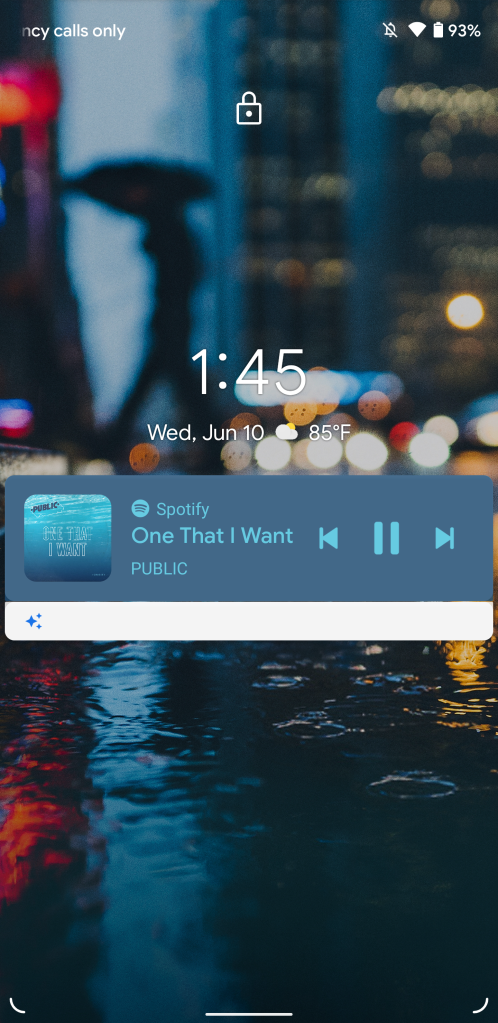
From Quick Settings integration to a new design on the lockscreen, Google’s upcoming mobile OS significantly revamps the media playback experience. However, as part of this, Android 11 will stop featuring lockscreen art.
To highlight active media, Google has long taken the album art of what’s playing and displayed it on the lockscreen. In Android 10, a blur effect was applied to the media artwork.
Android 11 is getting rid of lockscreen art entirely as confirmed by a Googler in the Issue Tracker on Friday:
We no longer show album art on the lock screen in R
This is already the case for users that enabled the big “Media resumption” redesign of player controls. However, others still have the old design, though Google considers this a bug that has already been “fixed” in an internal/upcoming build.
Many users are upset by this behavior, and the Android team did not provide an explanation. One possible reason could be that the redesigned notification controls show a non-blurred preview of the artwork, while another is that most Pixel 4 owners don’t even encounter album artwork when the “Skip lock screen” option is enabled. As biometric unlock options proliferate in the future, this could become the default experience.

Android 10 
Android 11
Others are less miffed, and never appreciated how media notifications hid their chosen wallpaper. Very few applications have a setting to disable this, though Google Play Music has long had an in-app preference.
Given that Google is close to finalizing Android 11, this lockscreen art change will likely be in the public launch later this quarter.
More about Android 11:
- Hands-on with Android 11’s brand new emoji [Video]
- Android 11’s internal dessert name is ‘Red Velvet Cake’
- Google releases Android 11 Beta 2.5 patch with Pixel 4 display fix
- Android 11 brings Personal/Work tabs to share sheet, more parts of the OS
FTC: We use income earning auto affiliate links. More.


Comments