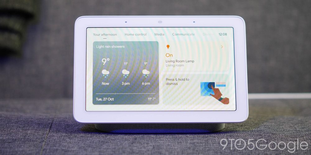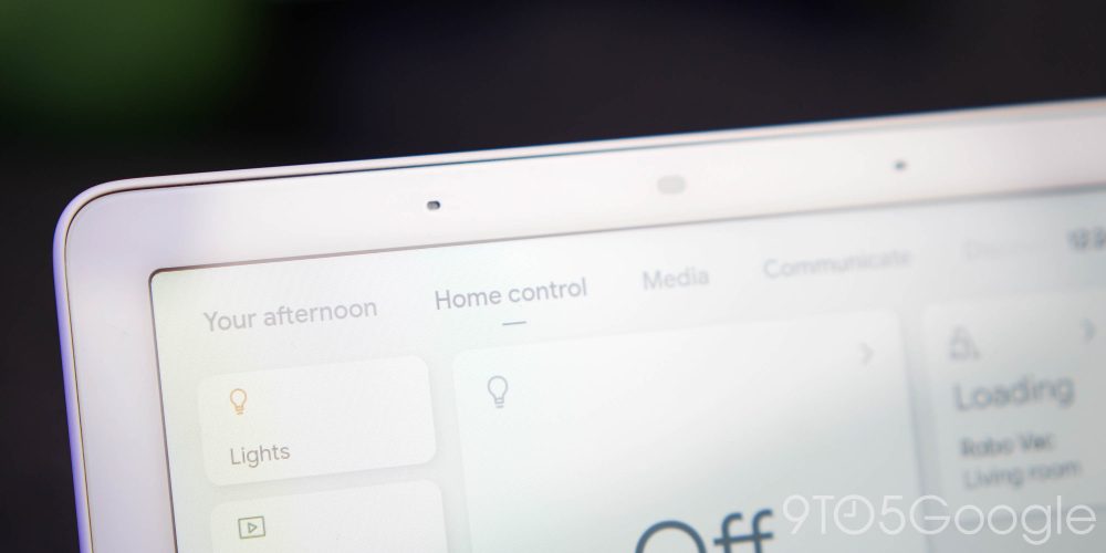
The battle for control of your smart-home tech has been fierce for years, but it’s about to heat up even further as Google rolls out a redesign of the classic Smart Display UI — which could change the way you interact with your Nest Hub, Nest Hub Max, or other Smart Display hardware.
We had a sneak peek at the redesign, thanks to some hands-on leaks, but while that was merely a glimpse, Google confirmed the rollout of the new UI to those on the Preview Program with version 32.28.38.336575889. The new update actually introduces a few neat new tricks that were latent in on the original Nest Hub — or at least have been fine-tuned.
What’s new?
A brand-new tour will be available as soon as you update that will guide you through the entire new UI, but here are some of the highlights of the Smart Display redesign:
Video — Hands-on: Nest Hub and Smart Display redesign
Subscribe to 9to5Google on YouTube for more videos
Your day
Rather than just having random items and toggles available with a touch or using voice controls, the new Smart Display redesign brings a “Your day” home view that updates in real time. This means that it will morph and update to give you pertinent information and news articles, toggles and quick actions throughout the course of a 24-hour period.
This should learn more about your usage, with your feed improving over time.
Tabbed view
The new tabbed view creates true separation between everything on your Nest Hub or Smart Display, with a “main” home view that has floating rounded square bubbles with key “at a glance” information such as the current weather conditions, notable smart home toggles, and more.
-
Home control
So you’ve got a main “home” view, but above that are a series of tabs with categories for new account-specific controls. There are dedicated tabs for “Home controls” that includes quick toggles for things like lighting, TVs, thermostats, and more.
This also shows any and all other connected Smart Displays in one easy-to-access panel. Think of this as a “true” hub for managing just what each of your devices is currently doing. This may save time if you prefer to use touch controls rather than voice controls for managing smart home tech.
Another notable is the room-specific controls and overview that is available. If you prefer to manage connected smart home tech on a room-by-room basis, this might be easier
-
Media
A larger part of the Smart Display and Nest Hub UI redesign is the focus on media. It has always felt like an inclusion rather than a focusing or honed portion of Google Assistant-powered displays. There is some crossover between the “Media” section and that of the recent Google TV for Android TV redesign.
You’ll get recommendations from services such as Netflix, YouTube, and other connected streaming services. Recommendations are pulled from your viewing history on platforms such as YouTube, where you may see subscriptions and recent uploads from your favorite channels. There is also a much greater integration with YouTube TV, with live channels being more prominent and accessible from this view — provided the service is available in your region.
Oddly, Google considers Google News as a media source in the same vein as YouTube Music, YouTube, and Netflix within this section. I suppose, technically they are correct, which is the best kind of correct.
-
Communicate
A really impressive new section that, again, showcases the “hub” element of Smart Display and Nest Hub hardware by giving you quick toggles for all of the direct communications services that your device is capable of.
The new Household contacts option plugs into your account linked contacts, allowing you to create a quick-access tab or icon for speed dialling those within your home/household — such as brothers, sisters, parents, children, spouses, etc. When setup, tapping will just call that person instantly.
Being able to broadcast messages to all Smart Displays in your home is also possible, along with quick access toggles for starting a Google Meet video call, Google Duo video or voice call.
-
Discover
Think of this as a hybrid of the Google Discover feed you’ll see on your Android device but with a few more tailored recommendations that make sense on a piece of home tech. You’ll get things like recipe recommendations or ideas, quick toggles for creating lists and checklists plus the Smart Display and Nest Hub redesign includes nifty hints for other capabilities.
You’ll be given hints for searches, information, and abilities that you may not have used or known about previously.
New animations
We can’t talk about a Smart Display and Nest Hub UI redesign and not mention the updated and improved animations. The previous animations were smooth but Google has added some character and “bounce” to swipes and taps in this public-facing preview build.
Dark mode

Finally, there is a dark mode or dark theme for Nest Hub and Smart Display with the latest UI redesign, it’s available within Settings or can be toggled during the initial setup process. You can apply it in the same way you would on your smartphone with an option to automatically revert between the standard light and new dark modes based upon time and room lighting too — making a smart display much better as a bedroom alarm clock.
How can I get the Smart Display redesign on my Nest Hub?
To get the updated interface and added features on your own Nest Hub hardware, you’ll need to join the preview program. Just open up the Google Home application, find the device you would like to update > Settings > Preview program > Join preview program.
Now you’ll want to power-cycle your device a few times to initiate the update, and within a few hours, the update should be available on your Nest Hub or compatible Smart Display.
More on Google:
- iPhone 12 owners on Google Fi are currently unable to access 5G
- Google Doodle celebrates Dr. Stamen Grigorov, the biologist who discovered yogurt bacteria
- Google Home app tests much-needed settings redesign for Nest Hub, other devices
FTC: We use income earning auto affiliate links. More.


Comments