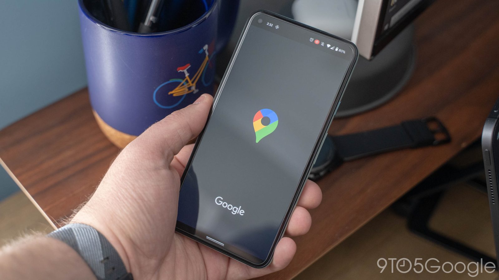
Since 2019, Google has been rolling out night modes to all of its apps. The last major holdout is Google Maps, but that’s fortunately coming to an end as its dark theme is set to soon launch globally on Android.
Update 3/18: A little over three weeks after it was first announced, the Google Maps dark theme on Android looks to be fully rolled out. It coincides with a tweet this morning from the official @Android account. All of the company’s biggest apps now have a night mode, with only a few exceptions (Google One, Shopping) remaining.
Update 3/1: Following last week’s announcement, the Google Maps dark theme is widely rolling out this evening. It applies to both the map layer and menus. Interesting design changes include how the ocean is pitch black, while various elements and buttons feature a notable outline/raised shadow. Overall, this night mode is rather blue.
Besides the introductory prompt, you can control from Settings > Theme. Make sure you have the latest Android version (10.61.2) of Maps from the Play Store and Force stop from the system App info page if it’s not yet live.


Original 2/23: Google Maps for Android’s dark theme sees the pill-shaped lookup field, carousel of search suggestions, and bottom bar, as well as other buttons, switch to light gray. A soft blue is used to mark your current tab and for the directions FAB. The darkest shade of gray is reserved for the underlying map layer/background when zoomed in, while streets and names are slightly lighter. All pins and icons have been similarly adjusted to fit.
This night mode is meant to provide “your eyes a much-needed break” and help conserve battery life. Users first started seeing it in late September as part of server-side testing. Only a small handful received it, but those that did kept it all these months. However, the theme has been disappearing in recent few days ahead of this upcoming launch.
Once live, you’ll be greeted with a “New! Maps in dark theme” sheet that presents three standard options. It’s also controllable from Settings > Theme. This main look can be set independent of the navigation appearance, which already has a night-friendly mode.
- Always in light theme
- Always in dark theme
- Same as device theme


Announced alongside other Android features coming this spring, Google says the dark theme is “soon expanding to all Android users globally.” We’re told this means the “coming weeks.” There’s no status for iOS yet, while — as a reminder — spring does not start for another month.
Nevertheless, Google is finally making the look official after a mockup first appeared over a year ago with the launch of Android 10. Other functionality debuting this spring includes:
- Google is bringing games to Android Auto, and no, it’s not Stadia
- Google Assistant lockscreen commands are now accompanied by glanceable cards
- Android’s ‘Autofill with Google’ manager now warns about compromised app passwords
- Android TalkBack updated with new gestures, customization, more

FTC: We use income earning auto affiliate links. More.


Comments