
The third beta to Android 12 makes some updates to the Pixel Launcher homescreen for Google’s own phones, including renaming “At A Glance” to “Live Space” and adding more splashes of color.
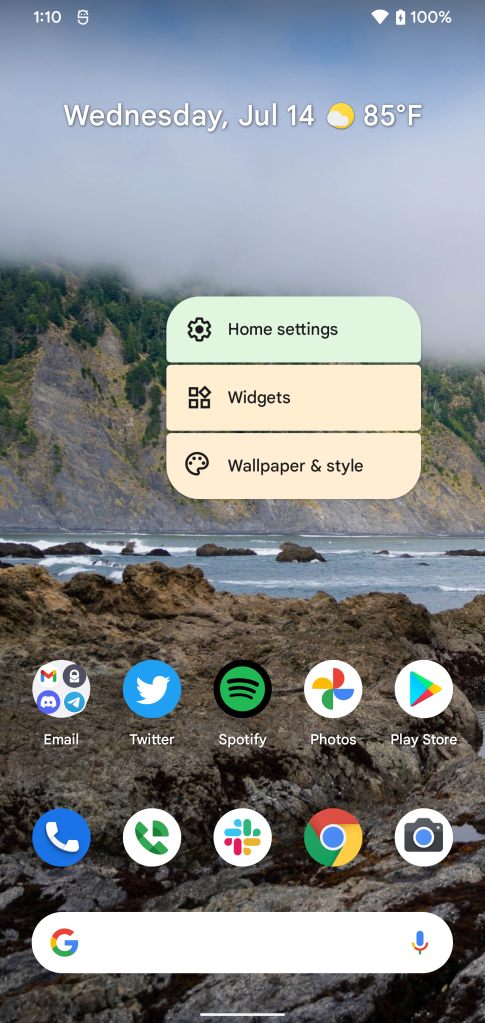
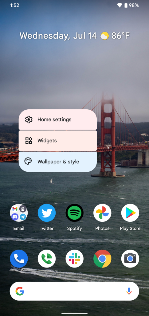
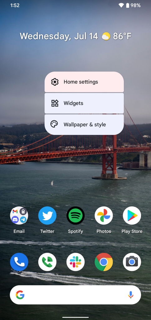
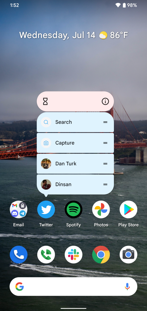
Starting with the latter, alongside more extensive Material You theming options, this update also adds a bit more color to the Pixel Launcher via the pop-up menus. Whether it’s a long-press to access the launcher’s settings or a long-press on an app icon to access its widgets and shortcuts, all menus are now themed according to your wallpaper.
This goes beyond a single static color, though. The different sections will adjust their color based on proximity to a color on your screen. So, in the examples below, you can see how each line picks a color based on what’s directly behind it.
Notably, too, the long-press menu for apps now shows widgets as a line item instead of bundling the option into the top bar, further emphasizing how widgets are a bigger part of Android 12.
Meanwhile, Google is also making a change to its “At A Glance” widget that isn’t just making it subtly bolder again. Well, maybe it is. We did observe a very slight font tweak that’s most noticeable in the comma. Essentially, Google has moved a bit closer to a serif font.
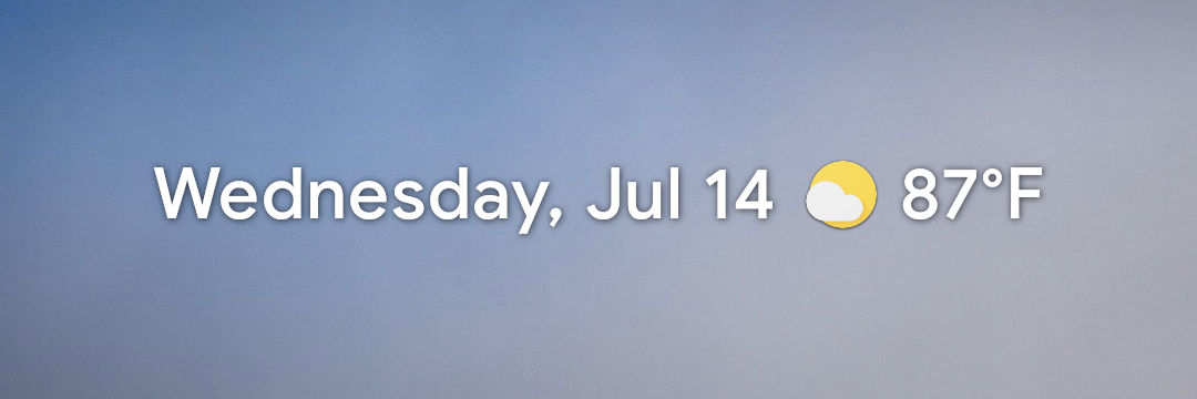
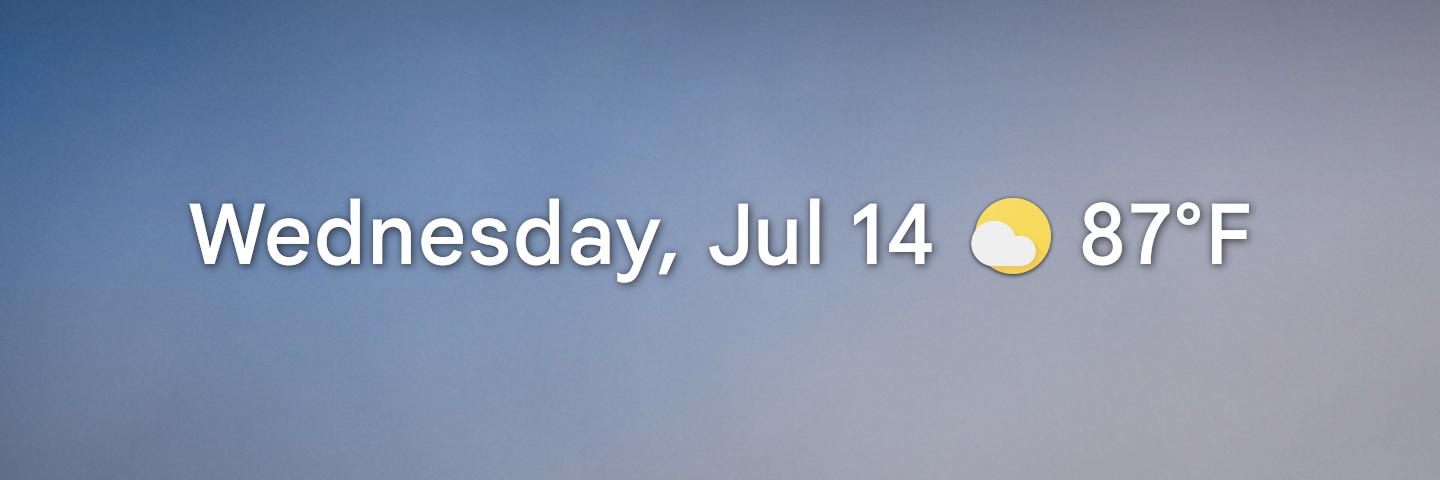
The bigger deal here is that Google appears to be renaming “At A Glance” to “Live Space” on Pixel devices, at least. This is a change we previously reported on but is now partially live in Beta 3. It only shows up in one part of the settings, hinting that there are probably bigger changes to come.

We’re still digging into Android 12 Beta 3. Drop a comment below or reach out to me on Twitter if you spot something we haven’t!
More on Android 12:
- Here’s everything new in Android 12 Beta 3 [Gallery]
- Google releases Android 12 Beta 3 for Pixel phones
- How to get the Android 12 Beta on Google Pixel
FTC: We use income earning auto affiliate links. More.


Comments