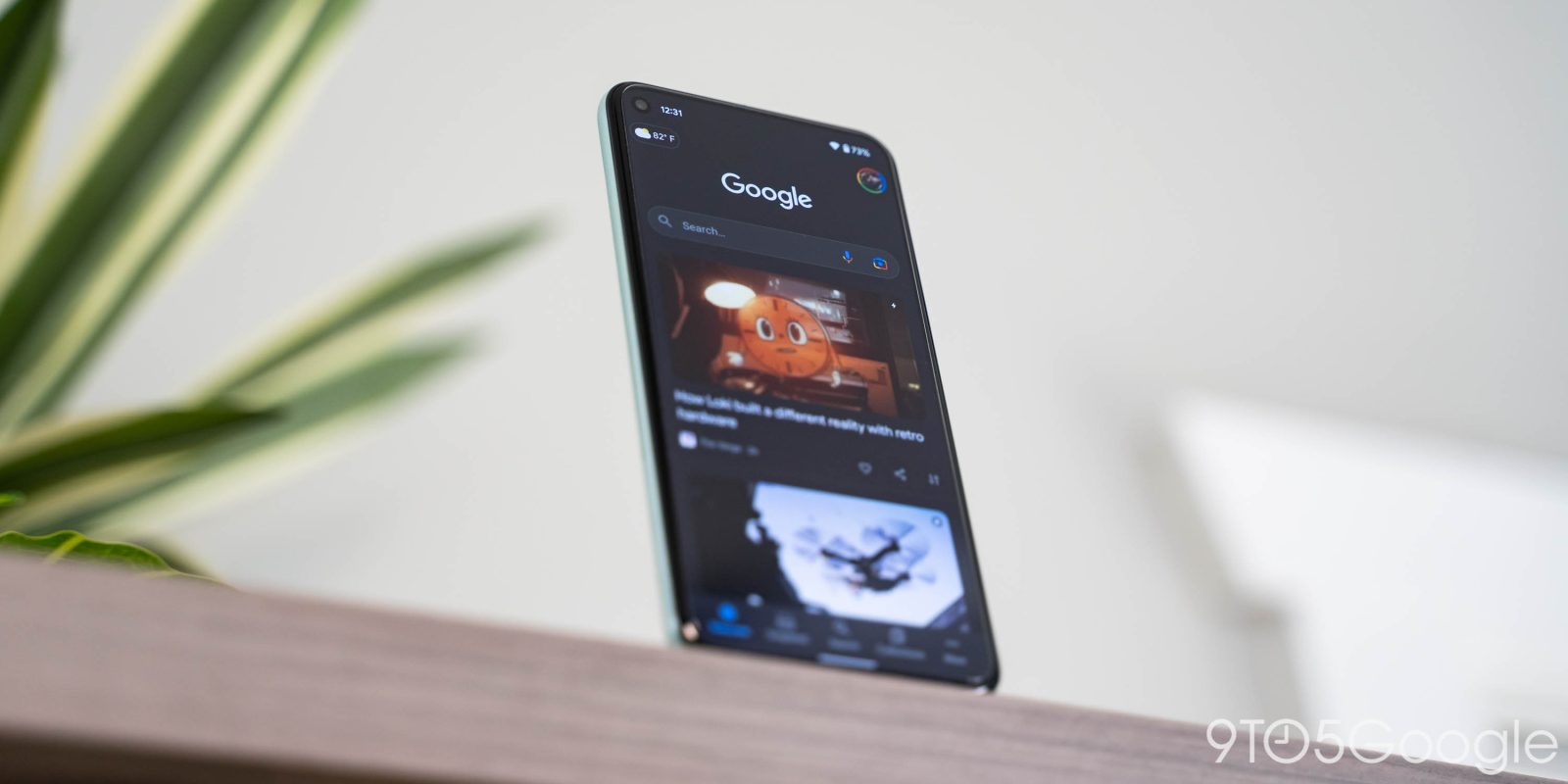
Following a “more streamlined” redesign for Android 12 that has since rolled out to older OS versions, Google Discover is testing showing an article’s related keywords.
Keywords appear between the headline and bottom row (with publication name, publish time, and other actions). There are usually three to an article, including on AMP/Web Stories and YouTube videos, with each placed in pill-shaped buttons. Some stories lack a topic or only feature one. It comes as Google removed content descriptions so that you have to rely solely on the title and cover image.
Tapping opens a feed of other articles with that same keyword assigned by Google Discover. It’s a convenient way to see other stories about the same topic without having to refresh or perform your own search.
With this addition, the overflow menu will show all those keywords so that you can mark “Not interested.” Compared to before, where you’d only get one, this provides much more granularity. The improved ability to tune Discover makes this a sleeper benefit of these visible topics.


This is not the first time keywords appeared for Google Discover articles, but it did not widely launch in January. That could have been part of early development for today’s feature.
Meanwhile, this test is currently limited to the latest beta version (12.28) of the Google app for Android that rolled out on Friday afternoon.
More about Google Discover:
- Google rolls out ‘more streamlined’ Discover feed on Android that removes article descriptions
- Discover redesign rolling out on Android 12, drops cards & descriptions
- Pixel Launcher Discover feed on Android 12 can be themed by Doodles in Material You-like manner
- Google app beta tests redesigned Discover header on Android 12
FTC: We use income earning auto affiliate links. More.


Comments