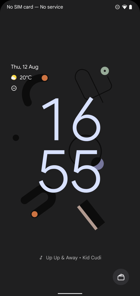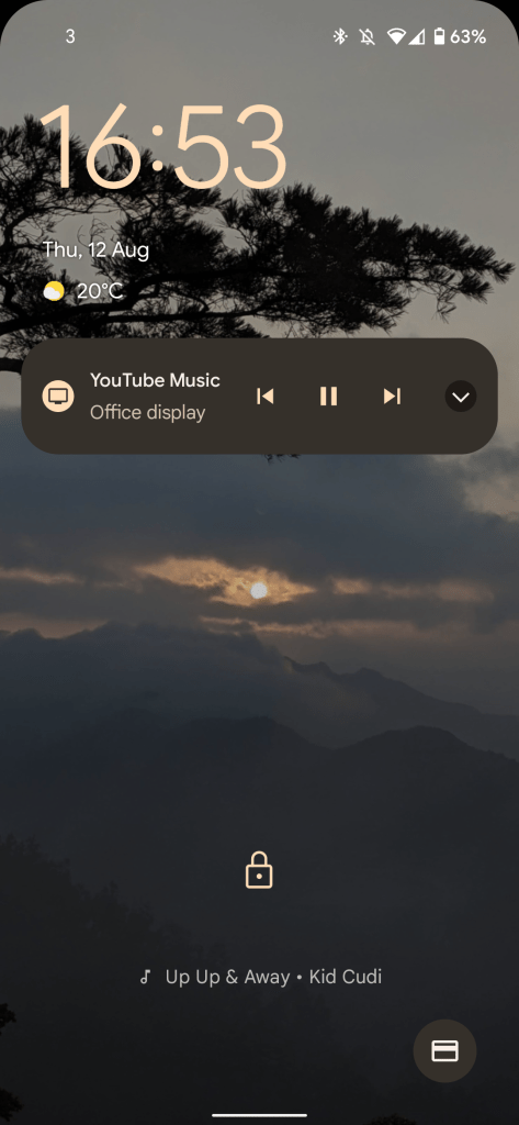
Android 12 Beta 4 has added a fair volume of new features and functions, but the lockscreen has seen a trio of tweaks that include the brand new Google Sans Text for the Now Playing feature, plus some improved icons for other existing features.
We’ve done a deep dive into just what makes this latest version of the pre-release OS tick, but we’re still finding new little tweaks and changes the longer we spend with Beta 4. The lockscreen has seen quite a few substantial changes with the Android 12 Developer Preview and now the Beta phase. Three new adjustments have been added with Beta 4, including another usage of the Google Sans Text — detailed at I/O 2021 — this time for the popular Now Playing music identification feature.
The font is much wider, ever so slightly more rounded and spaced a little different than the more compact font used prior. It’s very, very subtle, but you might have spotted it already and had difficulty working out just what has been altered. So yes, you’re not crazy; Now Playing just uses the Google Sans Text as you’ll see on Gboard and various other areas of Android — and associated apps. You can see just how minor the change is below:

Android 12 Beta 3 lockscreen 
Android 12 Beta 4 lockscreen
Another minor tweak — as seen above — is to the Cards & Passes icon. The icon is now more reminiscent of a credit card with a magnetic strip rather than a wallet filled to the brim with credit cards. It’s flatter and easier to decipher when viewing quickly. We can foresee this being an important change for people that might not necessarily be massively versed in Android and are faced with a new lockscreen icon to contend with.
Joining the new Google Sans Text on Now Playing and this updated Cards & Passes icon is a slight location change for the device lock indicator — or padlock. The lock icon has been moved up into a more central position from the lower position it has lived for quite a while now.
None of the changes, be that the Google Sans Text for Now Playing or the adjusted icons and positioning will drastically alter your daily experience with Android 12 Beta 4 — which isn’t without issues. However, add in the sheer volume of other tiny tweaks, and the result is a very different UI experience than with Android 11 and earlier.
Let us know what you think of the changes down in the comments section below.
Update: corrected official “Google Sans Text” naming
More on Android 12:
- How to downgrade from Android 12 Beta 4 to Android 11 on Google Pixel [Video]
- [Update: New ringtone] Google updates the default Pixel notification & alarm sounds w/ Android 12
- Android 12 Beta 4 hands-on: Top new features
FTC: We use income earning auto affiliate links. More.


Comments