
Compared to other redesigns, Material You for Google Calendar is very straightforward, but the widgets do benefit from one handy tweak.
Update 9/27: Google widely rolled out Calendar’s Material You redesign with version 2021.37.1-399144959 on Monday. Both Dynamic Color and widgets are live with that release.
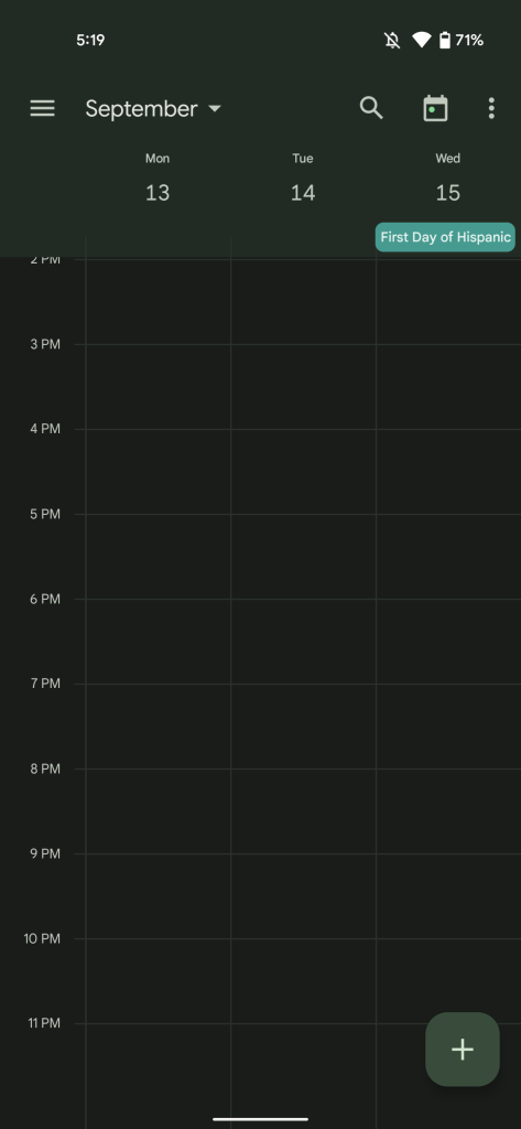
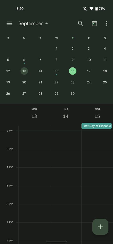
Original 9/16: Google Calendar’s app bar, which encompasses the day/date line in most views, gets Dynamic Color theming. This is also the case for the navigation drawer and rounded square FAB, which drops the four-colored “plus” sign. Most Workspace mobile and web apps are making this change, but not all as seen with Google Keep.
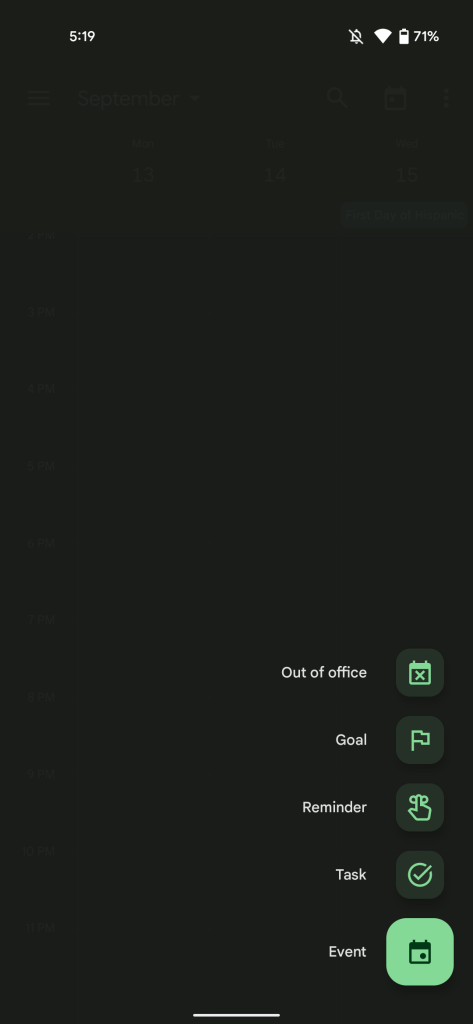
Meanwhile, the new FAB shape also applies to the Out of office, Goal, Reminder, Task, and Event actions. This update also introduces an animated splash screen.
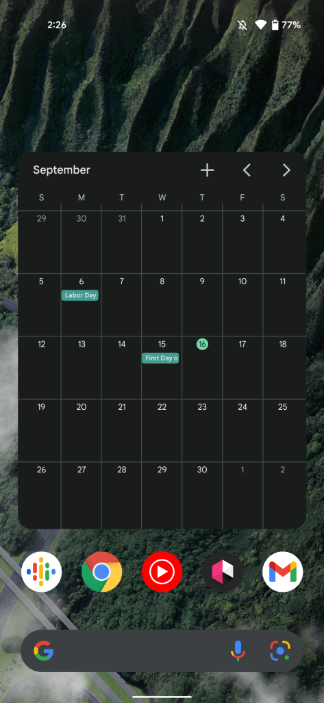
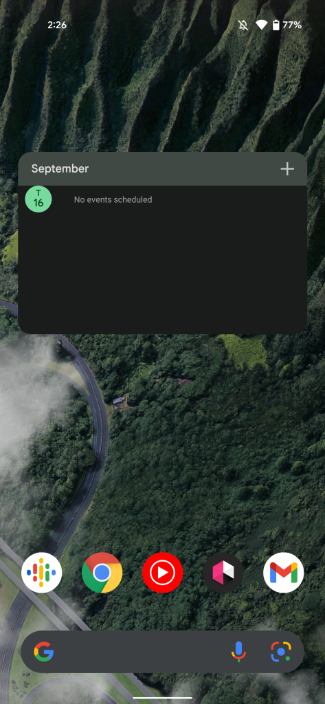
There’s a bigger change to the “Calendar schedule” widget with the top bar no longer showing the day and date. You just get the month, while a circle below notes the current date. The top-right corner now features a “plus” sign to quickly create an event. You can start typing after a tap, and it makes for a genuinely useful shortcut.
The “Calendar month view” also gets that shortcut with the main change being thicker lines and the blue accent going away for a single color widget background.
Google Calendar 2021.37.0 with Material You is rolling out now via the Play Store.
More Material You:
- Upcoming Google Keep redesign brings the best Material You widget to date [Gallery]
- These apps support Android 12’s ‘Material You’ wallpaper-based color themes
- Google Translate for Android prepares for Material You as its first major redesign in years [Gallery]
- Google Phone rolls out Material You redesign in beta
FTC: We use income earning auto affiliate links. More.


Comments