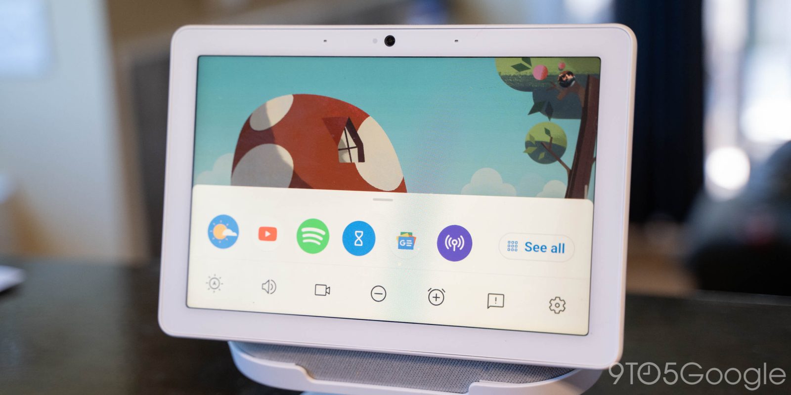
In October 2020, a big Smart Display redesign that brought more interactivity, as well as a dark theme, widely rolled out. Google is now introducing an “app” – though it’s more akin to shortcuts – launcher on the Nest Hub Max.
Update 10/21: We’re now seeing the app launcher on a 2nd-gen Nest Hub running Cast firmware 1.56 (and system firmware 265669). It’s unchanged from the Nest Hub Max — aside from being smaller — and lacks any customization options. Meanwhile, it does not appear on the original Nest/Home Hub running 1.52.
Update 9/23: The app launcher is now widely rolled out on the Nest Hub Max with Cast firmware 1.56.265669. We’re not seeing this drawer on the smaller Nest Hub today. You’ll notice a pill at the bottom of the screen throughout the UI (and most clock faces) that you can drag up.
In addition to quick settings, you now get a row of apps with “See all” opening the full grid, which respects the system light/dark background. There are 21 actions including third-party services that you might not have used in the past:
Assistant, Broadcast, Calendar, Contacts, Duo, Games, Meet, Netflix, News, Pandora, Podcasts, Reminders, Shopping, Spotify, Stories, Timer, Weather, YT Music, YT TV, YouTube and Zoom
Original 8/12: Officially, apps on the Nest Hub Max are known as “Actions on Google,” and everything that launches is very simple, if not identical. Previously, you could open these experiences with an “Open YouTube TV” voice command or by finding that service’s suggestions card in the appropriate (Media) tab.
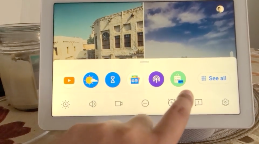
Google is now testing a grid of icons that can be accessed by swiping up from the very bottom of (or even off) the screen. You still get settings to adjust brightness, volume, disable the camera (on Hub Max), and see full preferences, but there’s now a row of circular icons above it. Six are shown by default with a “See all” pill button at the right.
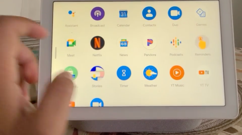
Those six suggestions are again shown at the top, while an alphabetical grid follows. In this video (via Reddit), we see:
Assistant, Broadcast, Calendar, Contacts, Duo, Games, Meet, Netflix, News, Pandora, Podcasts, Reminders, Shopping, Stories, Timer, Weather, YT Music, YT TV, YouTube, and Zoom


What’s notable is how none of the first-party apps are appended by “Google” in the name. Meanwhile, the third-party ones are presumably shown based on which services you have linked.
For Google, this is a very interesting direction that sees them resort to using a familiar and well-understood UI paradigm after years of believing that the correct approach was to algorithmically surface relevant cards throughout your day. Of course, those suggestion cards still appear with a left swipe from the clock face.
The Nest Hub app launcher is presumably an early test, considering how the person that recorded this is having trouble pulling up the bottom sheet. It’s not yet widely rolled out on devices we checked this morning.
More about Nest Hub:
- Google prominently adding Air Quality (AQI) info to Nest Hub, Hub Max in the US
- Google modernizing Workspace Status Dashboard, improving outage alerts for admins
- Google offers official instructions on how to know if your Nest Hub is running Fuchsia OS
FTC: We use income earning auto affiliate links. More.


Comments