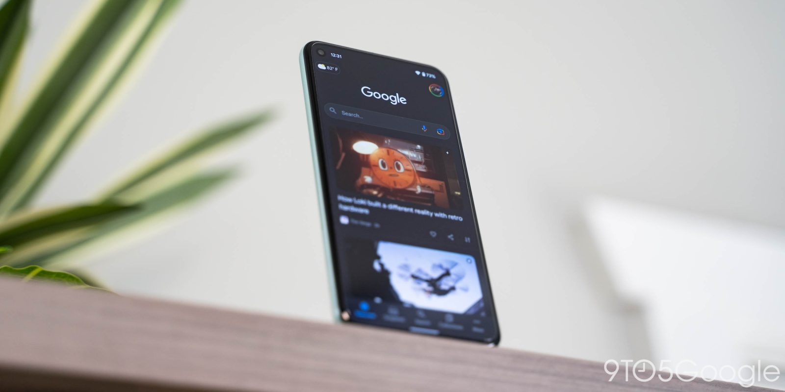
To the left of most Android homescreens is a feed that “actively tunes itself to a user’s interests and displays content that aligns with those interests.” This is Google Discover and something that people have many varying opinions about that are rooted in what it replaced: Google Now.
The idea of a feed that shows you relevant content dates back to Google Now. In that first iteration, surfacing news was not the primary goal of the product, but rather just another type of card among many others that were populated with information you’d find helpful throughout the day.
Now was the byproduct of a very specific era at Google where the next big thing in technology was not yet finalized. The broad strokes were apparent — intelligent/smart experiences — but the exact implementation remained unknown, and this allowed for a lot of experimentation. The overarching direction from 2012-2015 was — in my opinion — best described as a desire to make Google products “better than instant.”
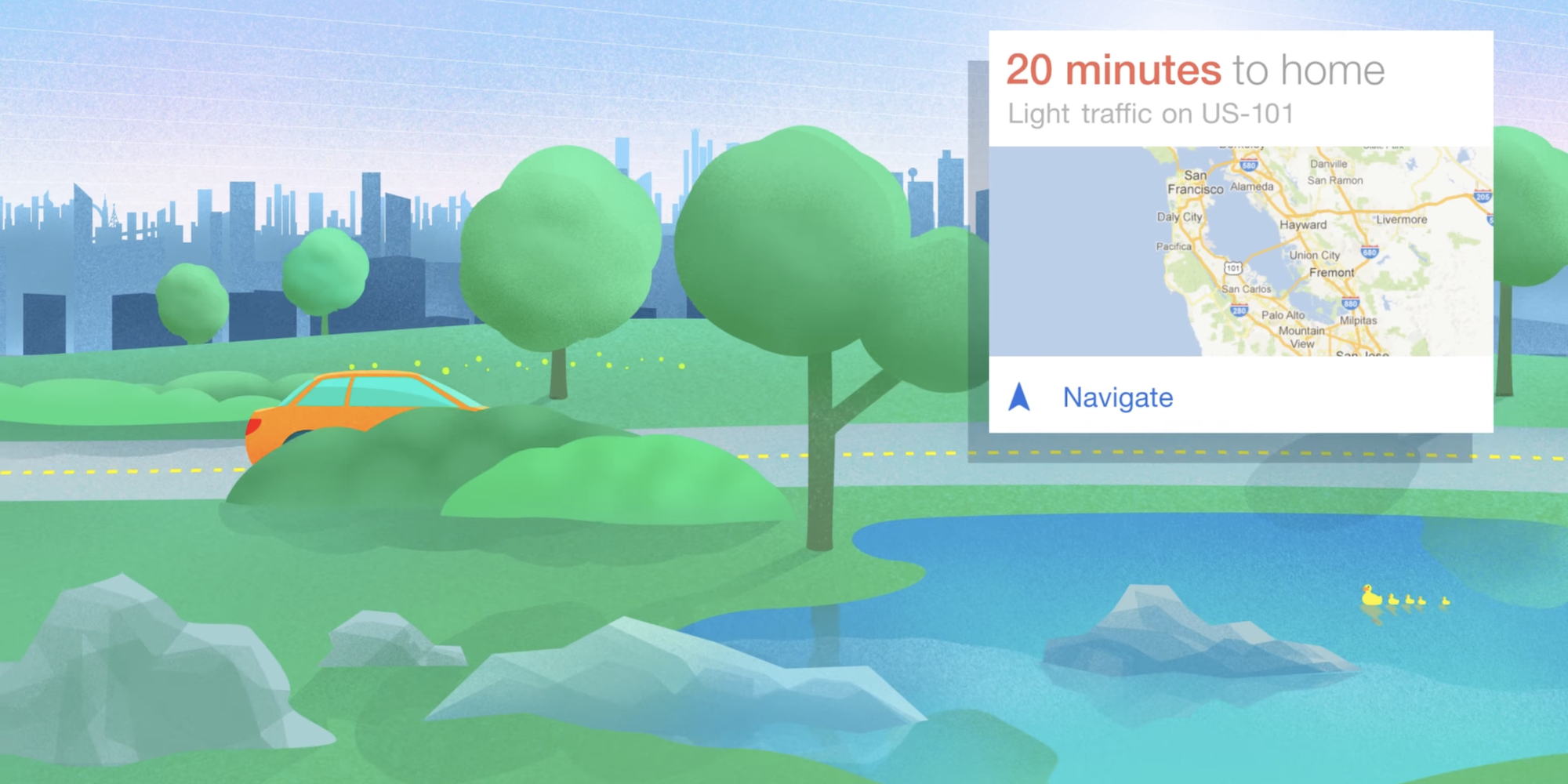
Nowhere was that aim more realized than Google Now. It was a cross-platform service that spanned the first Wear smartwatches to Google Glass through a scalable card-based metaphor, while it was most widely available on Android.
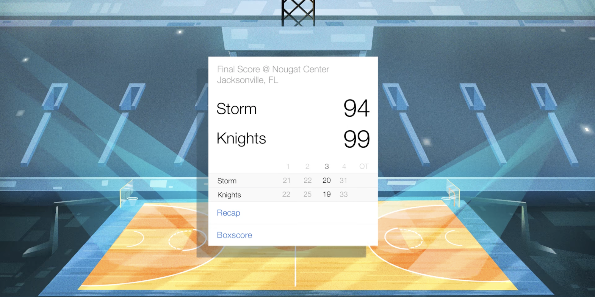
Instead of having to ask when your next appointment is or last night’s sports score, Google Now would just show it. For those that didn’t use it, this might sound like a calendar, but Now’s list of cards were much more contextual and live throughout the day. It wasn’t static and would account for things like traffic conditions in suggesting when to leave for an event. Having a personalized feed where you could see what’s coming next in your day was remarkably useful, and Android made it accessible regardless of what you were doing with a system-wide gesture/shortcut.


After a long decline from its original concept, Google Now officially became “Google Feed” in mid-2017 and surfacing stories became the entire point of the product. The transition started in late 2016 with Google Now getting a dedicated “Feed” tab, while cards related to your personal info were — very tellingly — moved to a new feed that was no longer the default view.
Just over a year later in September 2018, the “Google Discover” brand was introduced with various visual updates. The big difference with this iteration was how up-to-date articles and videos were supplemented by “evergreen” content that’s “new to you,” but wasn’t published recently. The company made a big push to position Discover as a tool — if not extension of Search — that lets you keep track of interests in a more passive manner.
Using the Topic Layer in the Knowledge Graph, Discover can predict your level of expertise on a topic and help you further develop those interests. If you’re learning to play guitar, for example, you might see beginner content about learning chords. If you’re already a skilled musician, you may see a video on more advanced techniques.
With the history and context out of the way, this brings us to our main question: Do you use Google Discover?
Discover is unavoidable with its prime left-of-homescreen position, to the feed being the first thing you see in the Google app on Android, iOS, and the mobile web, as well as Chrome’s New Tab Page. Fortunately, launchers let you disable the feed but it can’t be replaced, which leads to the next question: Do you like Discover?
There’s obviously a difference between using something and liking it. The argument in favor of the product is that it’s accurate and tuned to your interest as Google intends. I’m personally in that camp and find utility in Discover surfacing things that I wouldn’t have otherwise found in my usual web browsing routines.
However, not everyone has that personalized experience and big complaints about Discover center on the lack of relevant content being surfaced, while other people just aren’t interested in getting news in that algorithmic, non-curated manner. Other issues are with the number of spammy sites that appear and the growing number of ads as of late.
Meanwhile, some people miss the old Google Now and wish that its Assistant successor would be placed to the left of the homescreen. At that, Snapshot is nothing like the original concept.


While it’s Assistant-branded, Snapshot is very much outside of that product’s voice-first focus. Looking back, Now’s decline coincides with the rise of conversational assistants across the industry. Assistant, compared to Google’s previous voice search, was billed as allowing for two-way interactions that are more futuristic and natural.
For those that preferred Google Now, this transition was not well-received as it required you to talk to get information that could previously just be glanced at on a screen. The initial annoyance, which has been remedied over time, was how everything had to be done through voice even as the old ways worked much more efficiently. There was an element of retraining that required users to get behind Google’s vision — as heavily inspired by sci-fi — rather than technology adapting to you.
Overall, despite advancements, Assistant Snapshot does not have the same level of “vision, central on-phone placement, or wide backing” of Google Now, thus leading to a stale feed that’s not useful or future-feeling. Though indirectly, Discover is at fault for the ultimate fate of Google Now.
FTC: We use income earning auto affiliate links. More.


Comments