
Tomorrow will hopefully mark the beginning of the Apple Watch getting a serious competitor in the form of Samsung hardware running Google software. The wearable space is in serious need of competition, but it’s unfortunate how the two competing efforts are fundamentally the same. That similarity has deep ramifications for how we will experience technology for the foreseeable future.
The great and continuing lament of Google products is that many came before their time. As the years go by and successors are announced, it’s blatantly clear to me that this was the case with a trio of efforts active between 2012 and 2015. If everything was better implemented and — more importantly — there was a greater commitment, the technology landscape today could be markedly different. Namely, it wouldn’t be two ecosystems shepherded by Apple and Google fundamentally doing the same things, just slightly differently.
Google Now: The foundation of something different
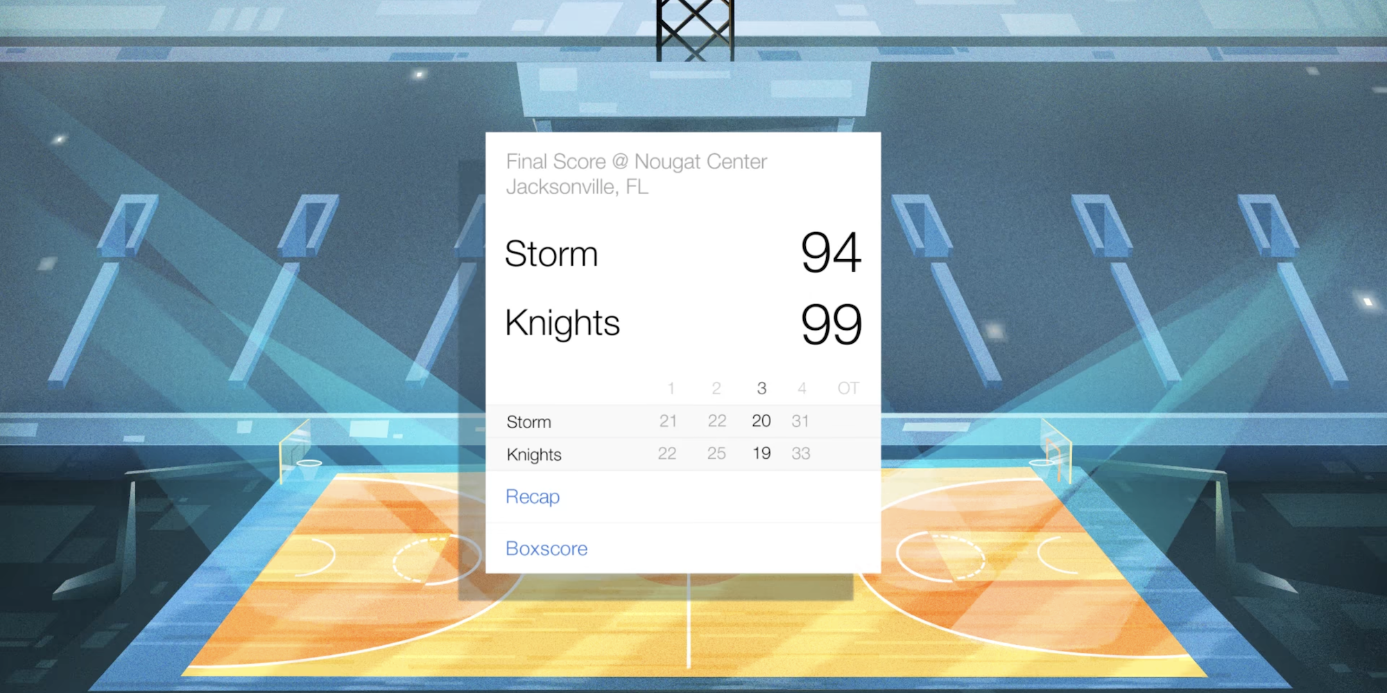
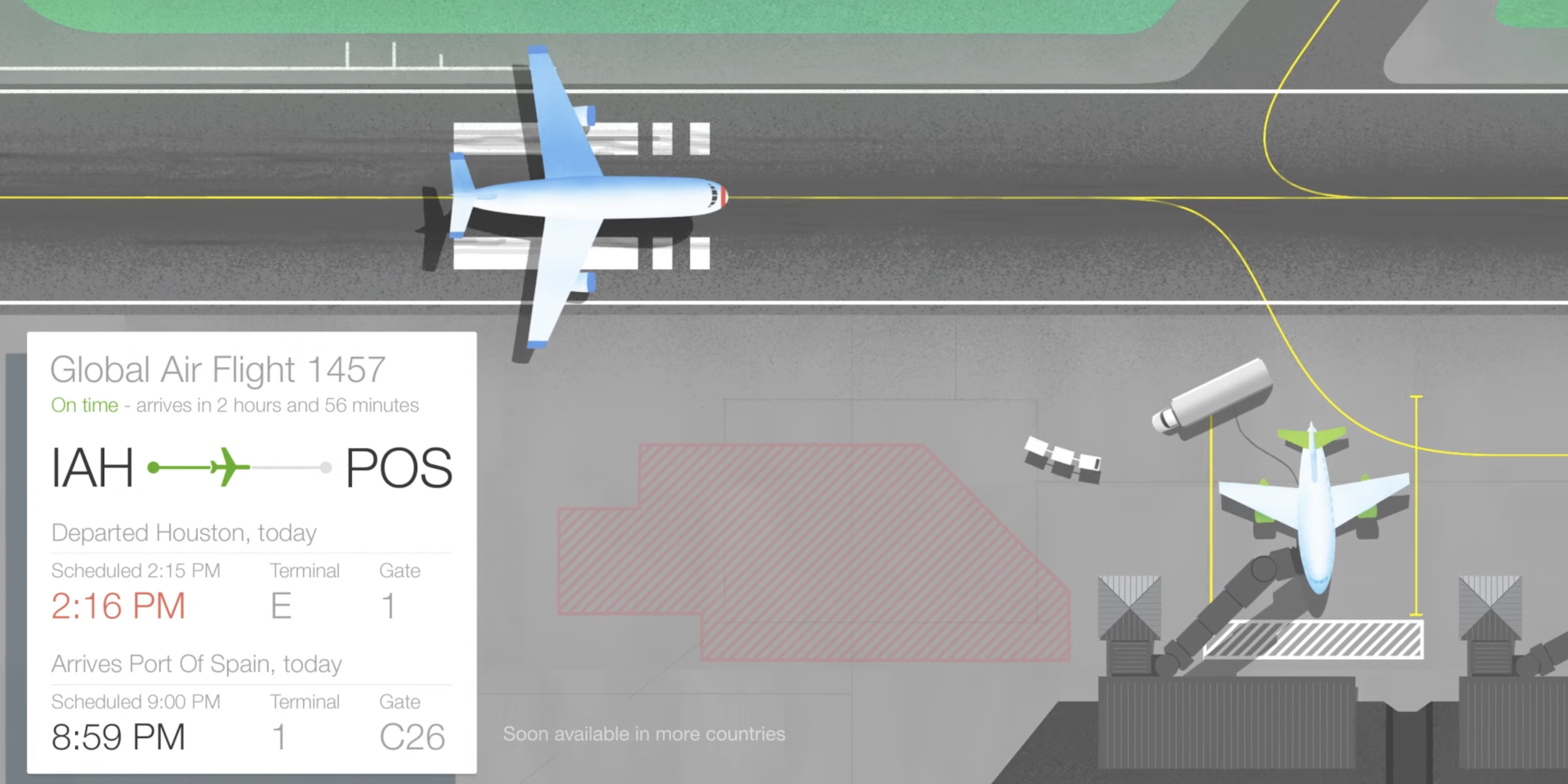
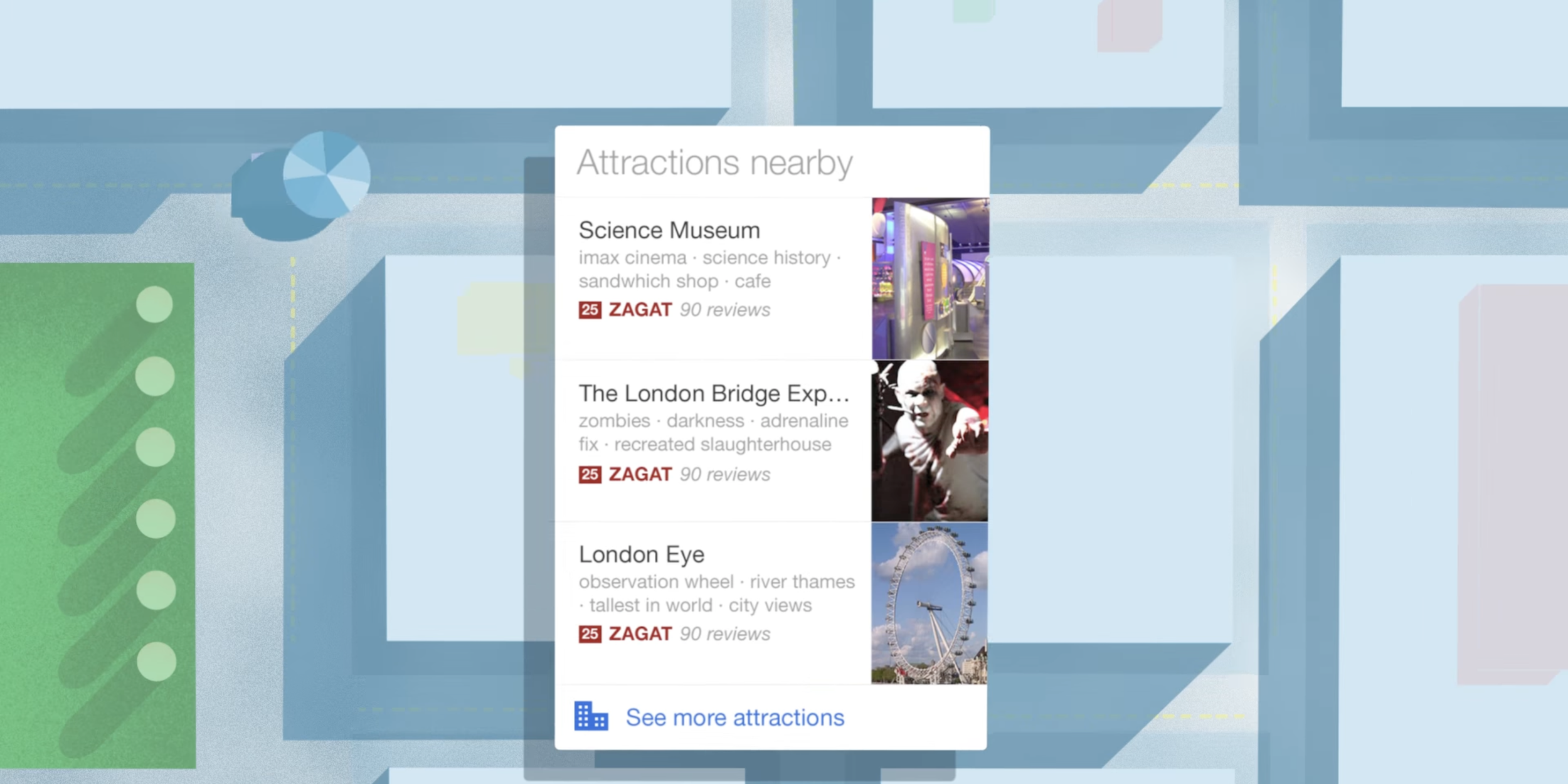
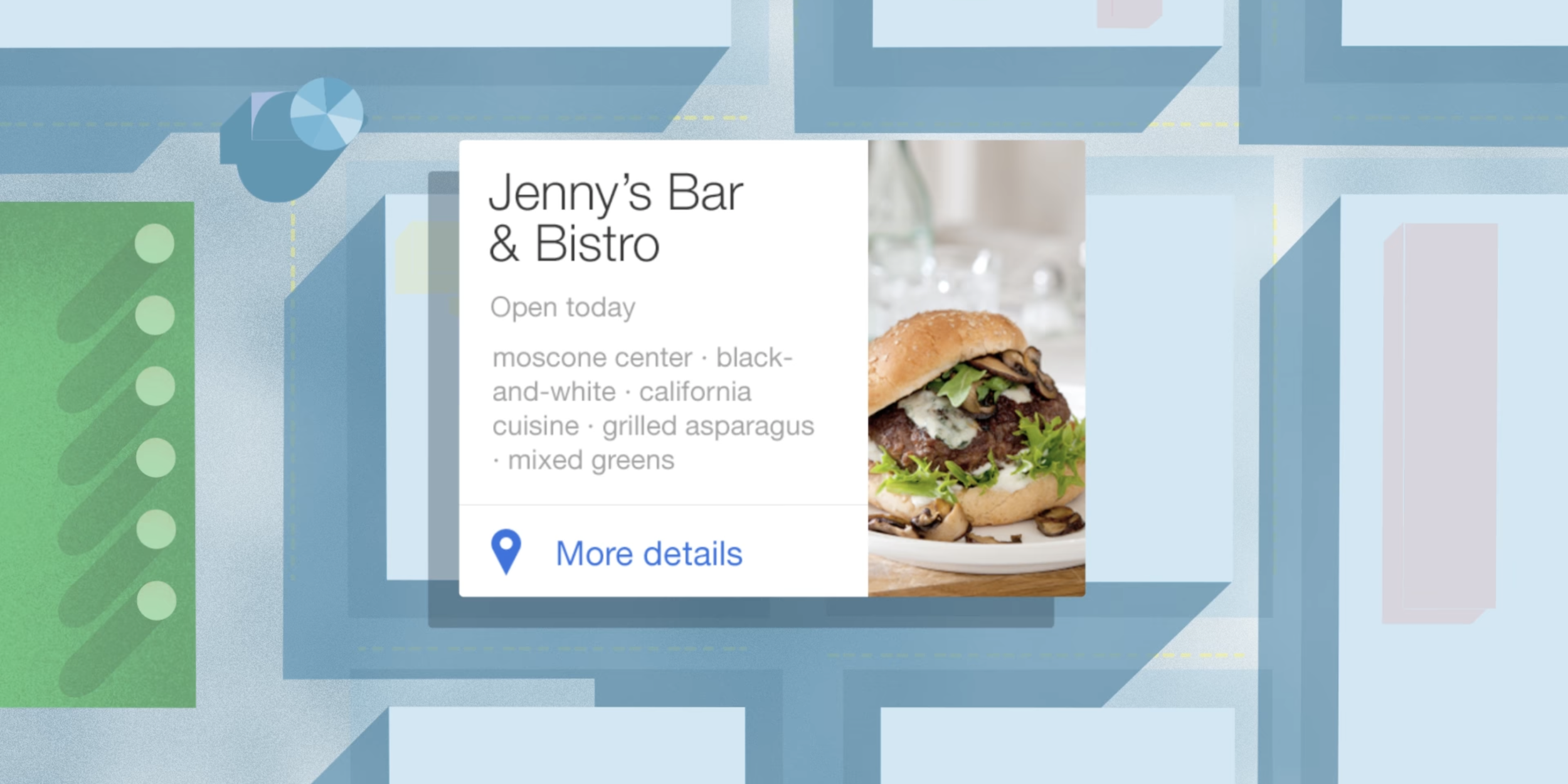
What could have been starts with Google Now, a proactive feed that showed the weather, upcoming calendar events, birthdays, commute and travel information, package alerts, movies/concerts you might like, nearby events/places/restaurants, news updates, and much more, including information from third-party apps.
It was announced in July of 2012 with Android 4.1 Jelly Bean, made its way to iOS a year later, and debuted on Chrome/OS in 2014.
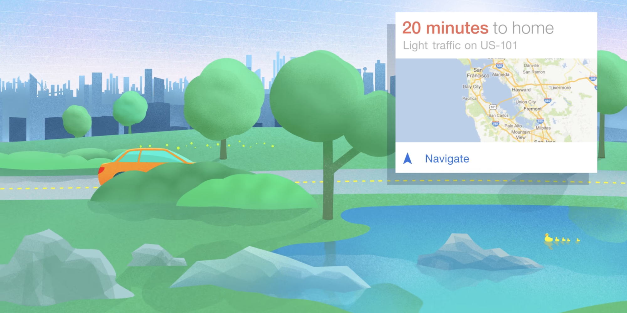
All this was displayed via a powerful card metaphor that showed just the relevant pieces of information. Users had one feed accessible to the left of the main Android homescreen or quickly launched by swiping up from the home button to keep track of their day and see what was next.
You didn’t have to jump into different apps to see upcoming flight details, check email to see when a package was arriving, or open a multitude of first and third-party apps to see your information. In those applications, you’re subjected to different layouts and have to learn different behaviors to access what is fundamentally your information.
Google Now broke apart the siloing of data and put it in a consistent and familiar interface.
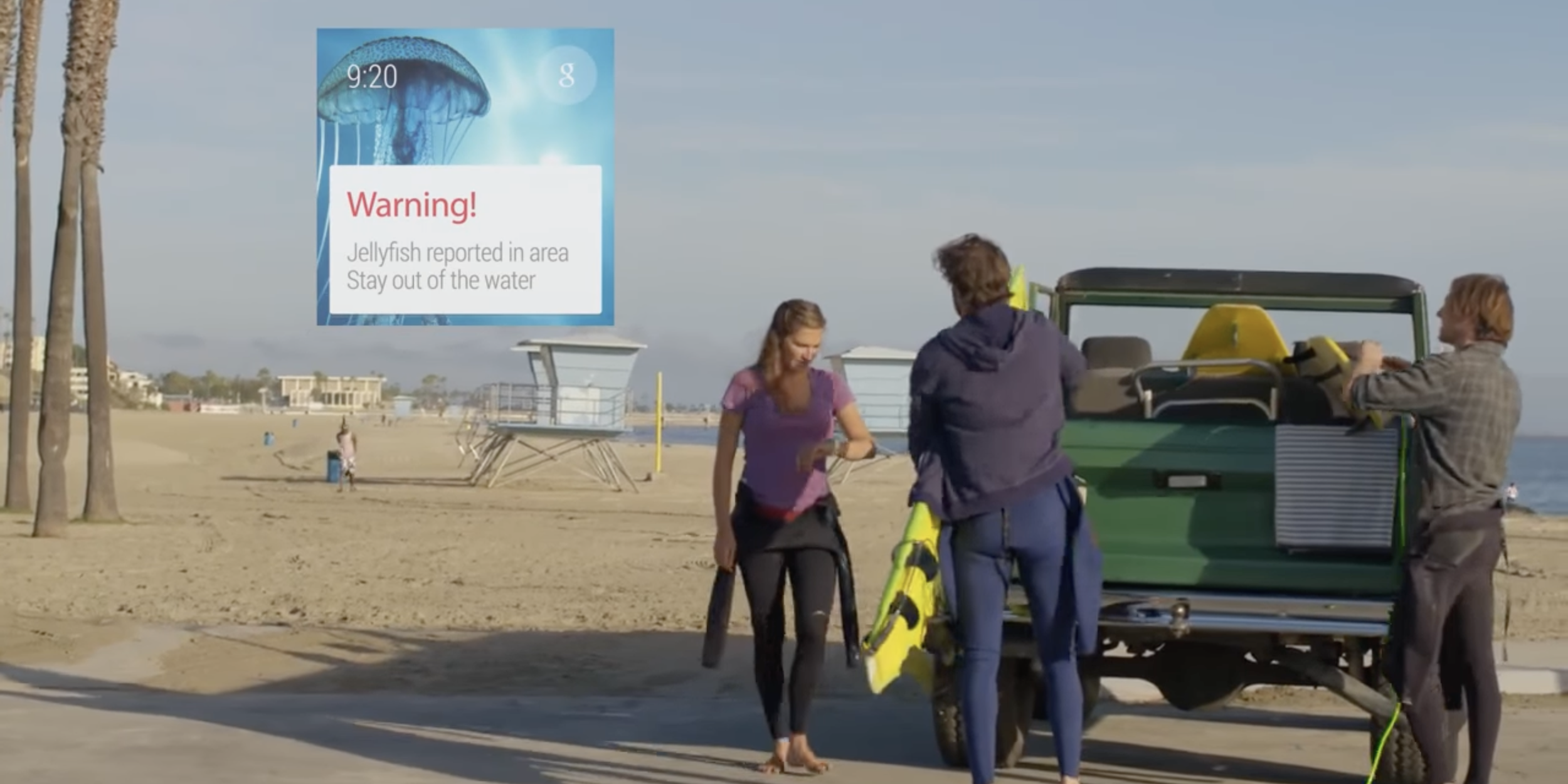
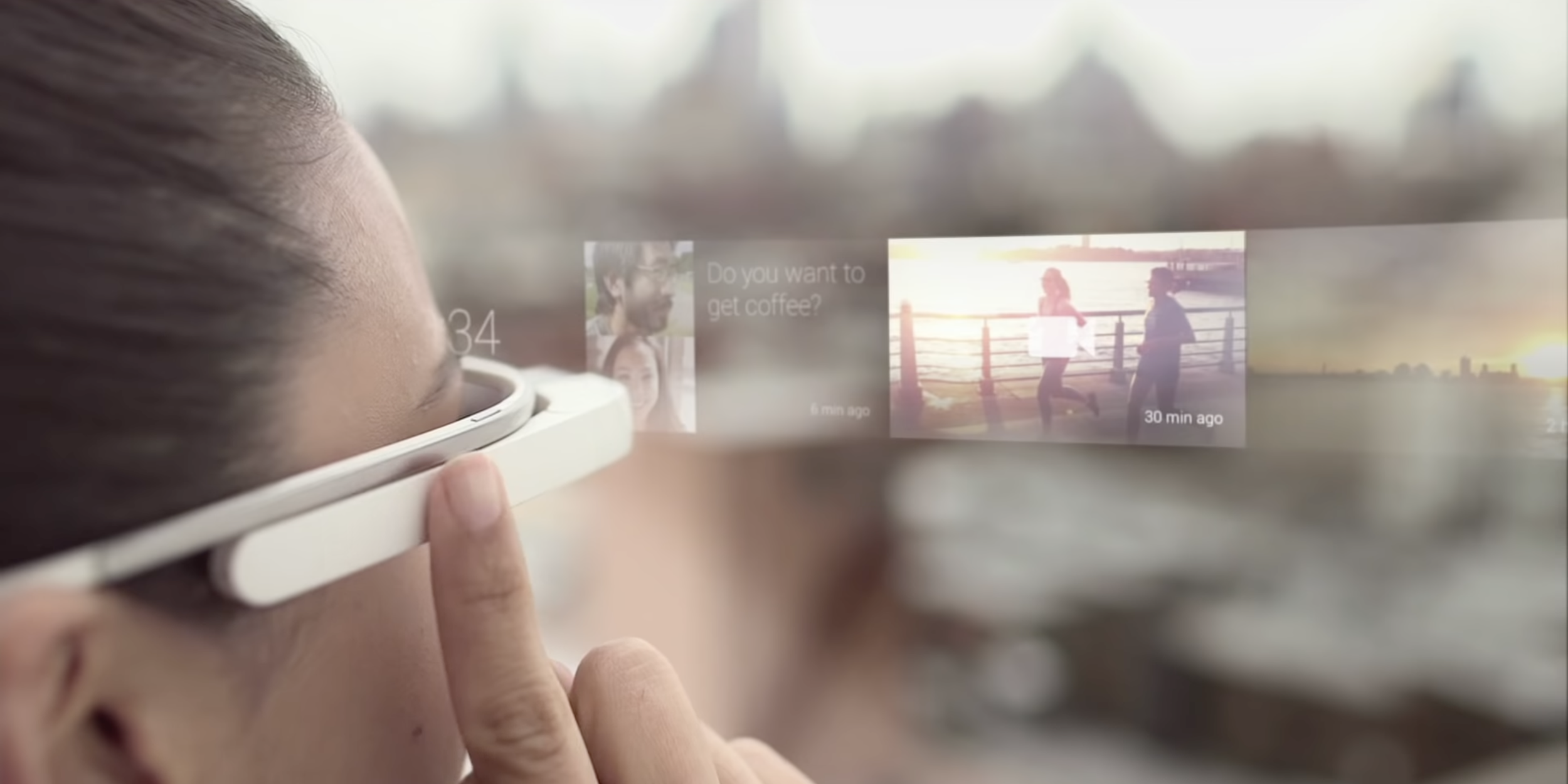
A year after Google Now first launched, Google Glass was unveiled, and Android Wear came after that in 2014. While very different hardware form factors, the common purpose they shared was showcasing Now cards.
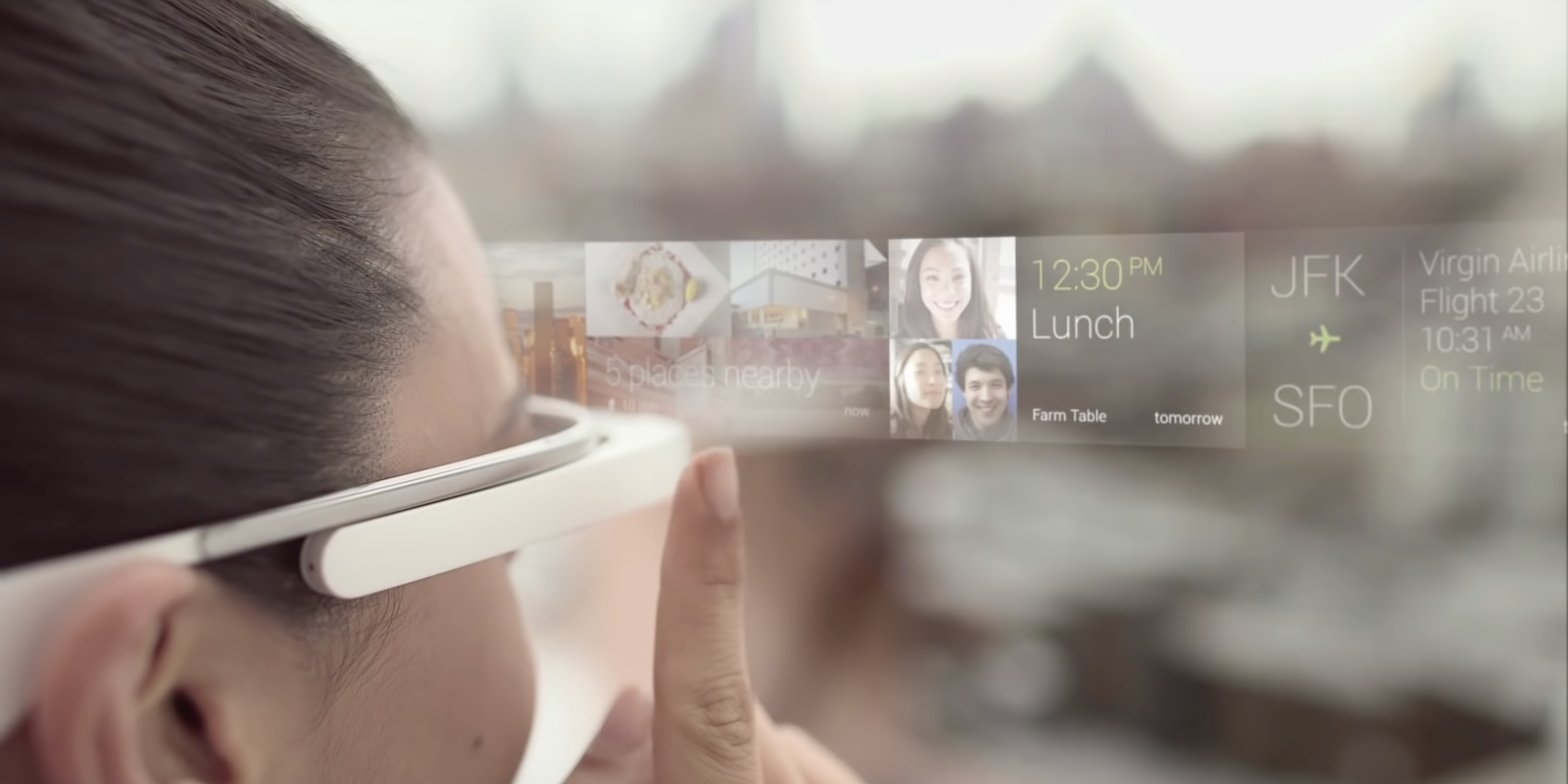
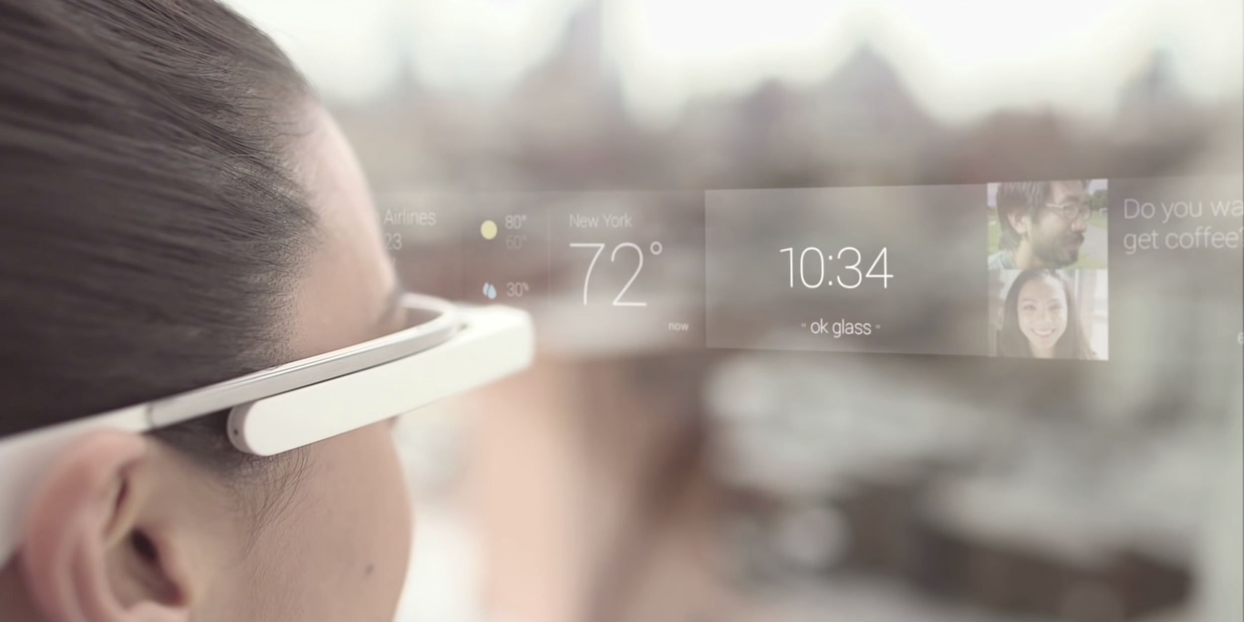
On Glass, you swiped horizontally on the side touchpad to see cards on the small glass prism. Items to the left of the homescreen/clock were relevant in the moment or coming up: weather, upcoming flight, or calendar events. Cards to the right of the homescreen were from the past, like messages and photos/videos.
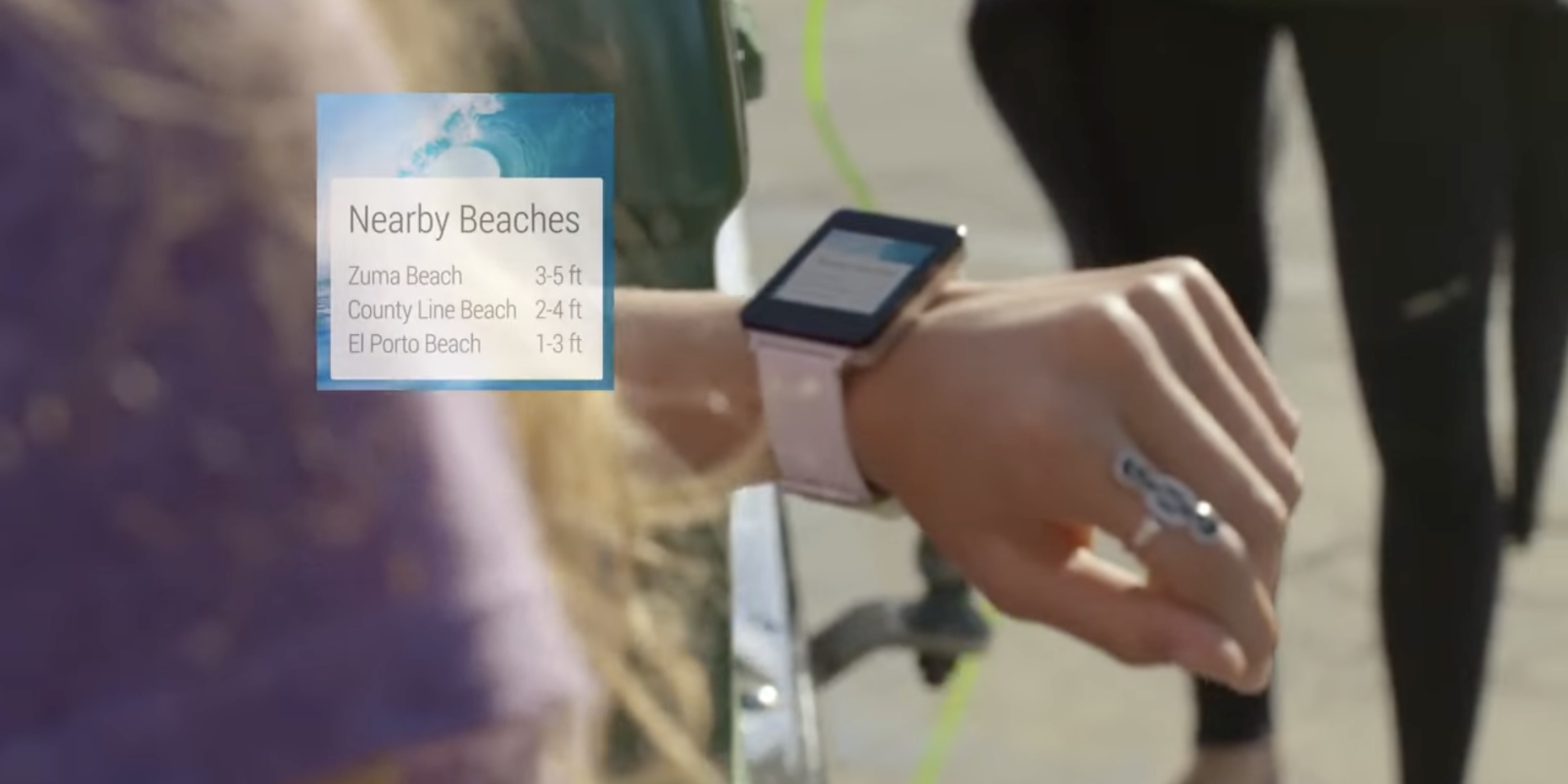
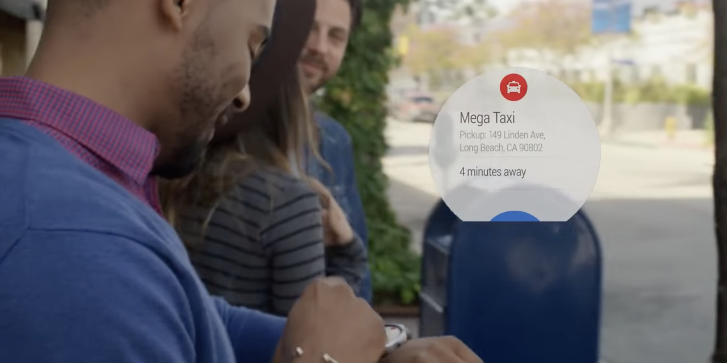
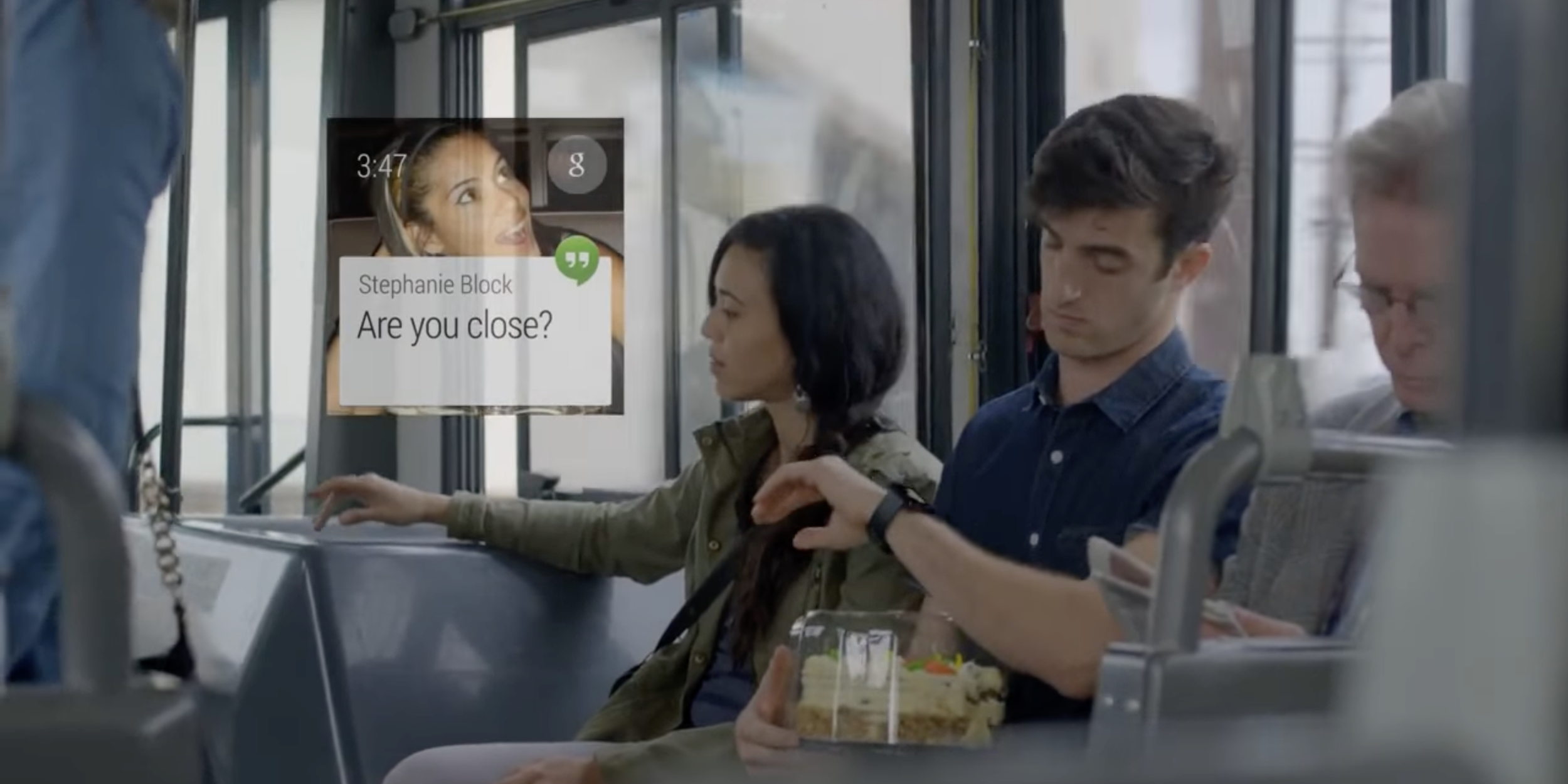
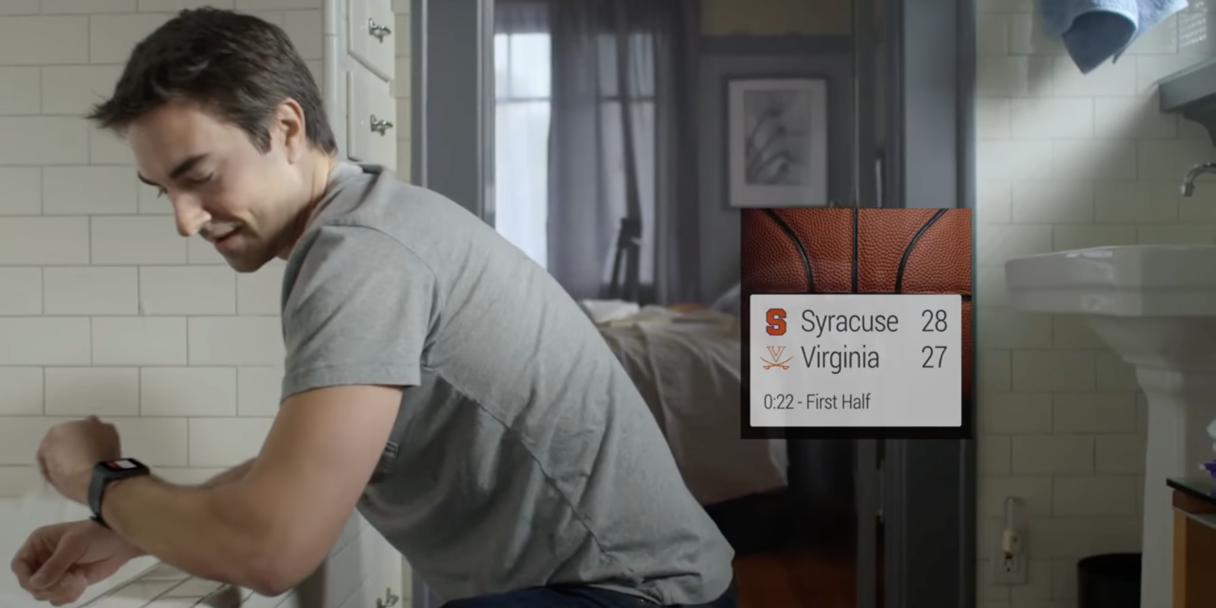
Meanwhile, swiping up from the watch face on the original Android Wear took you through fullscreen cards for message (Hangouts) notifications, weather, Google Fit step count, how long it’d take you to go home/to work, upcoming flight information, music controls, and calendar events.
If you step back, it’s wild to realize that from 2012-2015 a consistent, opinionated feed was the primary way you navigated two brand new form factors and was a central part of the Android phone/tablet experience.
As a user of Google products, that three-year period was so exciting for the sheer consistency that it brought. It seemed that the company had a clear vision of your data being free of app-based silos and accessible through Google Now. The seemingly parallel development of Glass and Android Wear seemed to indicate that something was coming after the app-driven smartphone.
In the short-term, you’d primarily access those cards on Android phones and tablets, while Wear helped you access information on the go with the added benefit of quick music control and message replies. Meanwhile, Google was planning for a future of face-mounted wearables that afforded very quick access to a camera and the promise of augmented reality where information was overlaid. As the display technology matured, the going theory was that it would replace the smartphone — rather than the smartwatch — as your next screen would not be physically constrained by a panel. It could be projected out into the world at an infinite size and could be used for desktop work if paired with a keyboard/mouse.
Of course, none of that came to be.
A typical Retreat
Google Now was phased out over the course of 2016. It became less focused on you and was repurposed to be a “Feed” that showed you web articles and videos relevant to your interests. Discover, as it’s known today, does surface useful content, but just not any personal information related to your day.
Google Assistant was the intended replacement for proactive assistance, but the company was very adamant that users get their help over voice rather than an efficient list of glanceable cards. Google’s worldview was greatly informed by Amazon Alexa and the Star Trek computer/vision, where people in the future are interacting with their technology via a two-way conversation.
However, for those that didn’t like talking aloud, it’s a very big turn-off, and Assistant eventually came around to showing information on the Assistant Snapshot feed and Smart Display. However, it’s clear that Assistant’s visual display of information, compared to Google Now, does not have the same level of vision, central on-phone placement, or wide backing.
Elsewhere, Android Wear became a great deal more complex with version 2.0 and its stated goal to make your watch a standalone device. While Google wanted to make Wear less reliant on phones, it ironically replicated the entire smartphone paradigm. The feed you swiped up to access became primarily for phone notifications, while apps took center stage with an on-device Play Store.
In a way, you cannot blame Google for going back to the familiar idea of applications. If users want something, they’ll seek out the appropriate app to check the weather or see sports scores. That behavior has been ingrained in them.
However, you can blame Google for chasing Apple. The key context of that three-year period when Android Wear became much more complex was, of course, the Apple Watch. The initial version of watchOS tried to do everything to the point it had to be pared down before it made a lot more sense to people.
But before that watchOS simplification occurred, Google seemingly took all the features the Apple Watch could do as a roadmap of how Android Wear had to follow.

This two-pronged abandonment of a unified, unsiloed feed on phones and wearables led to the app paradigm being entrenched into today and for the foreseeable future.
Of course, Google was not operating in a vacuum, and while it could pull a lot of information from Gmail and your browsing interests, third-party apps made mobile successful, and developers would not want to give up their end-to-end controlled experience.
None of this is to take away from the phone. The smartphone — and tablets, which are an extension if not just enlargement of that until very recently — is likely the single most important form factor ever invented and will be in place for the foreseeable future. For example, five-six years after the wind-down of Now, Glass, and Wear, Google is doubling down on the smartphone with custom silicon, is about to reboot its smartwatch effort, and display technology for next-generation face wearables remains years away.
However, it’s all far from ideal.
Waiting for the next form factor
The app paradigm needs to end. It’s restrictive and requires people to learn and conform to a dozen or so differing ideas on how to access information every day.
At the start of the smartwatch era, I would have assumed a grid of icons could not be crammed into a wrist-sized display. I was clearly wrong, but I genuinely believe you cannot use that existing paradigm on smart glasses for a myriad of technical limitations:
- Initially, the field of view on face-mounted wearables will be limited, so what information can be displayed has to be prioritized. There has to be a great deal more curation and ranking of what’s important.
- Controls will presumably be wrist-mounted — Jacquard anyone? — and akin to a trackpad. Unlike one-to-one touch interaction, swiping is not too precise and, again, not as much information/touch targets can be shown on screen.
The other thing to factor in is that Google Lens-like visual search and augmented overlays will be the primary UI/homescreen. In the former, you just snap a scene, and Google will hopefully bring up the most interesting thing you were looking at. The latter will primarily be surfaced as you navigate the world.
That said, it’s somewhat unfortunate that breaking the app paradigm and a return to a proactive, user-centered feed will require a whole new hardware form factor that is still some years away. The great shame is that this shift didn’t start years ago with smartwatches when all the pieces were in place.
If Google stuck with the core concept of Now on all form factors, it could have familiarized people with a feed-based paradigm for using technology that was more personal and would have been a key difference against the iPhone or at the very least force Apple to compete — all at the expense of siloed apps.
The first Wear OS 3 watch launching tomorrow is a momentous occasion for competition but also a reminder that everything stays. Wrist-based wearables could have been a chance to free ourselves from the phone-app paradigm, but instead, we continue to embrace it fully.
FTC: We use income earning auto affiliate links. More.
Comments