Google Search is perhaps the most-used tool on the internet, and the company is always looking for ways to improve it. We’ve seen several UI tests in Search over the past couple of years, including the recent rollout of dark mode, and now Google Search is adding some slick new animations to its UI.
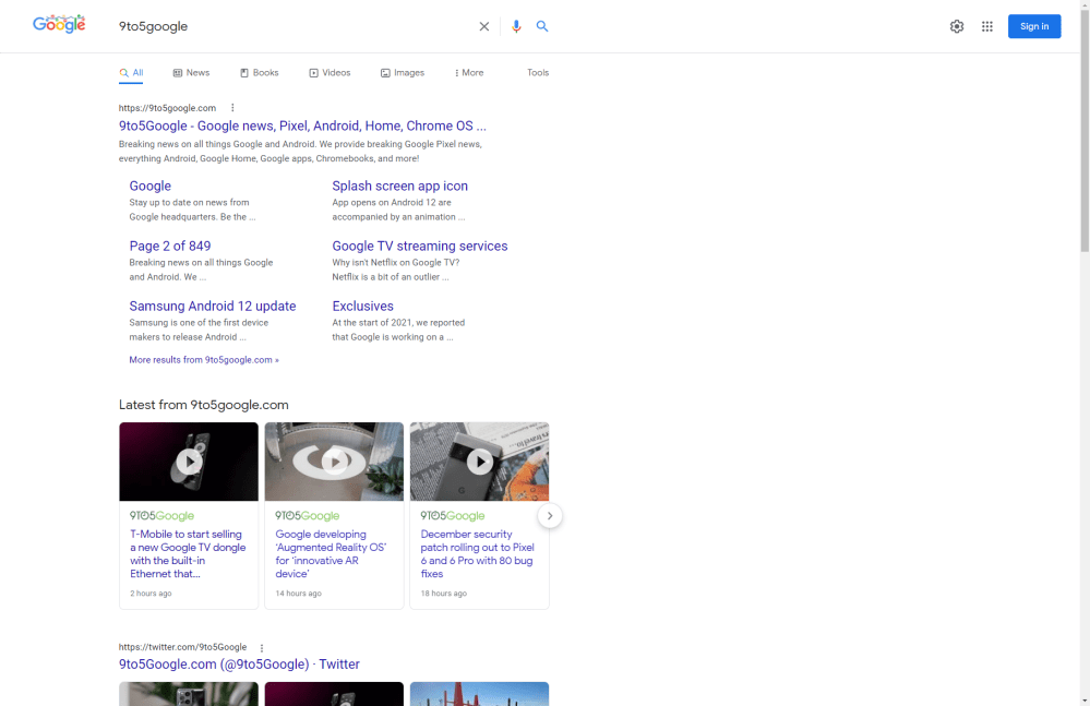
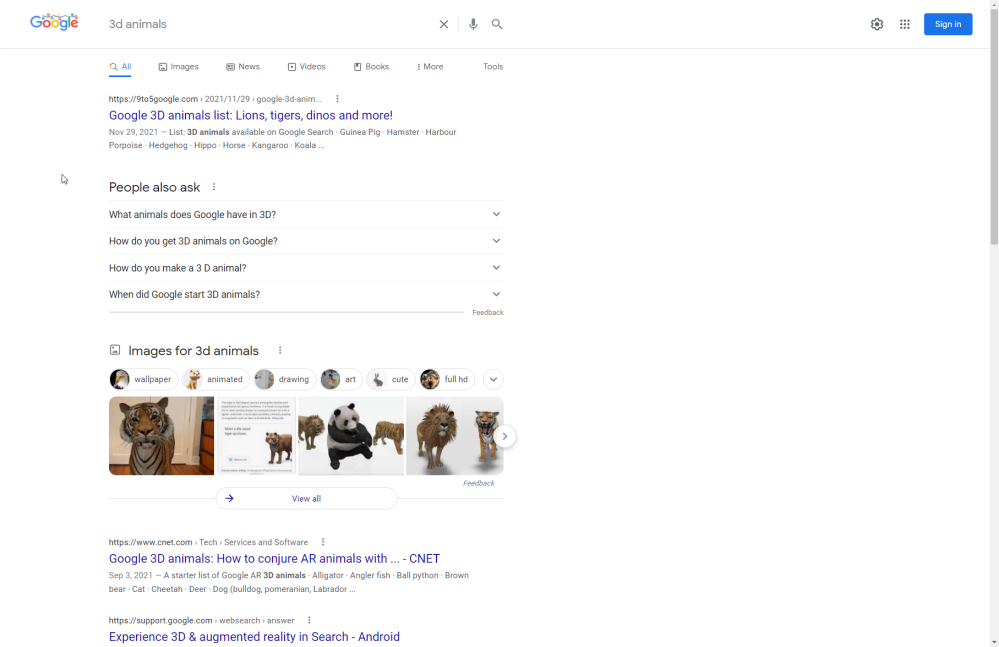
This minor overall tweak to Google Search on desktop brings a slightly more modernized UI. The search bar ditches its currently-available rounded appearance in exchange for a new bar that is split from the results by a horizontal line. Like with the current UI, there are still shortcuts for voice search and to clear the search field.
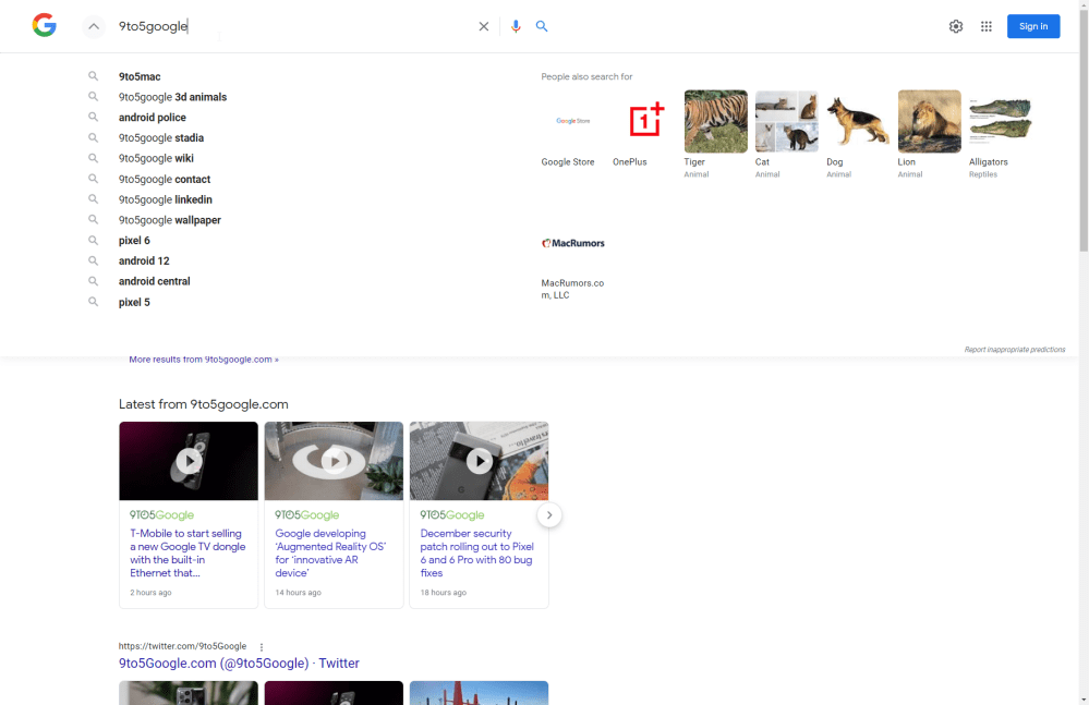
While those visual changes are quite obvious, one of the more subtle changes comes with the new animations that Google Search shows. When clicking on the search bar, the Google logo quickly animates to just the multi-color “G” version while expanding related search terms below.
The large drop-down also integrates more indirectly related search terms under a “people also ask section,” as well as some Knowledge Graph-powered suggestions.
Currently, this new UI only seems to be appearing in Google Search when browsing in incognito mode, at least in our testing. We received one other report of this UI appearing as far back as December 10, though it was notably appearing for that user while signed in.
If you’re seeing this new UI, let us know in the comments below!
Last week, Google added a new design to Search for its “Top Stories” feature.
More on Google Search:
- Google Search updates ‘Top stories’ with new grid design, organization on desktop web
- Healthcare providers in Google Search, Maps can now list which insurance they accept
- Google Search adds 3D monuments, including Big Ben, Eiffel Tower, Parthenon, & Tokyo Skytree
FTC: We use income earning auto affiliate links. More.


Comments