
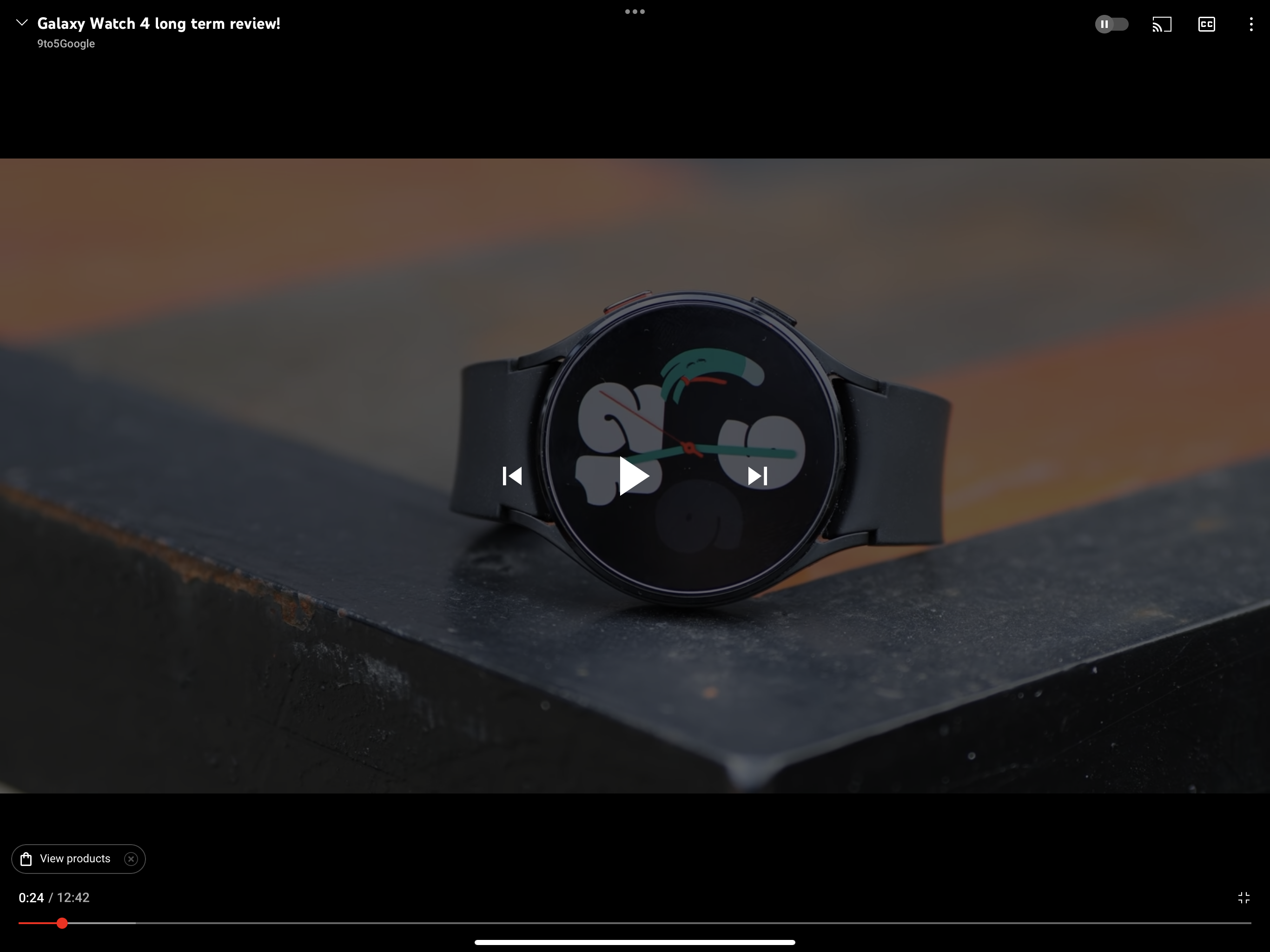
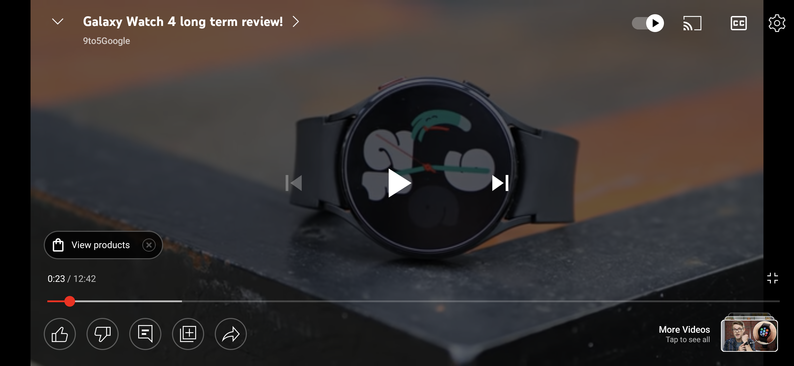
YouTube tends to overhaul its website and mobile apps component-by-component. The latest example of this is a big redesign, especially in fullscreen mode, of the video player in YouTube for Android.
The primary difference is a row of buttons (using YouTube’s thin outlined-style iconography) at the bottom of the screen that let you like, dislike, open comments in the right sidebar, save to playlist, and share. To the right is a prominent “More Videos” shortcut with thumbnail preview that opens the usual carousel of other things to watch. It maps to the Up Next queue.
As a result of these new actions, the video timeline/scrubber is pushed up, which is a side benefit of this redesign.
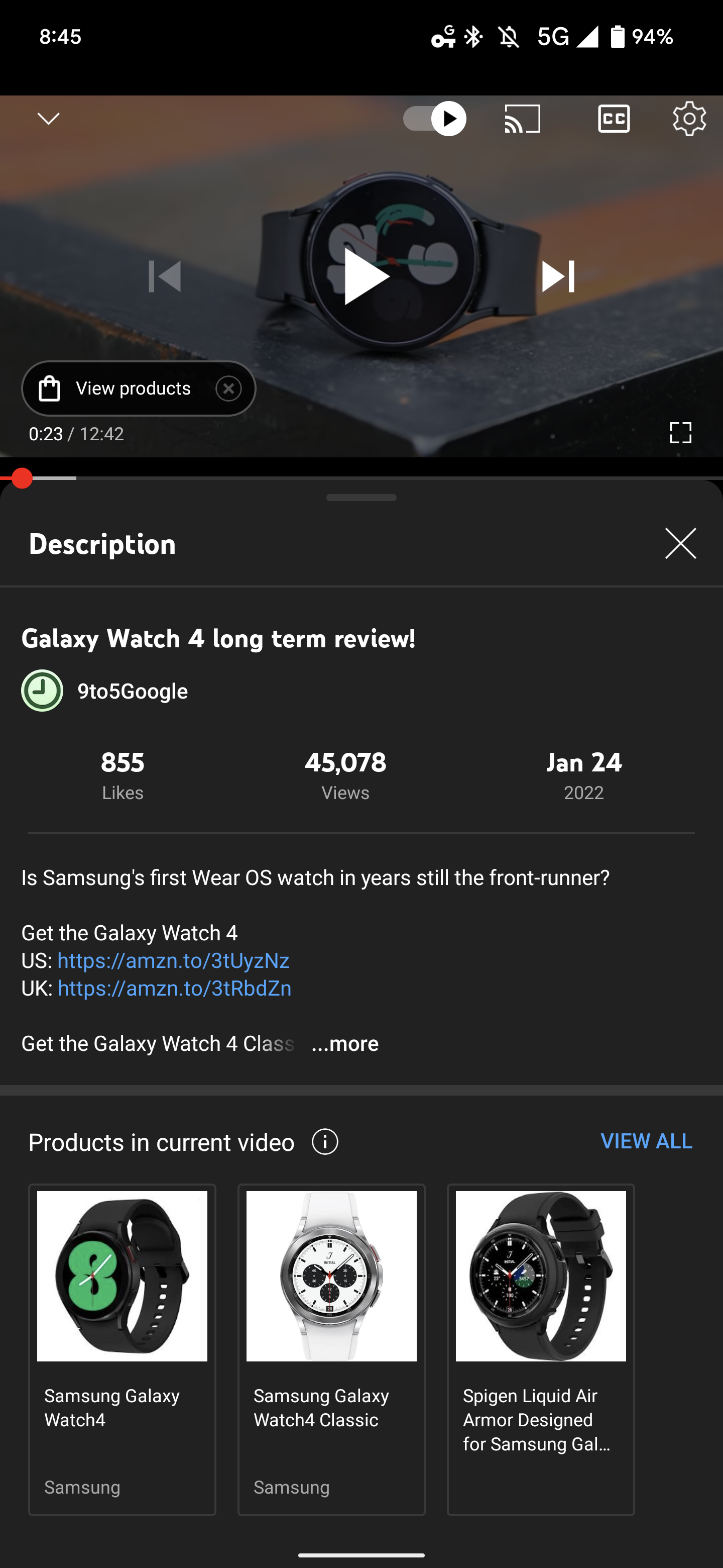
Elsewhere, you’ll notice that YouTube has replaced the three-dot overflow button with a more straightforward settings gear when viewing in both landscape and portrait orientations. There are otherwise no changes to this menu today. Lastly, tapping the chevron next to the video title will open the “Description” side panel.
This redesign of YouTube’s video player on Android is widely rolled out today – the iOS app has yet to be updated. Overall, it lets you do more from the fullscreen UI for a better content-focused, leanback experience.
More on YouTube:
- YouTube TV launches referral program that lets you get up to $200 in bill credits
- YouTube Music tests personalized ‘Recommended radios’ influenced by multiple artists
- YouTube Music for Android testing new ‘Add to playlist’ UI from the web
- Do you want to listen to podcasts on YouTube? [Poll]
Thanks Philip and Michael!
FTC: We use income earning auto affiliate links. More.


Comments