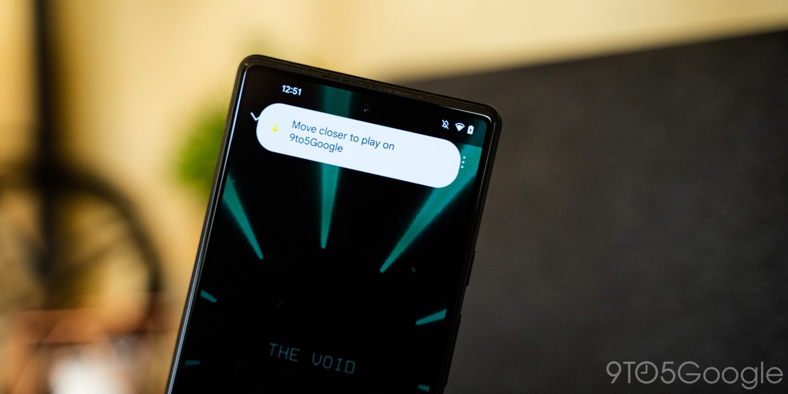
A few weeks back, concept renders revealed that Google was working on a new “Tap to Transfer” feature in Android 13 for speakers and other devices. Now, in the first developer preview, we’ve been able to turn on the feature so you can see what it looks like.
Android 13 ‘Tap to Transfer’ feature
We’ve been able to activate the “Tap to Transfer” feature in Android 13, which allows media apps to move playback to a compatible device simply by moving your phone close to that device.
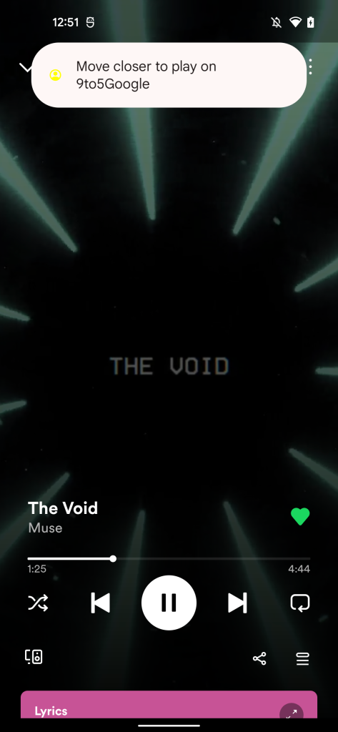
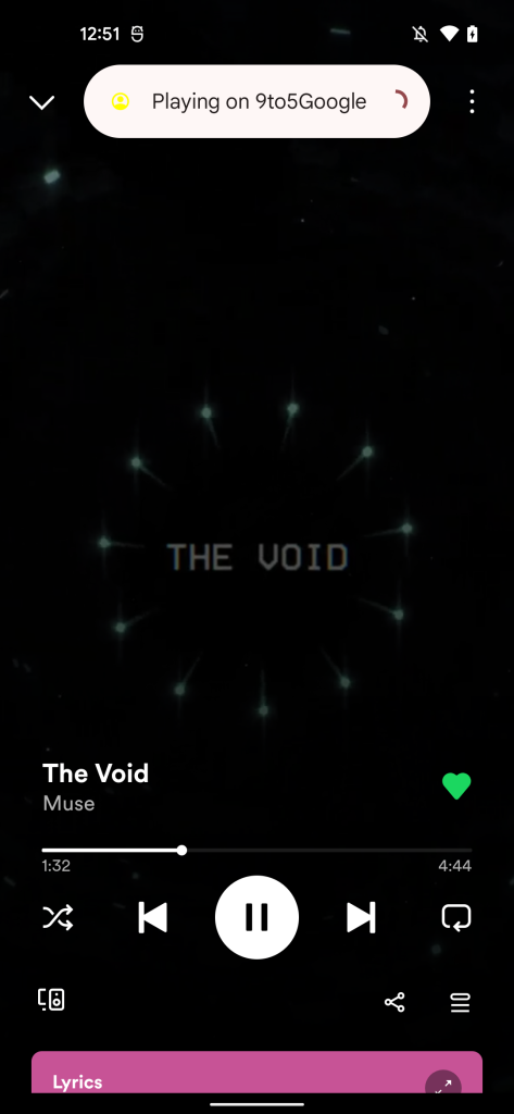
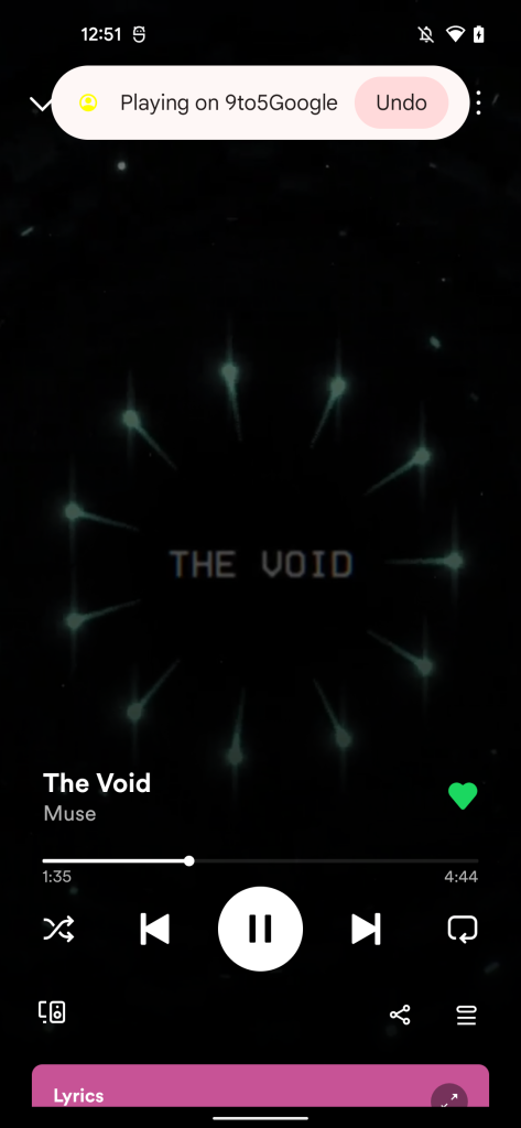
We can’t test this feature in action, unfortunately, because the feature has not yet been fully implemented. However, we can show you what it might look like. The first part of “Tap to Transfer” in Android 13 puts a message telling users to “move closer” to the device they want to transfer media to, and then it shows a message while connecting to that other device. After connecting, the message changes to include an “undo” button to bring playback back to your device. The avatar icon seen on the message in the screenshots below will instead show the app being used when the functionality is properly used.
Apple has similar functionality in iOS for its HomePod speakers. Currently, it’s unclear how this functionality will manifest itself in Android. The “tap” naming implies it may rely on something like NFC to talk to speakers, while Apple uses UWB to accomplish this task. Notably, Google’s current speakers such as the Nest Audio and Nest Mini support neither of those technologies.
Media Session card might get a revamp
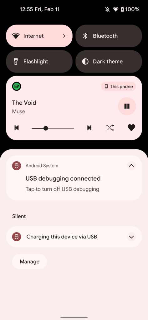
Further in Android 13 DP1, we’ve been able to uncover a possible redesign to the Media Session card that appears in the notification shade. This redesign has buttons for shuffle and favorite, along with play/pause, track controls, and a scrubbing bar for moving through the track. Album art is removed, leaving only the song title and artist. An app icon appears in the top left with the output picker in the top right.
This new design incorporates the same features as the previous one, but makes those features easier to access by making them immediately available instead of requiring a second swipe. It remains to be seen if Google will actually go with this design in final Android 13 builds.
Dylan Roussel contributed to this article.
More on Android 13:
- Android 13 prepares new user profile switcher on the lockscreen
- Android 13 Developer Preview 1 hands-on: top new features [Video]
- Android 13 DP1: Pixel Launcher supports two homescreen layouts, surely for foldables
FTC: We use income earning auto affiliate links. More.


Comments