In addition to a slew of new developer features at I/O 2022, Google is testing a Play Store tweak on Android that lets users see more information about apps without having to open the full listing.
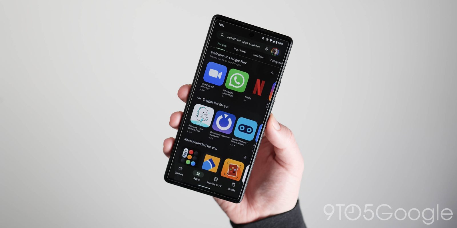
Google Play has long made use of carousels that feature the icon, name, and rating, with three full apps visible before you have to scroll.
A design in testing sees this switch to lists, though you still swipe left to see more. The icon gets slightly smaller, and Google now lists the developer-provided promo text. Tapping the arrow still takes you to a full grid view.
We’re seeing this visual revamp for the top “Based on your recent activity” and “Recommended for you” card/shelf. It does not appear in the Games or Books tab, while Movies & TV is on the way out from this month onward. This change is not widely rolled out and is only visible on one Google Account of the several we checked today.


This app list is a slightly less visual approach but makes for a better Google Play browsing experience as people no longer have to go off the icon and app name when quickly browsing. Meanwhile, the old style is in use as going full list would be quite overwhelming.
More on Google Play:
- Google Play system updates for May bring Nearby Share to self, Google Help redesign, and more
- Play Store reportedly hit 28.3 billion app downloads in Q1 2022, led by Instagram
- Google Play highlights easy ways to donate to support Ukraine, including using Play Points
- New YouTube Premium and TV subscriptions on Android now use Google Play Billing
FTC: We use income earning auto affiliate links. More.


Comments