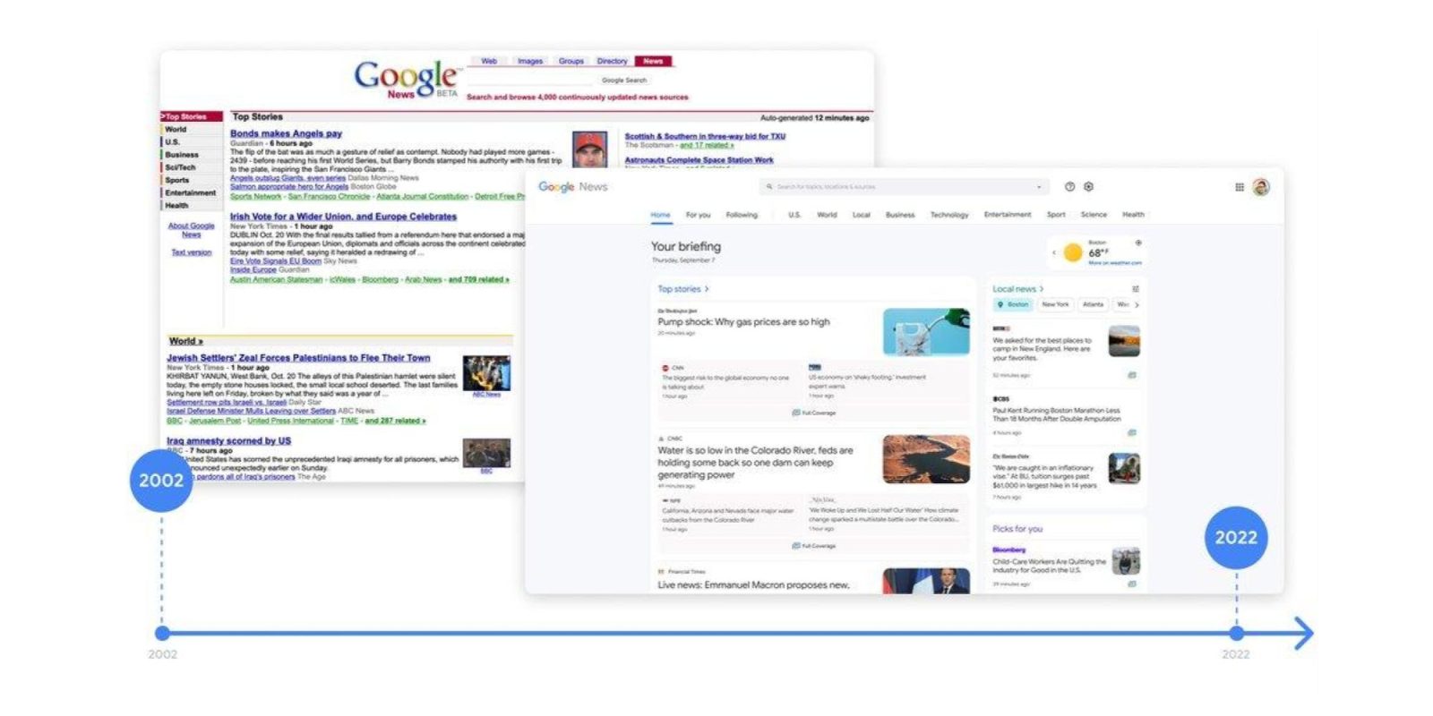
To mark its 20th anniversary this year, Google News on desktop is getting a redesign today that focuses on customization by “bringing Top stories, Local news, and personalized picks for you to the top of the page.”
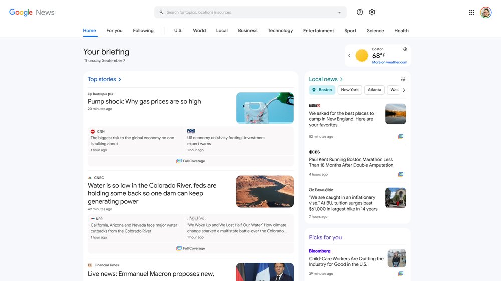
With shared elements from the Android and iOS apps, Google News now features a row of tabs at the top of the screen underneath the search field. Replacing the navigation drawer at the left, there’s Home, For you, and Following. That matches the mobile client, while sections for your country, World, Local, Business, Technology, Entertainment, Sports, Science, and Health come after.
The Google News desktop redesign starts with a “Your briefing” header that notes the day/date and current temperature, which can be expanded to get a four-day forecast. “Top stories” is the first card, while “Local news” and “Picks for you” are right next to it. Google is making use of pastel colors to differentiate the section titles.
You can now use the filter button to add multiple locations to your local news section, so you’ll never miss important news about the cities and towns you care about. This change is just the latest way we’re bringing local news to users around the world.
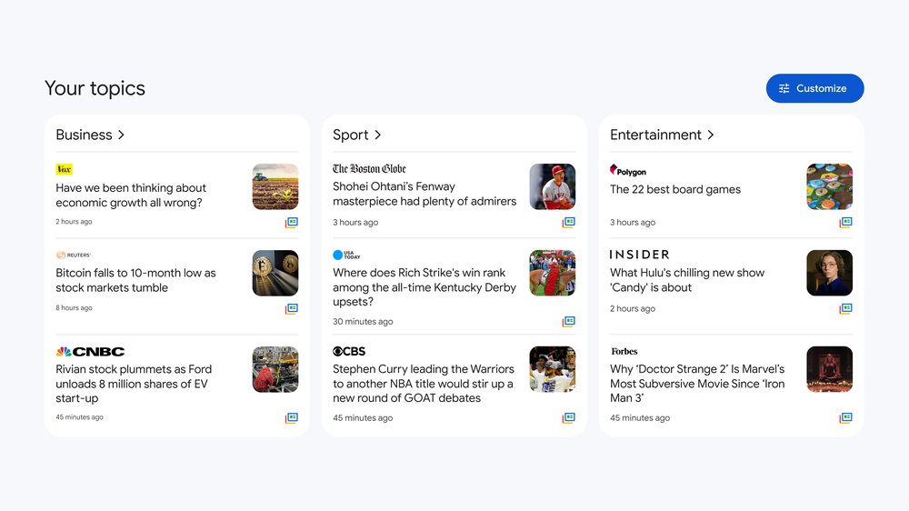
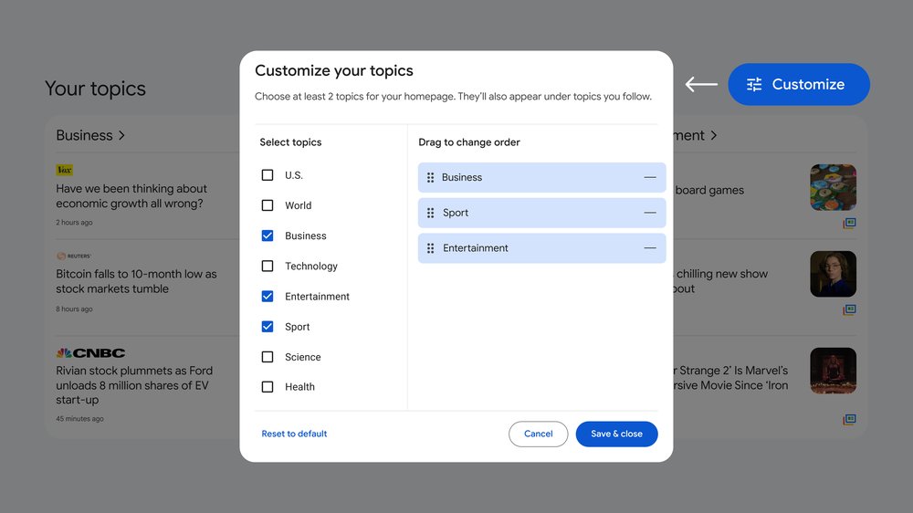
The “Your topics” section is next with a prominent button to edit the cards (at least two and up to eight) that appear here, including the order they appear in:
This new feature makes it simple to scroll and click through to the stories that most interest you. You can add, remove or reorder topics – just click the blue customize button in the top right of the Your Topics section to get started.
Other highlights of this Google News desktop redesign include an expanded “Fact Check” section to “see the original claim made along with the fact-checked assessment from independent organizations.” “For you” and “Beyond the front page” round out the homepage.
Google News turns 20 this year, and today’s launch coincides with a return to Spain due to Europe’s new copyright law after an “eight-year hiatus.”
This revamp is live today by visiting news.google.com and tapping “Try it out” at the very top. For the moment, you’re able to switch back to the old UI by going into settings, which also houses control for the dark theme and temperature unit.
FTC: We use income earning auto affiliate links. More.


Comments