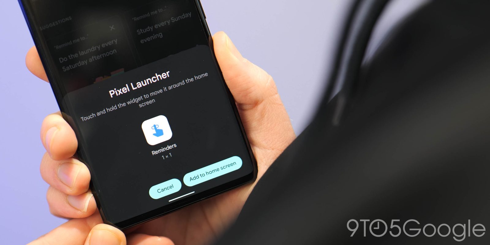
With Google Calendar set to lose Assistant Reminders, you’ll be forced to use the very basic and incredibly laggy UI that’s part of the Google app. It’s still bad, but Google recently rolled out some usability tweaks to Reminders and restored the dark mode.
Last September, Google Reminders gained a dark theme on Android that’s controlled by system settings. It disappeared in recent months but is now back with Google app 13.33 and finally shows the status bar. Previously, Reminders would go fullscreen, thus requiring a swipe down or just opening the notification shade to get the time, which is pretty useful to have when scheduling to-dos.
Meanwhile, the app bar no longer uses a blue icon, while the profile avatar has been replaced by a refresh button, which is more useful to have since this web view occasionally bugs out. The shadow below this UI element has also been toned down.
Another change is to the FAB (floating action button), which is now a pill and blue instead of the previous four-color plus sign housed in a circle. After tapping, the creation sheet is no longer hidden by your keyboard.
Lastly, the hamburger menu, which linked to “Send Feedback” and “Help,” has been removed. Performance, unfortunately, remains the same after these UI tweaks.


Elsewhere, assistant.google.com/reminders on the web can now be accessed from reminders.google.com. It’s unclear if this is foreshadowing a bigger change, with the new URL introduced earlier this year.
Google Calendar for Android and iOS is planning to remove the ability to create and see Reminders, which are being transitioned to (Google) Tasks. Google has yet to make this change official, but it recently confirmed the upcoming deprecation of Goals. Reminder creation should remain available in Google Keep.
FTC: We use income earning auto affiliate links. More.


Comments