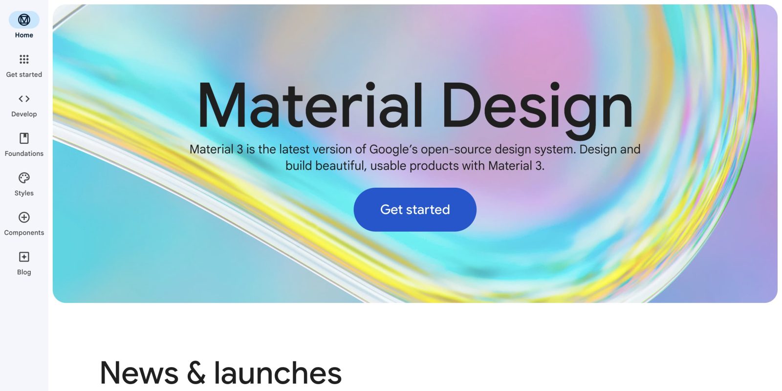
Google announced Material You at I/O 2021, and it has since come to the vast majority of its Android apps. On the web, Gmail is the primary example, but you can also demo Material Design 3 on Material.io.
Google considers Material.io to be an “online textbook” and it was redesigned this month with even more Material Design 3 elements to demo its full potential:
For this refresh, the Material.io team showcased new features and components while also demonstrating how Material 3 principles can be extended to solve product-specific use cases, in our case, a rich library of information to help designers and developers build beautiful products.
Instead of wallpaper-derived Dynamic Color, Material.io uses content-based Dynamic Color that leverages a “set of imagery ranging in style, color and subject matter.”
The dynamic color transformation creates a holistic visual experience by having the site reflect the content a reader is consuming, and demonstrates Material Design 3’s new color system which uses a unique palette of tones and compliments.
You can see this in action when viewing Material Component guideline articles.
Meanwhile, Material.io gained a dark theme (bottom-left corner switch) with this redesign, and Google made it so that key images respond to the different modes. The site also avoids green, given red-green colorblindness, and uses blue (Do) or red (Don’t) instead.
In terms of site navigation, Google “combined the new navigation rail with the navigation drawer using a simple hover interaction which gives readers a sense of ergonomic speed and quickly provides an overview of the site’s content with relative ease.” Tabs and tables of contents are the other primary forms of navigation.


Of particular note is Material.io’s approach to bullet points with a “cookie” shape:
Applying these shapes to bullet points at such a small scale, and randomly rotating them with some simple CSS provides a sense of understated iconoclasm, pushing visual expression for the sake of expression, rather than strict utility.
On the motion front, there are full-screen page, vertical slide, and lateral transitions. Similarly:
Icons react by increasing in weight while hovering and decreasing in weight upon press; this again again provides a sense of magical energy and utility. For navigation components, icons become filled when an item is selected.
FTC: We use income earning auto affiliate links. More.


Comments