Announced on Monday, YouTube’s new, darker design is actively rolling out. How YouTube is laid out doesn’t fundamentally change, but taken together, these tweaks make for a more drastic upgrade than what was telegraphed earlier in the week.
On Android and iOS, you’ll be greeted with a “New look, still YouTube” prompt after getting the server-side update. Be sure to download the latest version of the mobile apps. “Pinch to zoom in fullscreen” is prominently highlighted on the next page, and you can magnify up to 8x.
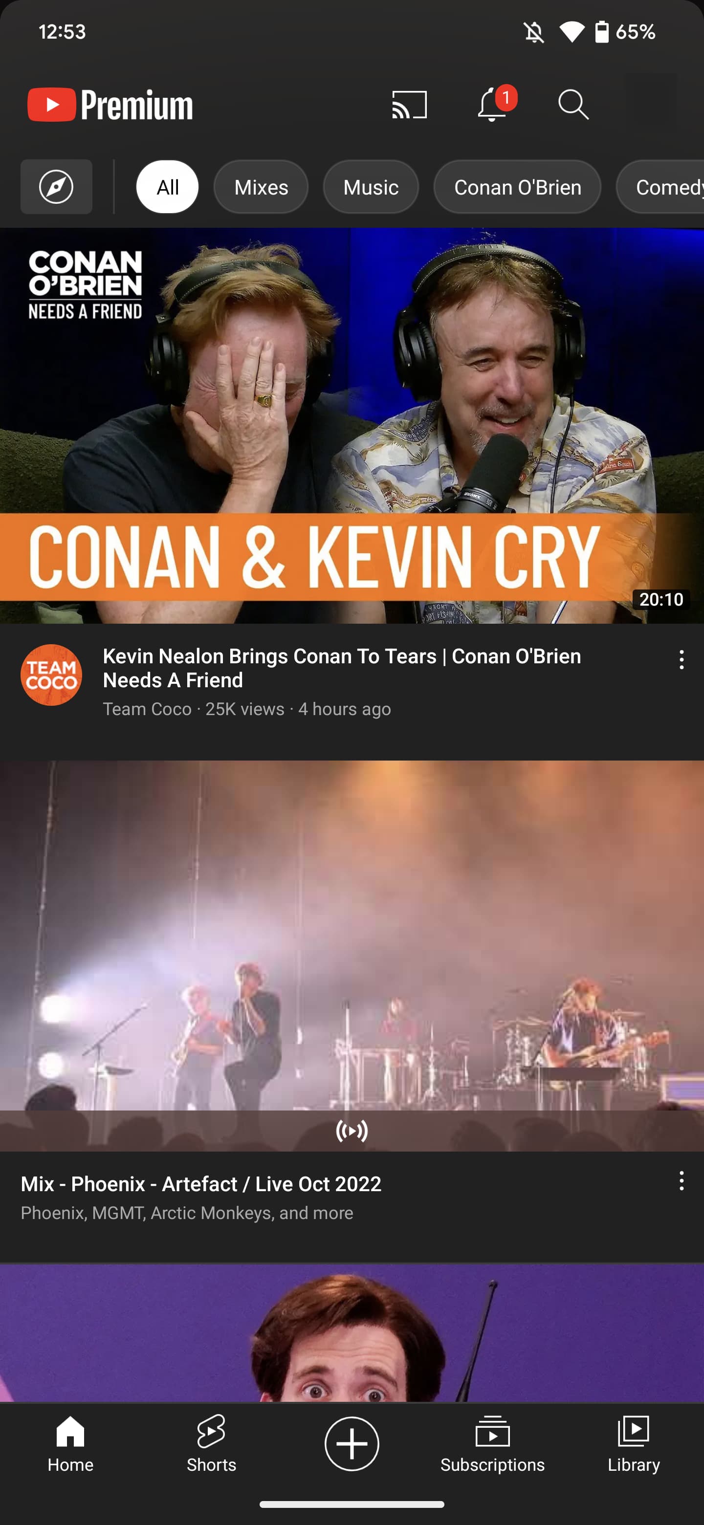
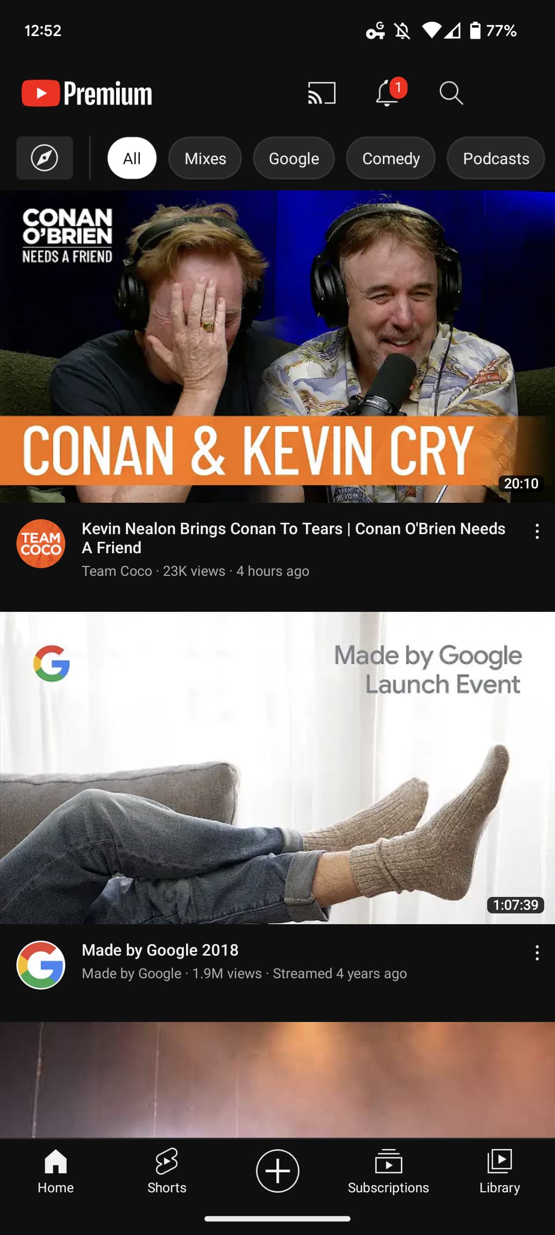
If YouTube’s dark theme is enabled, the first change you’ll notice is how the background is darker (#0F0F0F), though not completely black. This matches YouTube Music and is something people have long wanted in the mobile apps.
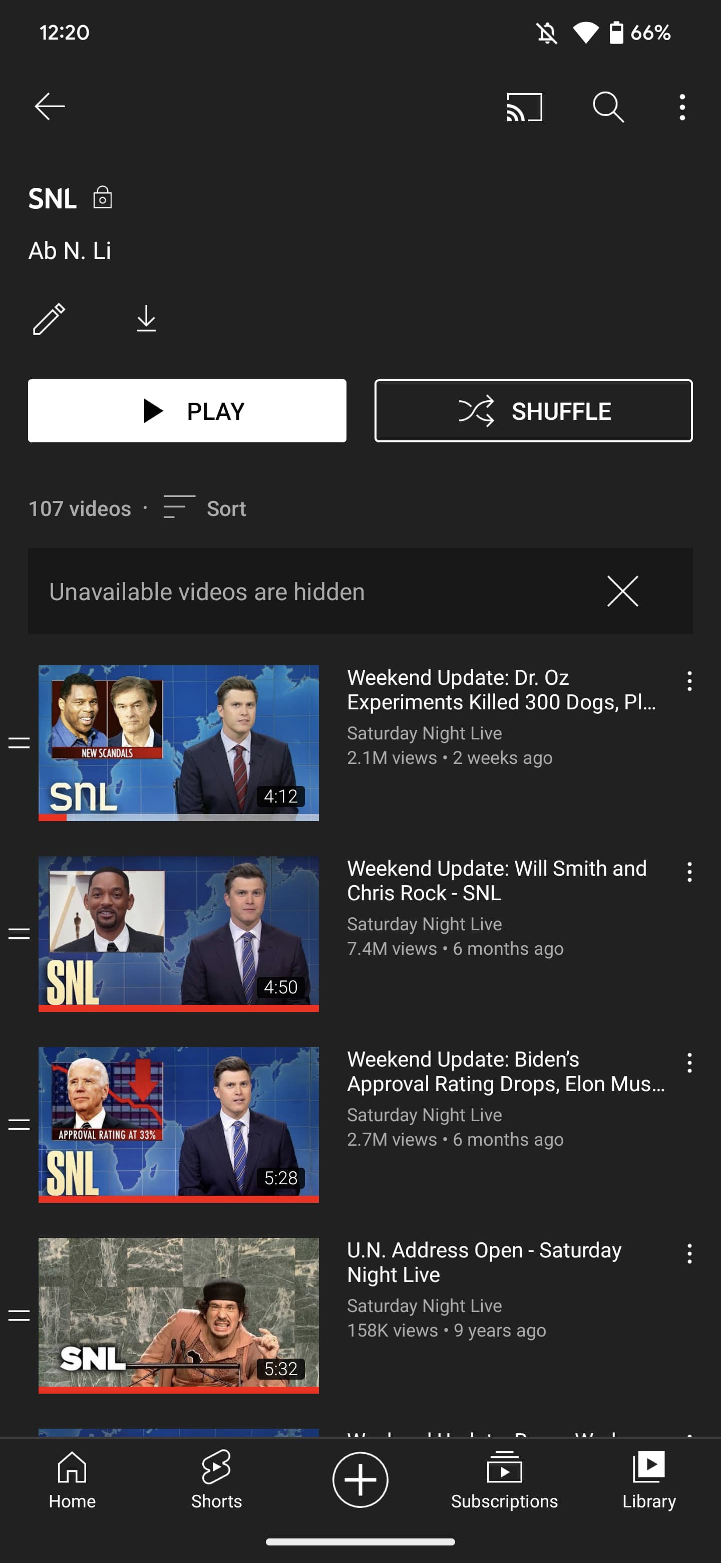
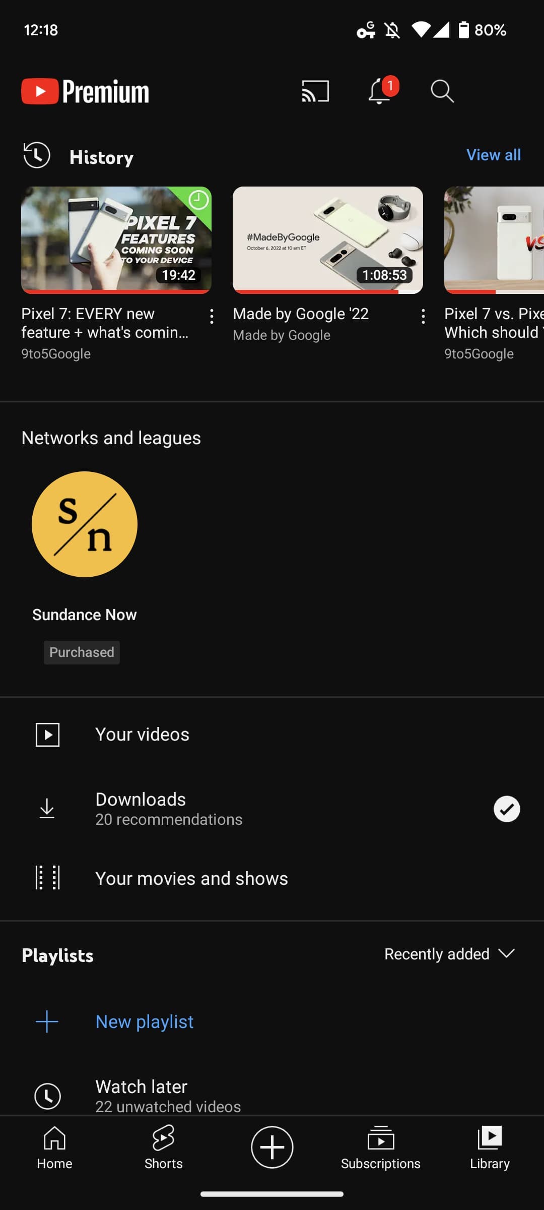
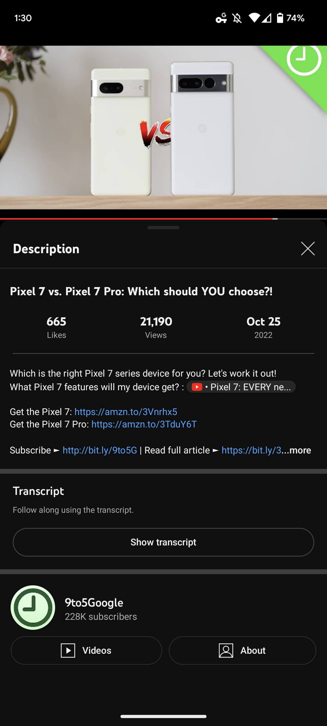
In the Library tab, you’ll notice that video thumbnails now feature rounded corners, and this change is also applied to the web redesign. To elevate playlists, YouTube now shows a cover thumbnail up top, though you see fewer videos right off the bat. Pill-shaped buttons are leveraged with more prominence for edit and download, which are now placed in circles.

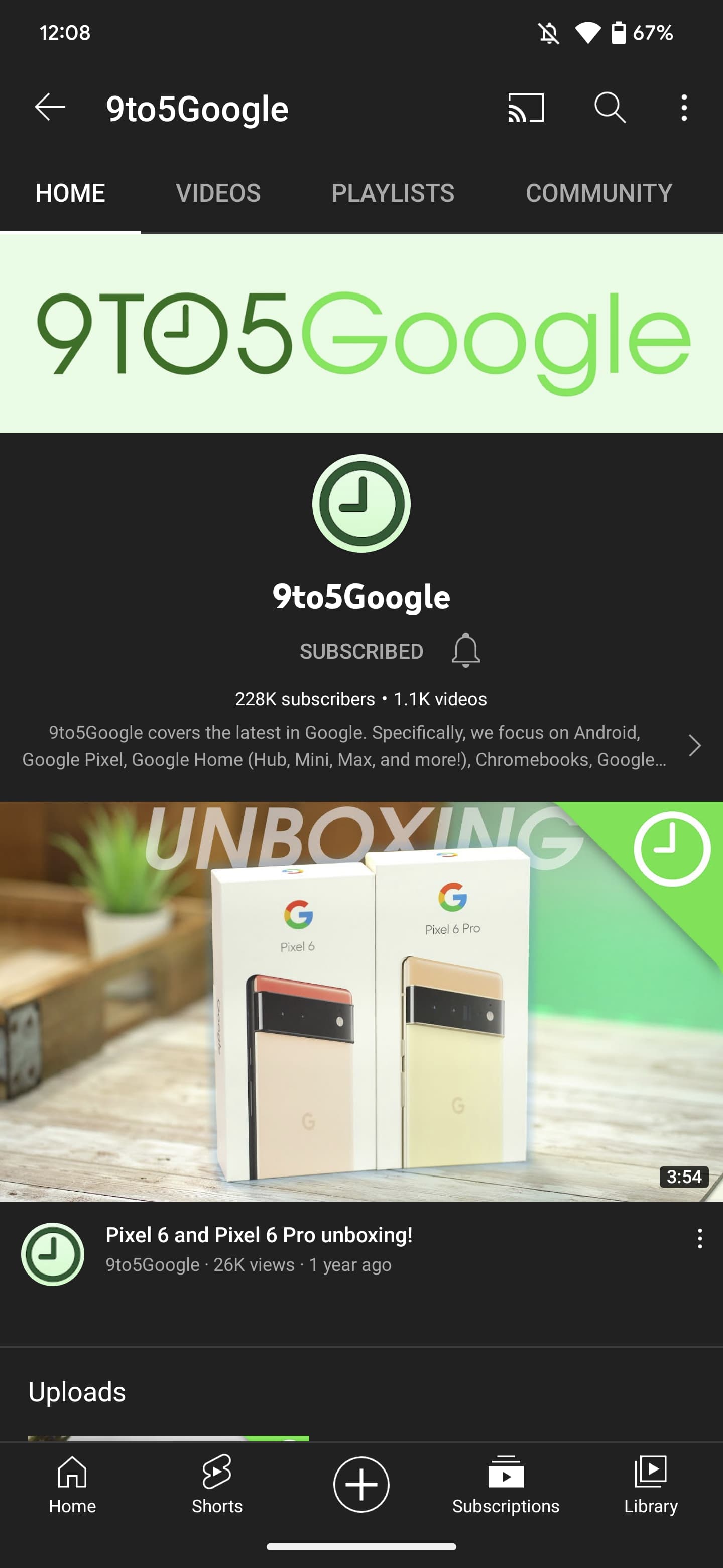
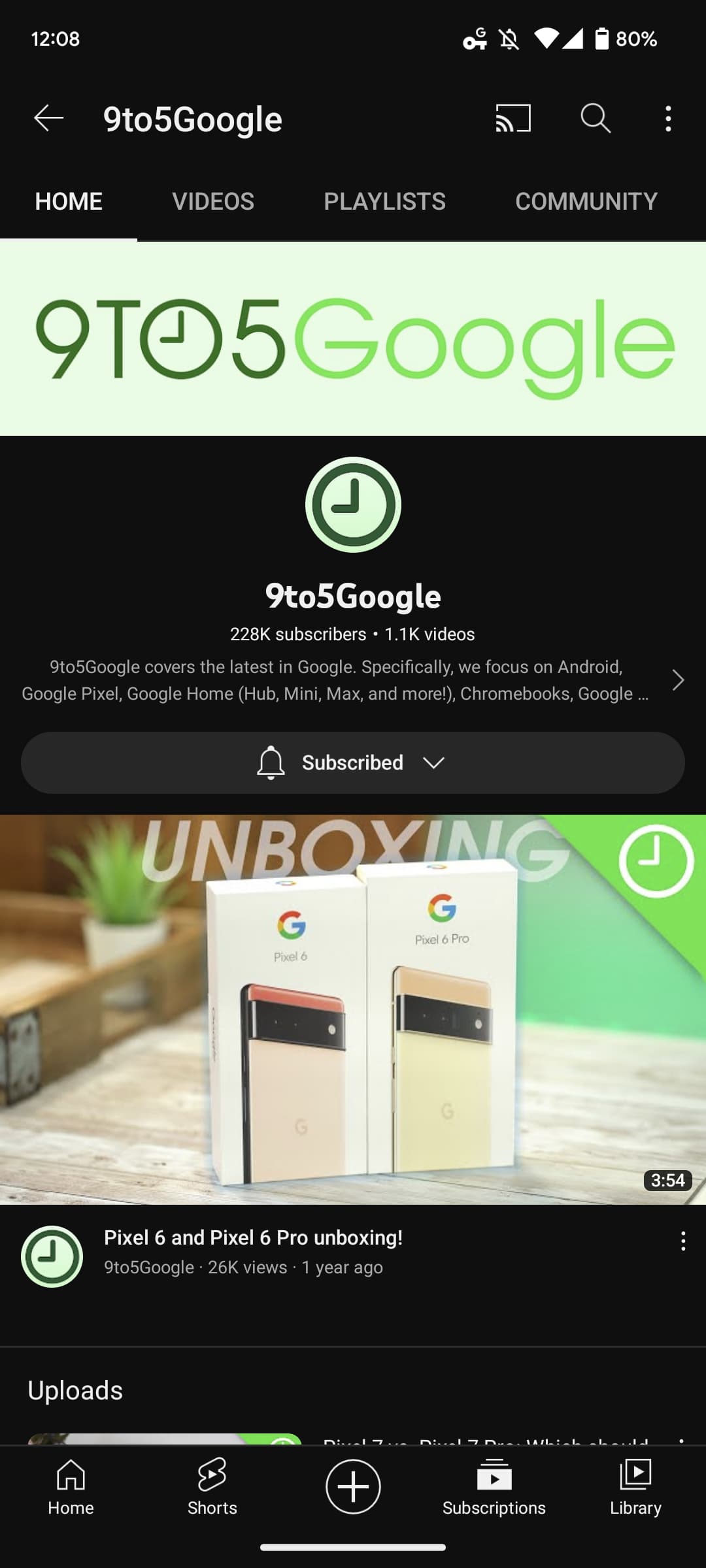
L: Old | R: New
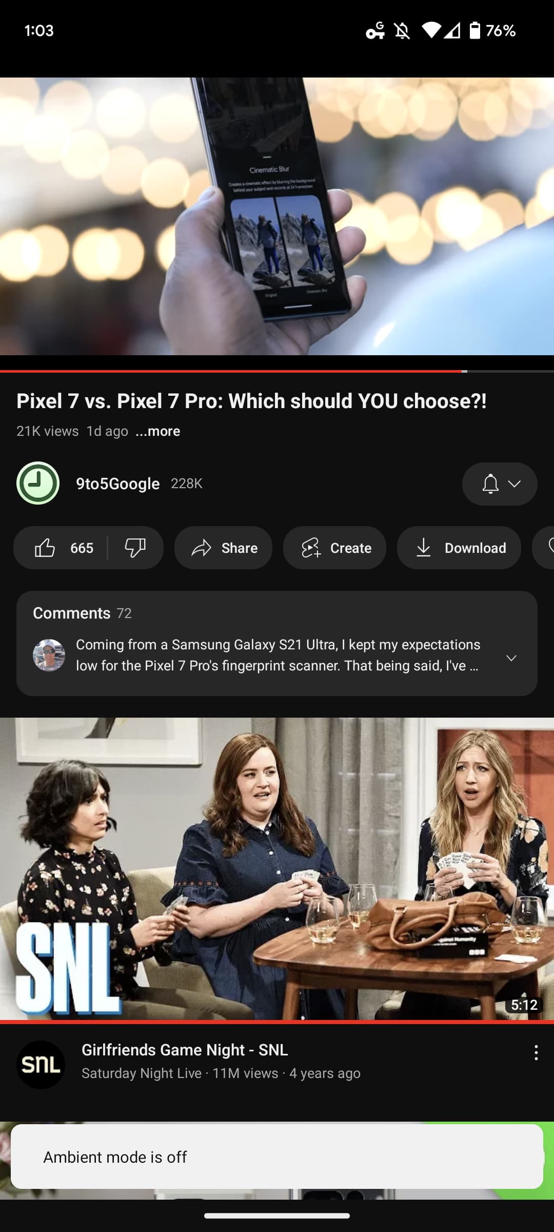
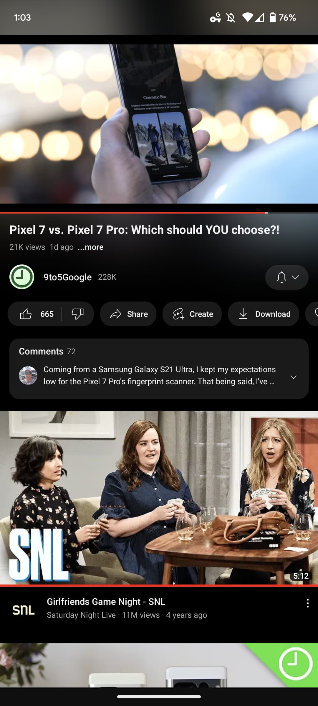
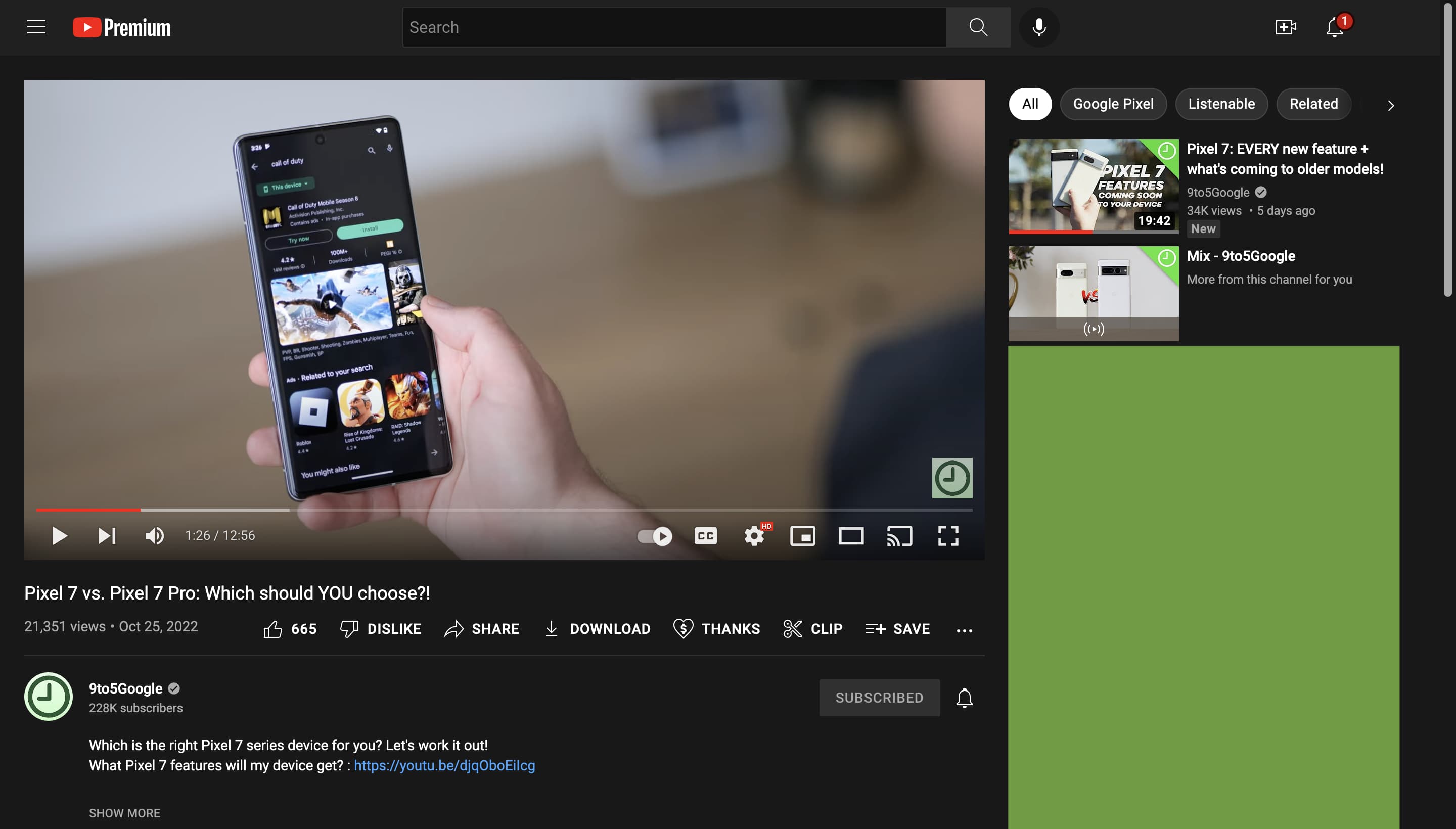
The next set of changes are on the video page. By default, Ambient mode is enabled so that the top and bottom of what you’re watching bleeds into the status bar and video description below, respectively. It will take some time to get used to and works best with vibrant colors versus dull ones. Fortunately, you can disable it by tapping the settings gear in the top-right corner and tapping the fourth item in the menu.
We were inspired by the light that screens cast out in a darkened room and wanted to recreate the effect so viewers were drawn right into the content and the video takes an even greater focus on our watch page.

L: Old | R: New
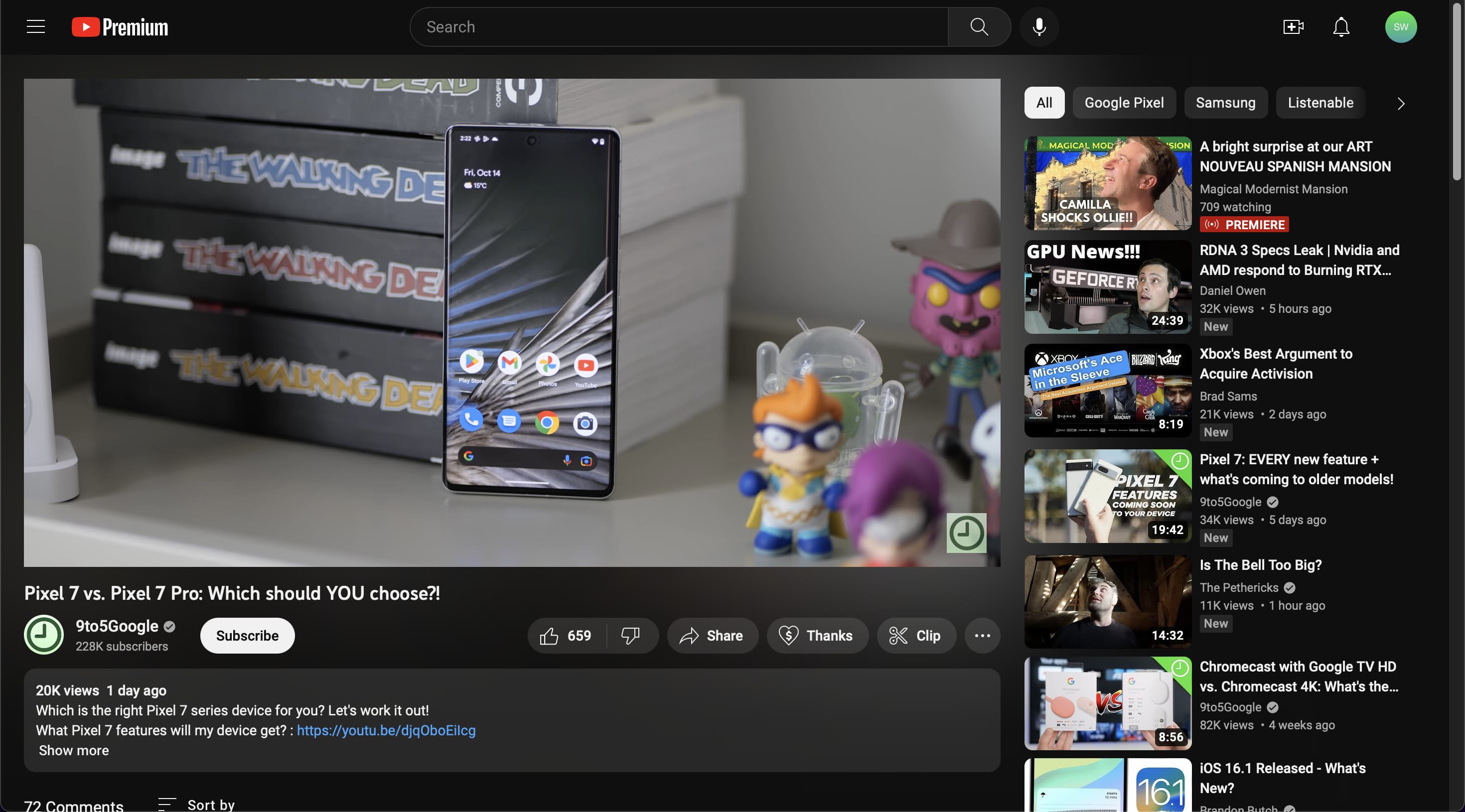
Below the video, tapping anywhere opens Descriptions, but YouTube now uses “…more” instead of a chevron. Additionally, links have been replaced by pills that include the video’s title for a rather nice preview. The channel name appears next, while the Google service has updated the subscribe button to no longer be red. (Channel pages have been slightly tweaked to be somewhat cleaner.)
Next is a carousel of key actions like thumbs up/down, Share, Create, Download, Thanks, Clip, and Save. All these buttons are placed in pills. The top comment is now more prominently highlighted on a card.

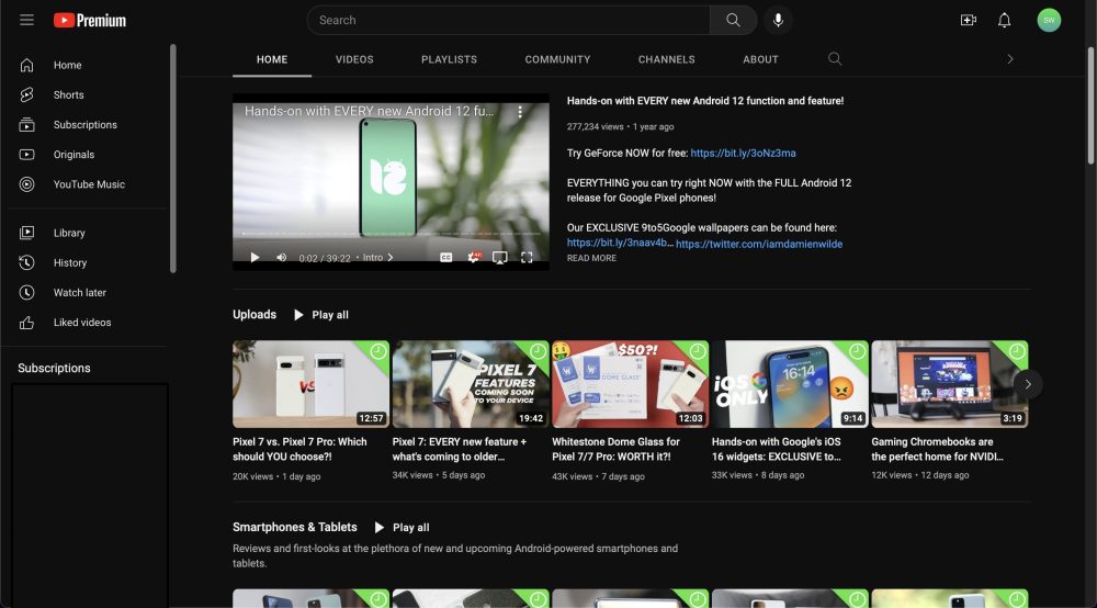
On desktop, YouTube.com gets several Material Theme tweaks that are not present on mobile. For example, the carousel just below the search bar now uses rectangles with rounded corners instead of pills while the equally rounded video thumbnails are much more pronounced here.
Beyond the darker theme, the video page gets similar tweaks to the layout below the video while Ambient mode is a bit nicer here. This bleeding extends to the side feed of videos and comes off as rather elegant on a large screen.
This new YouTube is still rolling out and not widely available yet.
FTC: We use income earning auto affiliate links. More.

Comments