At I/O 2022 in May, Google previewed a big redesign of Android Auto that brings a split-screen mode to in-car displays of all sizes, including smaller 5- and 6-inch screens. The summer launch was delayed due to Google incorporating feedback from early testing and polishing, but it’s entering beta today with a slew of upgrades.
Rail up the taskbar
Unchanged from the original preview is a side (or bottom) navigation rail taskbar that houses status icons: cell connection, battery, and the time. There’s also a microphone to launch Google Assistant, and the key navigation button that opens the app launcher or lets you go back to the side-by-side, split-screen dashboard when you’re in an app. However, there’s no longer a bell for the notification center as you now get a live count of unread messages that you can tap to see the list of alerts.
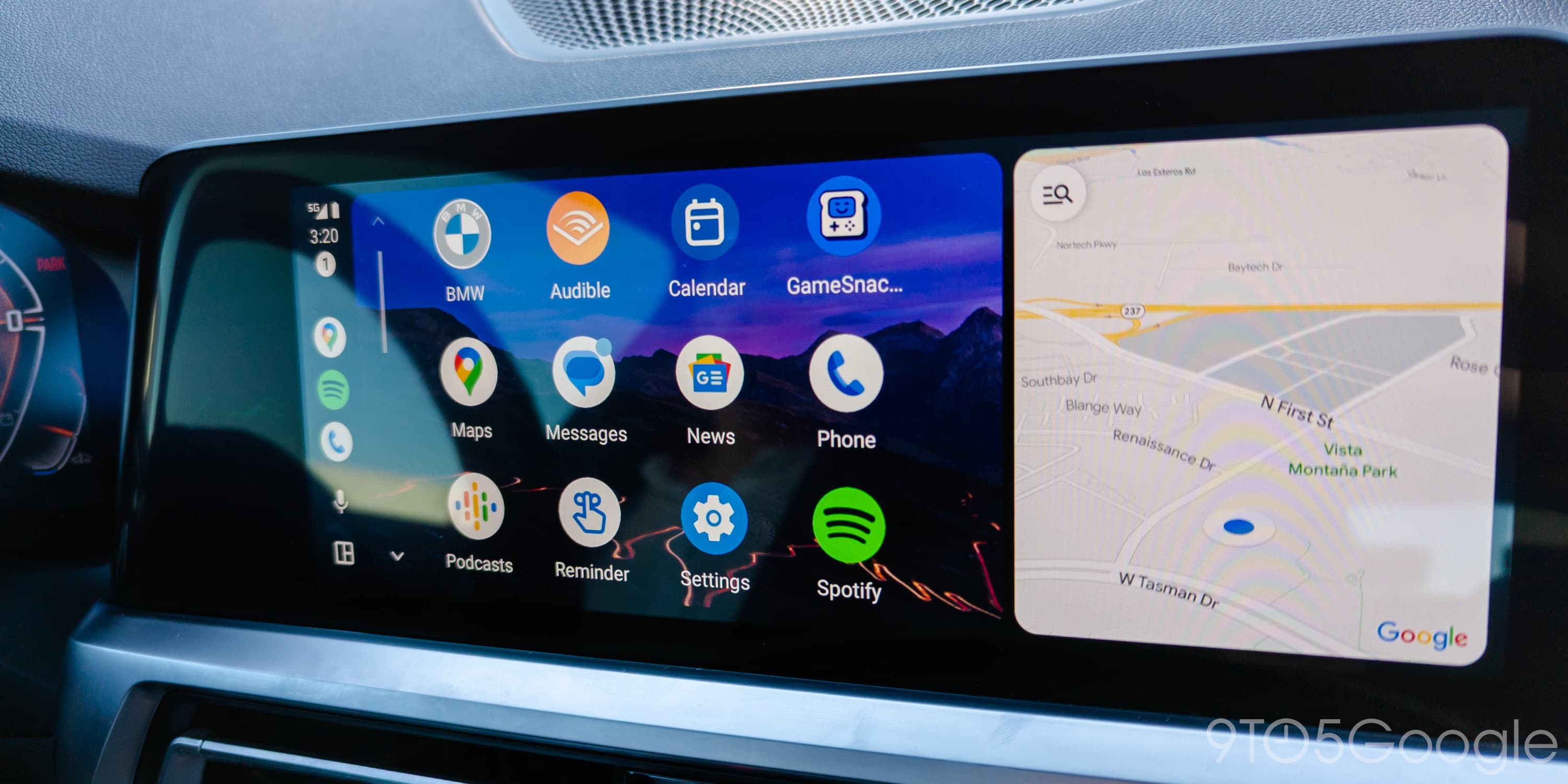
The bigger change is how icons for recent apps will appear at the center of the strip for quick multitasking. Technically toggles, Maps will appear first, followed by the last used media and communication apps, including the profile photo of ongoing calls. Vertical rails just show three apps, but horizontal bars can fit a fourth. Visually, it’s rather similar to Android 12L and 13’s taskbar on tablets, with Google updating more parts of Android Auto with Material You.

Canonical Android Auto
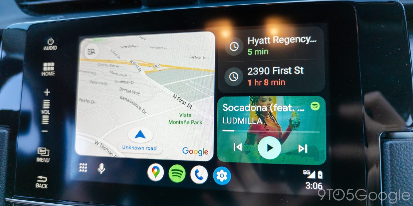
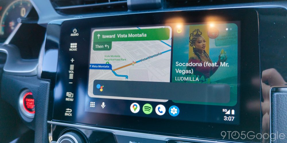
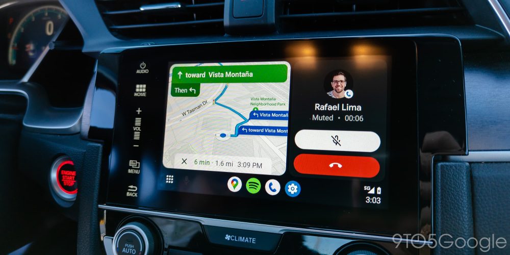
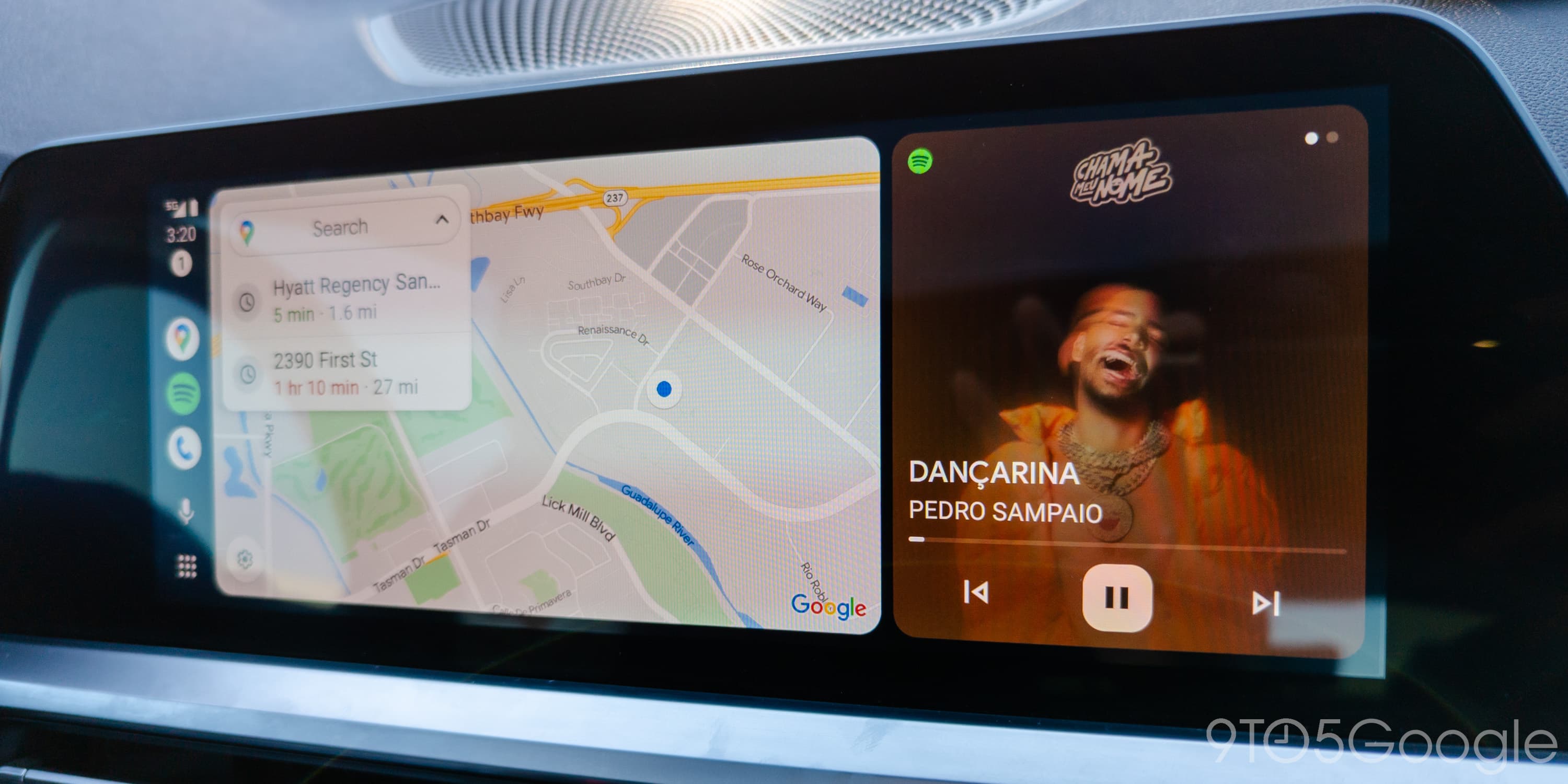
The redesigned Android Auto is largely dependent on the size of your in-car display. Most people will experience it on a 6- or 7-inch landscape screen, with Google internally referring to this as the canonical layout. The map card is the largest and will appear closest to the driver by default in the dashboard. Tapping the map card will fullscreen navigation so that it takes up the entire screen, while you can also toggle the icon in the rail to do this.
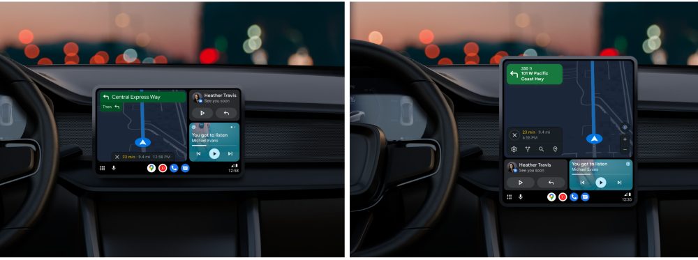
Navigation is fully usable in the card, and this canonical size lets you have up to two more cards in the right column. Since the Maps card is shrunken down, recent places that immediately start navigation when tapped will appear as a suggestions card in the top-right corner. After starting a trip, another card in that position can show a travel ETA with a share button that sends how far away you are via text message.
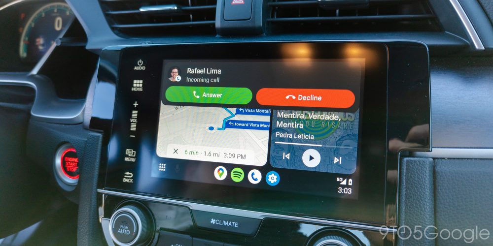
This top position can show missed calls and messages after the top pop-up has been dismissed. There are on-screen smart replies, as well as voice dictation.
This suggestion card can be swiped away entirely so that now playing takes up the entire height. Since May, Google has tweaked the media card with a new design that features a play/pause button that changes shape depending on state, just like on Android 13 for phones, with theming occuring based on album art. Later on in the beta, Google will finally give you a seekable progress bar that will be especially useful for podcasts.

Meanwhile, swiping left now gives music, podcast, and other media (“For you”) recommendations from Google Assistant. This is not limited to the current app and can be populated by different services at the same time.
For those that liked having media controls appear at the bottom, you can re-enable “Show quick controls for apps” to replace the app icons when something is playing or navigation is active.
Mo(re) screen, mo(re) Android Auto
Top comment by berto1014
Wow, this is better than I thought it was going to be. The fact that you can still opt for full screen maps or even the toolbar audio controls is great for those that preferred it that way. I know there were concerns about the small maps card, but that sounds like a non issue if you can choose full screen or cards. Super excited to try this out. AA has been stagnant for years. Now if they could only add incident reporting to Google maps in this interface, we would be golden and Google redeemed in my eyes.
If you have a car with a wide portrait display, you will get the full Google Maps app — instead of just a card — displayed nearest the driver. When this happens, Maps will always show either in the main position or as the right card if you’re interacting with a music app, launcher grid (which drops the previous top row given the taskbar), calling screen, etc.
On even larger screens, like a portrait display, the map app appears at the top, while two cards appear at the bottom in the dashboard view. One suggestion card you get in the dashboard view shows the weather. (FYI: Since I/O, Google has removed the time/date card that used Material You’s scallop shape.) Meanwhile, you’re able to open another app so it takes up half the screen.
How to get the Android Auto redesign
Since the May announcement, Google says it has taken into consideration feedback from early testers. There’s a particular focus on speeding up core interactions, and what’s coming out today is more feature-rich and polished.
The Android Auto split-screen redesign will be entering public beta for those already enrolled in the Play Store preview channel. At this very moment, the beta channel is closed to new sign-ups. Fortunately, those that are already running the latest beta release will start seeing the Android Auto redesign today as part of a server-side update in a faster than usual rollout.
FTC: We use income earning auto affiliate links. More.

Comments