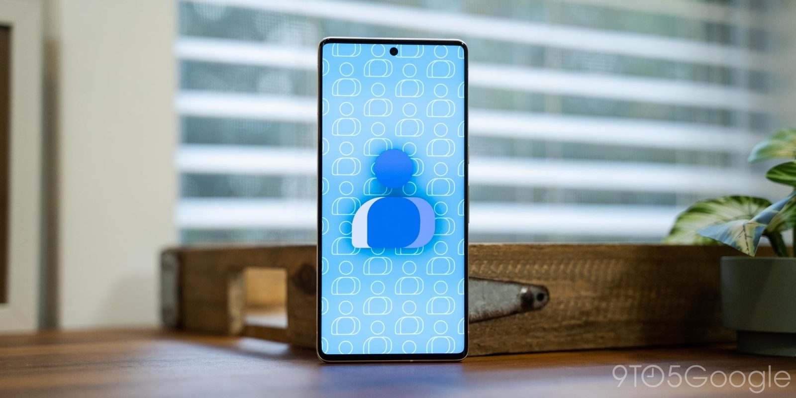
Besides the new icon, Google Contacts has seen quite a few changes in the past year, and the latest is a new “Highlights” tab.
“Highlights” appears between “Contacts” and “Fix & manage” in the Material You bottom bar. Underneath the search field, you get a grid of “Favorites” that fits four icons in a row. It’s more dense than the Phone app’s “Favorites” tab, and you can quickly “Add” new ones from the top-right corner.
The grid coexists with the list of Favorites at the top of the main tab. As such, there’s now two ways to view.
This is followed by “Recents,” which is a two-tab list that starts with “View recently.” Each contact is accompanied by a view date, and the overflow menu lets you clear that history. “Added recently” rounds out the list, and is the most useful part of this new UI.
With this change, which rolled out recently, Google Contacts is now a three-tab app that also features a navigation drawer in the main list view. The app is getting a bit busy.
“Fix & manage” to highlight various tools that the app offers was a good addition, but it’s not clear whether it required a whole tab approach. If anything, the new contacts grid should just be added to the top of the main list and replace the Favorites list, while the Recents section can go into the existing Manage tab.
That said, in theory, this new Highlights tab could be the primary way people use Google Contacts. Instead of scrolling, they could just search, while the grid is more visual and friendly than the list.
More on Google Contacts:
- Google’s new Sun and Favorite contacts Tiles roll out on Pixel Watch
- Contacts getting a large Material You homescreen widget
- Google Contacts rolls out card-based details page redesign
FTC: We use income earning auto affiliate links. More.


Comments