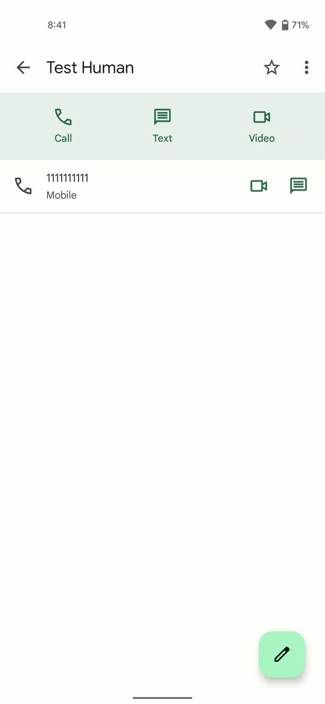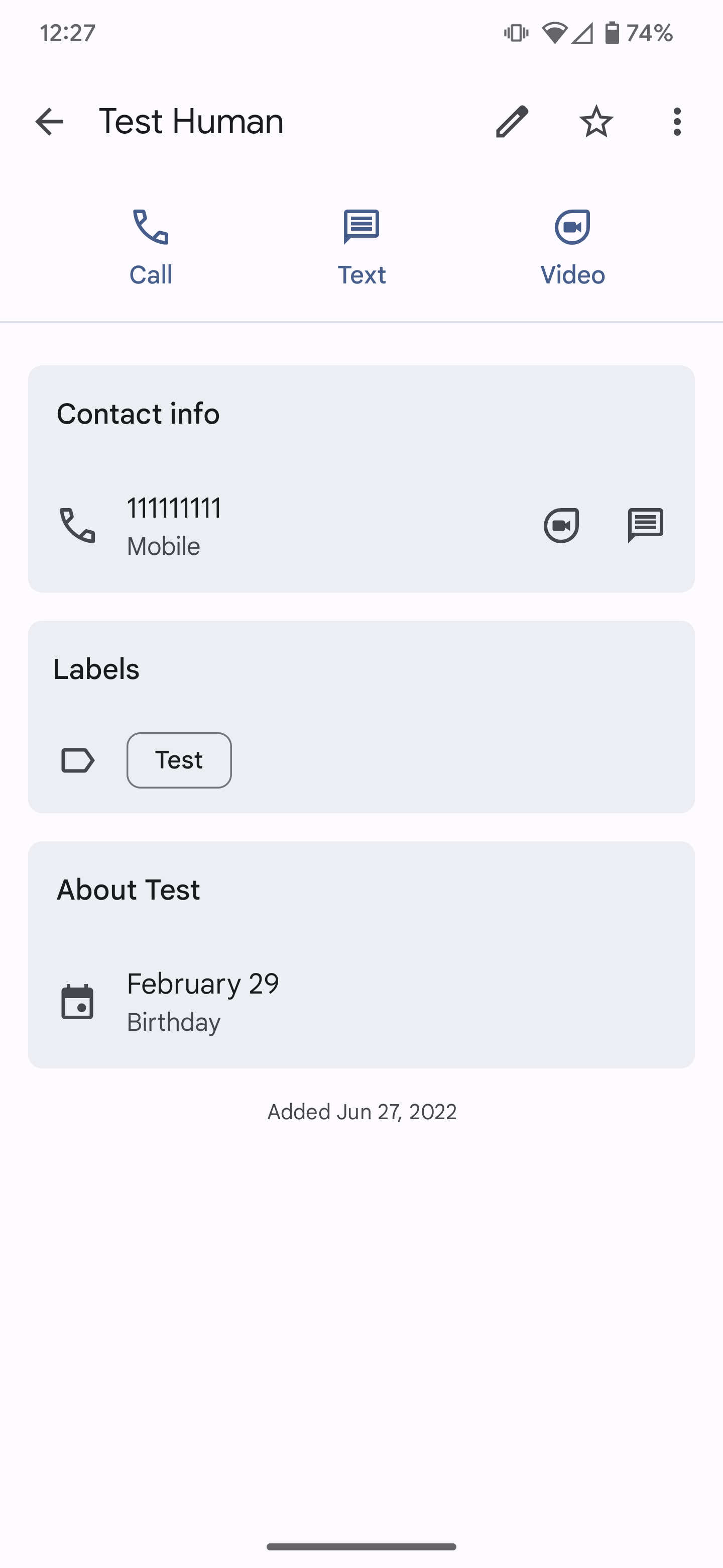
Google Contacts has rolled out its latest redesign, which trades in a simple list of details for neatly organized cards.
Last year, Google Contacts was the first app from the company to get a major update to the Material You design language. This involved tweaking some of the shapes of in-app elements and adapting the app to the Dynamic Colors system in Android 12+.
The latest change to Google Contacts — which appears to have rolled out widely with the newest update, being available on every device we checked — massively shakes up the design of the contact details page. In both the old and new designs, this page consists of the contact’s picture and their name, along with a list of actions available depending on what info is available.
In the old version, below that action bar, you would find a simple list of each field you’ve filled in for that person — phone number, email, address, etc. Now Google Contacts divides up this info into different categories, including “Contact Info,” “About [name],” and “Labels.” Each category is then given its own Material You styled card.
Another notable tweak is that the floating action button seems to have been removed in favor of putting a pencil/edit icon in the top bar.


On the one hand, this redesign is clean and more easily readable than the previous iteration of Google Contacts. But on the other hand, one can argue that the design is less efficient in the way it uses your screen real estate. Unlike the simple list that was used before, the cards need to have padding on all sides to keep a clean design.
What do you think of the latest Material You styled, card-based redesign for Google Contacts? Let us know down in the comments.
More on Material You:
- ChromeOS is set to gain Material You Dynamic Colors
- Concept: An iOS 16-inspired Android lockscreen for Pixel with Material You and depth
- Google Clock 7.2 brings tablet redesign with new navigation rail [U]
FTC: We use income earning auto affiliate links. More.


Comments