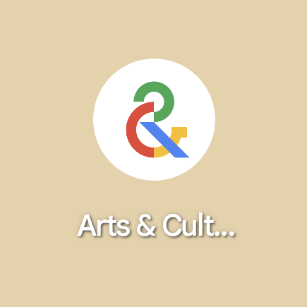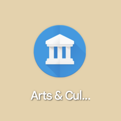
Starting today, Google Arts & Culture has ditched its classic icon, styled after a museum, for something more modern.
Google Arts & Culture is the company’s portal to the wide world of artwork, history, and fun, bringing the learning experience of a museum to your own home. Matching that feel, the app has long been represented by a Material Design styled logo made to look like the entrance to a museum. This icon took design cues from the British Museum, with its marble pillars and angled roof.
Last year, we were the first to report that Google was working on a rebrand of its Arts & Culture app. Specifically, Google was planning to swap out the museum icon for a more modern look, opting to focus on the ampersand in the app’s name.
Beyond being a more simplified design, the ampersand — at least in this author’s opinion — speaks to how the app is a digital museum “and more.” There are fun activities that encourage you to get more familiar with works of art and moments in history. And you can find your doppelgänger (or your pet’s!) in historic artworks. And you can make your photos look like a famous masterpiece through Art Filters.


Of course, art is subjective, so Google’s intention behind the new ampersand logo for Arts & Culture is up for debate.
The new icon for the app arrives first on Android with the update to version 9.5, rolling out now via the Play Store. Humorously, despite Google’s recent push for Material You-themed app icons in Android 13, Arts & Culture still uses a full-color image. The app’s listings on the Play Store and the App Store have also not yet been updated with the new design.
More on Google apps:
- Google Arts & Culture Android widget celebrates the birthdays of famous artists [Gallery]
- Google Home app rolls out full TV controls on supported sets [U]
- YouTube Music finally rolling out Library redesign on Android and iOS
FTC: We use income earning auto affiliate links. More.


Comments