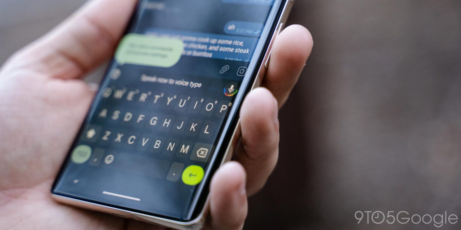
Since August, Gboard has been working on a redesign of the Shortcuts toolbar. Development on that continues with the latest beta this week, while Google has decided to tweak the tablet UI.
About APK Insight: In this “APK Insight” post, we’ve decompiled the latest version of an application that Google uploaded to the Play Store. When we decompile these files (called APKs, in the case of Android apps), we’re able to see various lines of code within that hint at possible future features. Keep in mind that Google may or may not ever ship these features, and our interpretation of what they are may be imperfect. We’ll try to enable those that are closer to being finished, however, to show you how they’ll look in case that they do ship. With that in mind, read on.
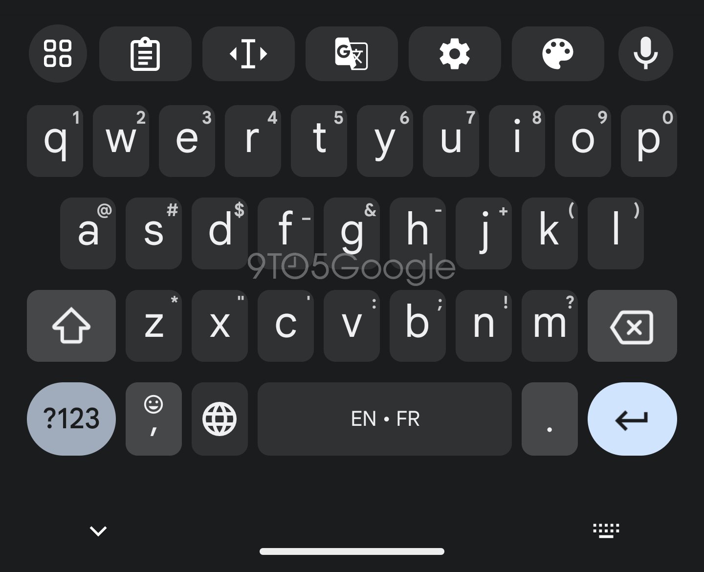
This revamp elevates Gboard’s row of shortcuts and tools by making them look more like keys. Each is placed in a rectangular container with rounded corners, with this design allowing for one more item to appear as the ellipsis has been replaced.
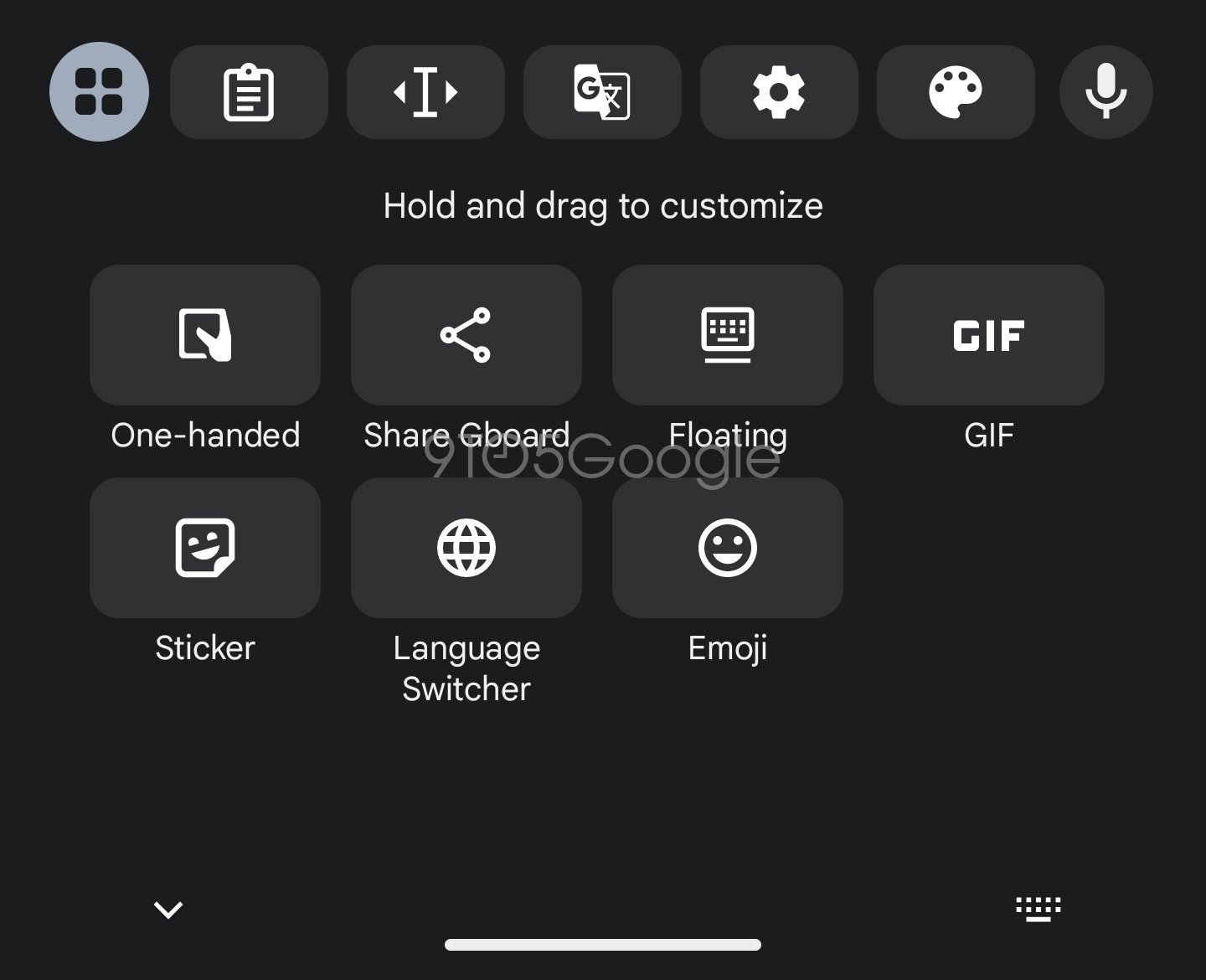
Meanwhile, tapping the top-left corner button shows a new grid layout for the remaining shortcuts that’s more dense. “Language Switcher” is a recent addition here, while Gboard is more explicit about how you can “Hold and drag to customize.” It was previously a bit hidden.
It’s not clear when this redesign will launch.
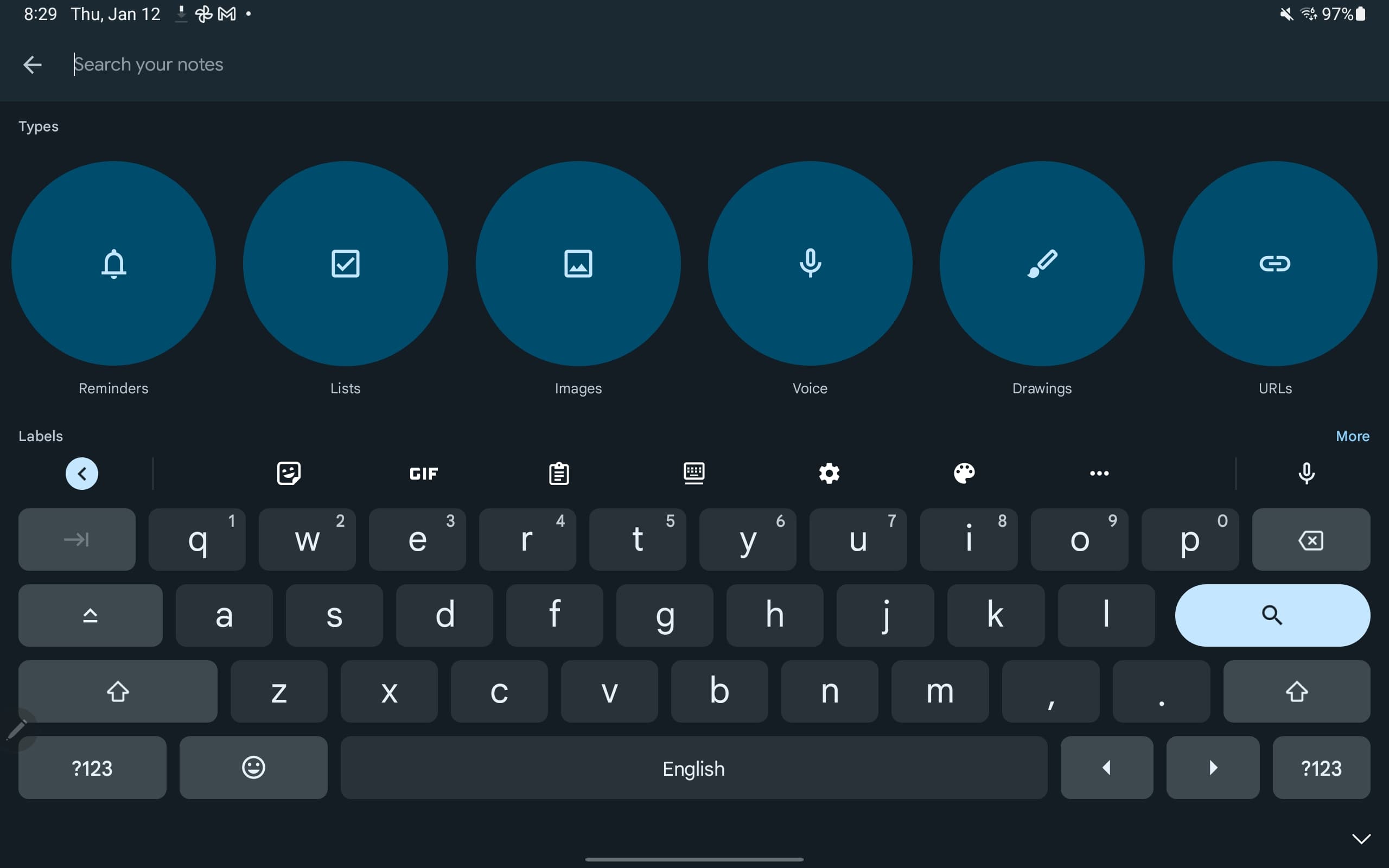
Version 12.6 also makes one tweak to the full tablet UI that was introduced in October. Instead of the bottom-right corner being home to a dedicated key that hides Gboard, Google has decided to add another “?123” shortcut.
The previous key was more useful in my opinion, but you can always just tap anywhere else on the screen or use the back gesture.
Thanks to JEB Decompiler, from which some APK Insight teardowns benefit.
Dylan Roussel contributed to this article.
FTC: We use income earning auto affiliate links. More.


Comments