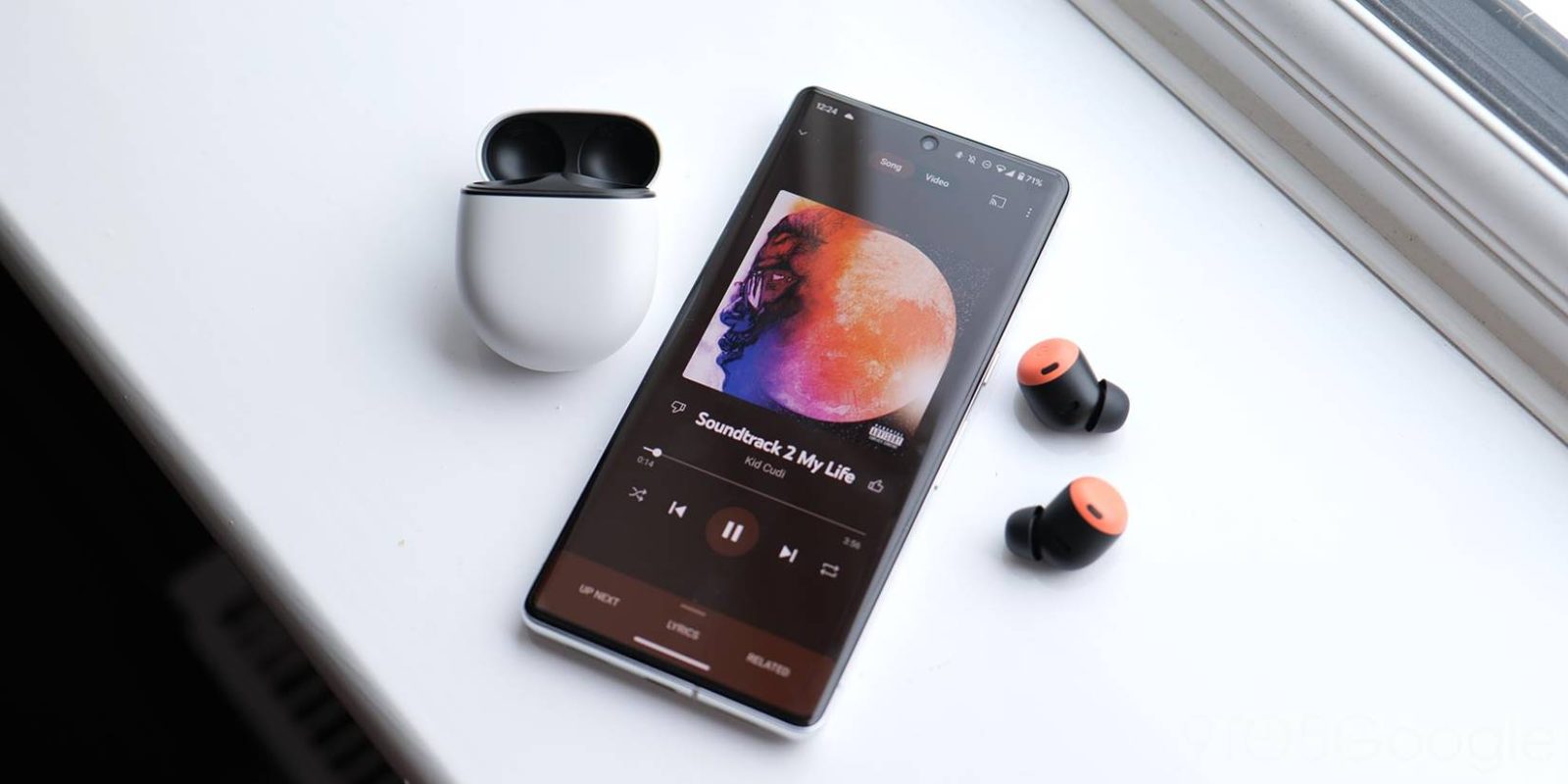
In mid-November, YouTube Music rolled out a redesigned Now Playing screen on Android that notably hid the dislike button, but has now disappeared and the old interface is back.
YouTube Music is back to the centered song name flanked by both thumbs up and down. The artist is also no longer left-aligned, while the play/pause button is back to being themed like the rest of the player.
YouTube Music’s overflow menu is back in the top-right corner, while “Playing from…” has disappeared. This is the case on all Android phones running the latest version (5.40.52) of YouTube Music, which widely rolled out yesterday.
Curiously, the redesign remains on Android tablets, while it never came to iOS, though there’s a history of Now Playing redesigns significantly lagging between platforms.
This is most likely a bug as the YouTube Music team officially announced the revamp in December: “These improvements were made as part of design efforts to modernize the look and feel of YouTube Music.”
If you’re on a mobile device, you’ll see small design changes on the YouTube Music player page including – container text at the top of the page, modified album art, updated control buttons, updates to thumbs up/down and the use of left aligned text.
The redesign was fine and great for adding “Playing from,” though the increased frequency of scrolling text is quite annoying.
More on YouTube Music:
- New YouTube Music Library removes ‘Downloaded songs’ playlist
- YouTube Music ‘Listening Room’ beta program launching [Update: Sign-ups closed]
- YouTube Music tests live lyrics with newer Casting UI
FTC: We use income earning auto affiliate links. More.


Comments