Following the Library revamp in January, YouTube Music for Android and iOS is rolling out a redesign of the album view.
YouTube Music first modernized playlists and albums on Android tablets as part of the large screen optimization push that makes use of dual-column layouts. This new playlist UI then came to Android phones in mid-October and very recently arrived on iOS.
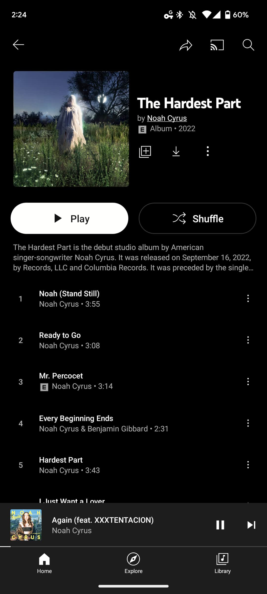
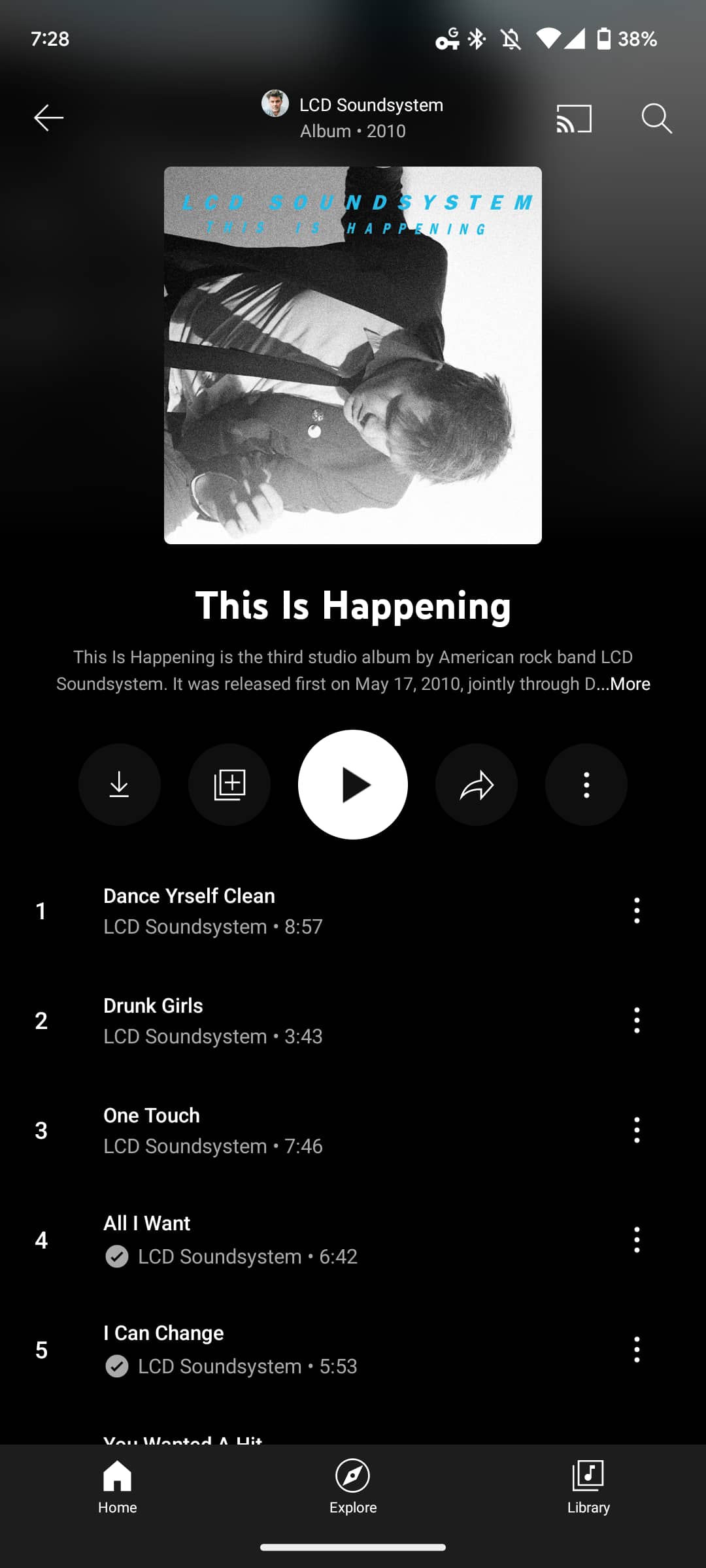
This redesign prominently centers album artwork and shows a blurred version behind it. At the top you get the artist (which can be tapped), Album/Single, and release year. The album name appears next with a description from Wikipedia underneath that.
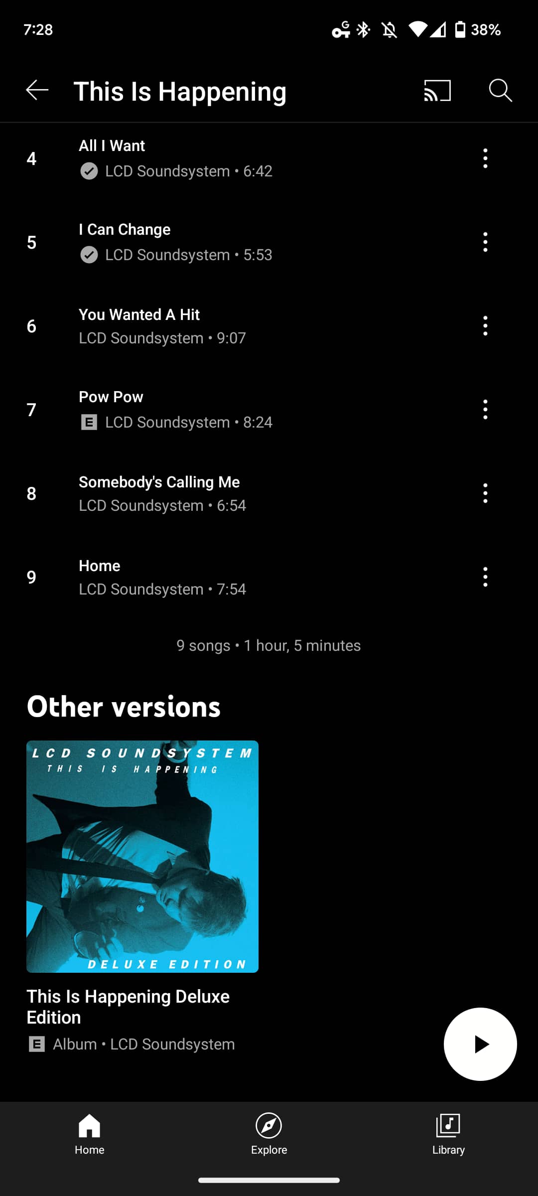
Available actions include download, add to library, play, share, and an overflow menu, which is how you now access shuffle (in a somewhat annoying change). As you scroll down the track list, a play FAB appears in the bottom-right corner. Lastly, at the very bottom, you get the number of songs and album duration.

As of this evening, we’re seeing this album redesign on YouTube Music for Android and iOS (iPhone + iPad). Rolling out as a server-side update, it does a great deal to modernize the application and some vibrancy.
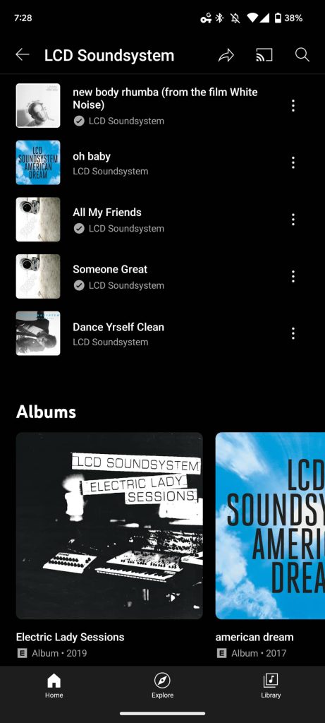
Another recently rolled out tweak sees Google boost font size in the artist page and Explore tab. This is particularly noticeable in the Top songs list.
More on YouTube Music:
- YouTube Music Now Playing redesign on Android has disappeared
- YouTube Music’s excellent ‘Create a radio’ tool more widely rolling out [U]
- YouTube Music brings mood filters to the web
- YouTube Music ‘Listening Room’ beta program launching [Update: Sign-ups closed]
FTC: We use income earning auto affiliate links. More.
Comments