YouTube Music was one of the Android apps that Google said would get tablet optimizations at I/O 2022, and the redesigned playlist interface is now live.
Update 6/7: YouTube Music’s playlist redesign is now appearing on Android phones for some users. It’s not yet widely rolled out and just the new look but in a single column.
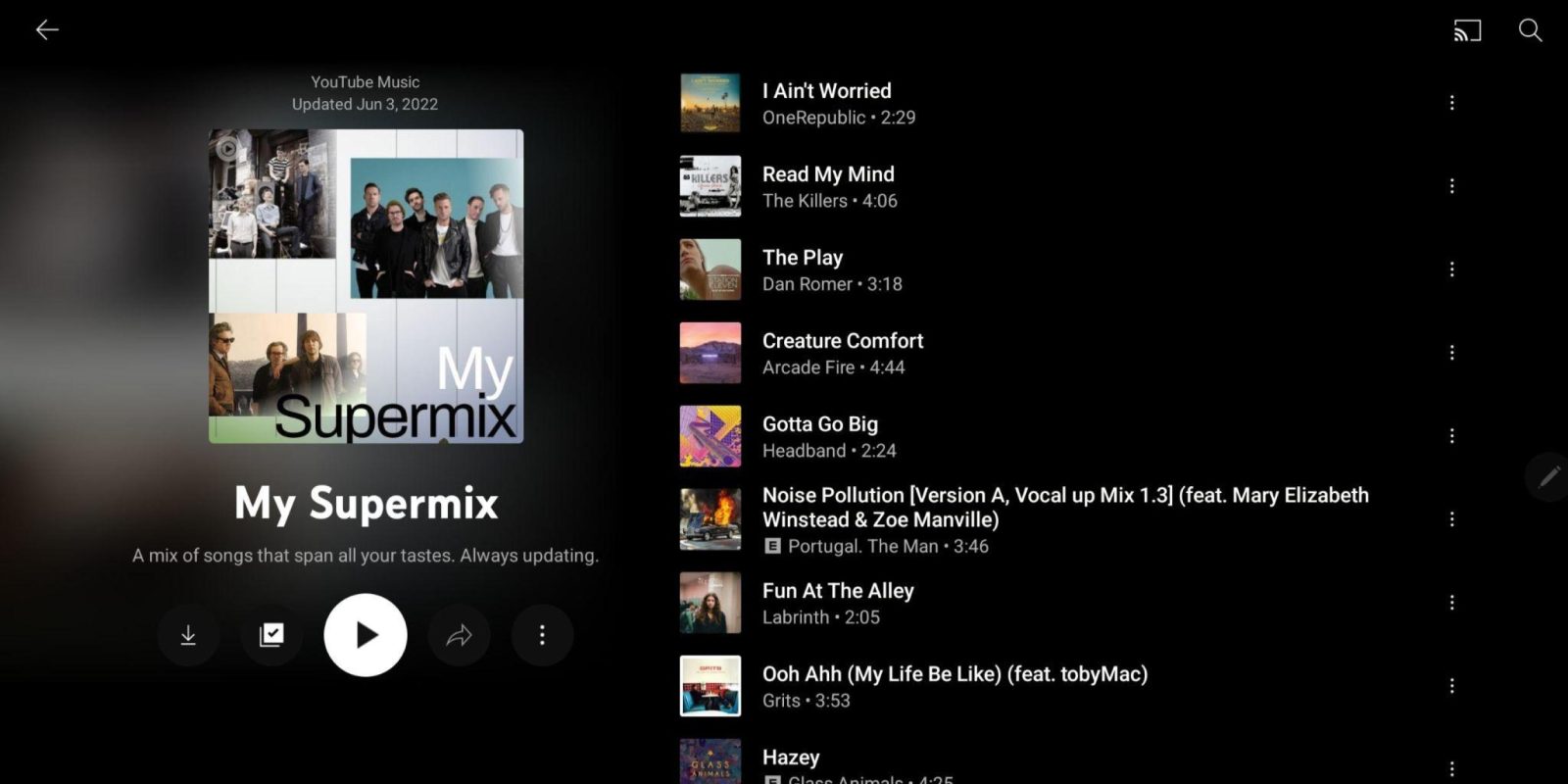
The share button is no longer in the top-right corner, but rather next to play or shuffle. It’s the latter when you’re in a playlist you made (which includes Your Likes), while the former is for those created by YouTube Music. Meanwhile, given how the top portion is larger, you do see less tracks per screen initially.


Original 6/4: This view entered A/B testing before the on-stage announcement and it notably only applies to playlists, which are arguably a big part of the streaming service. Both your playlists and those generated by YouTube Music get the new coat of paint, but not albums at the moment.
It’s a two-column view with cover art and background blur at the left, while the creator and when it was last updated is at the top. The name appears below with a description and controls for downloading, editing (details and sort), shuffle, share, and an overflow menu. The list of songs appears next to it with suggestions on what to add underneath that.
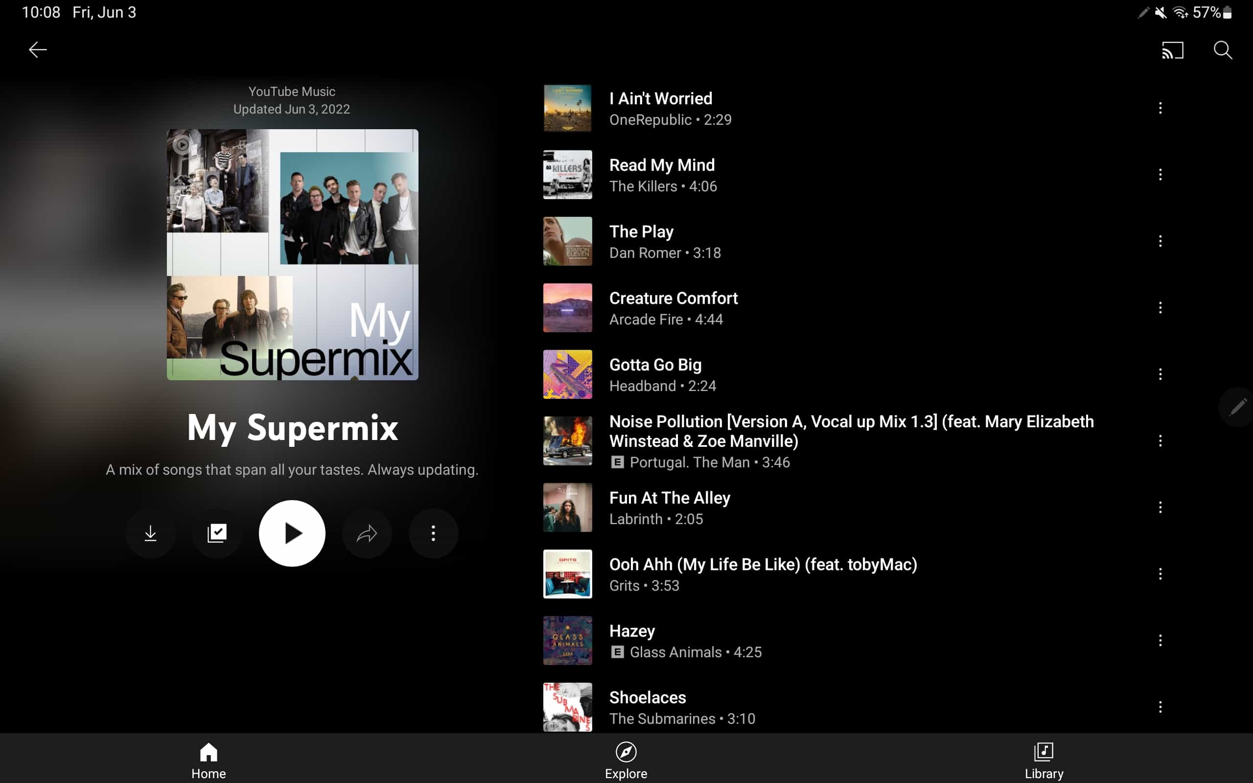
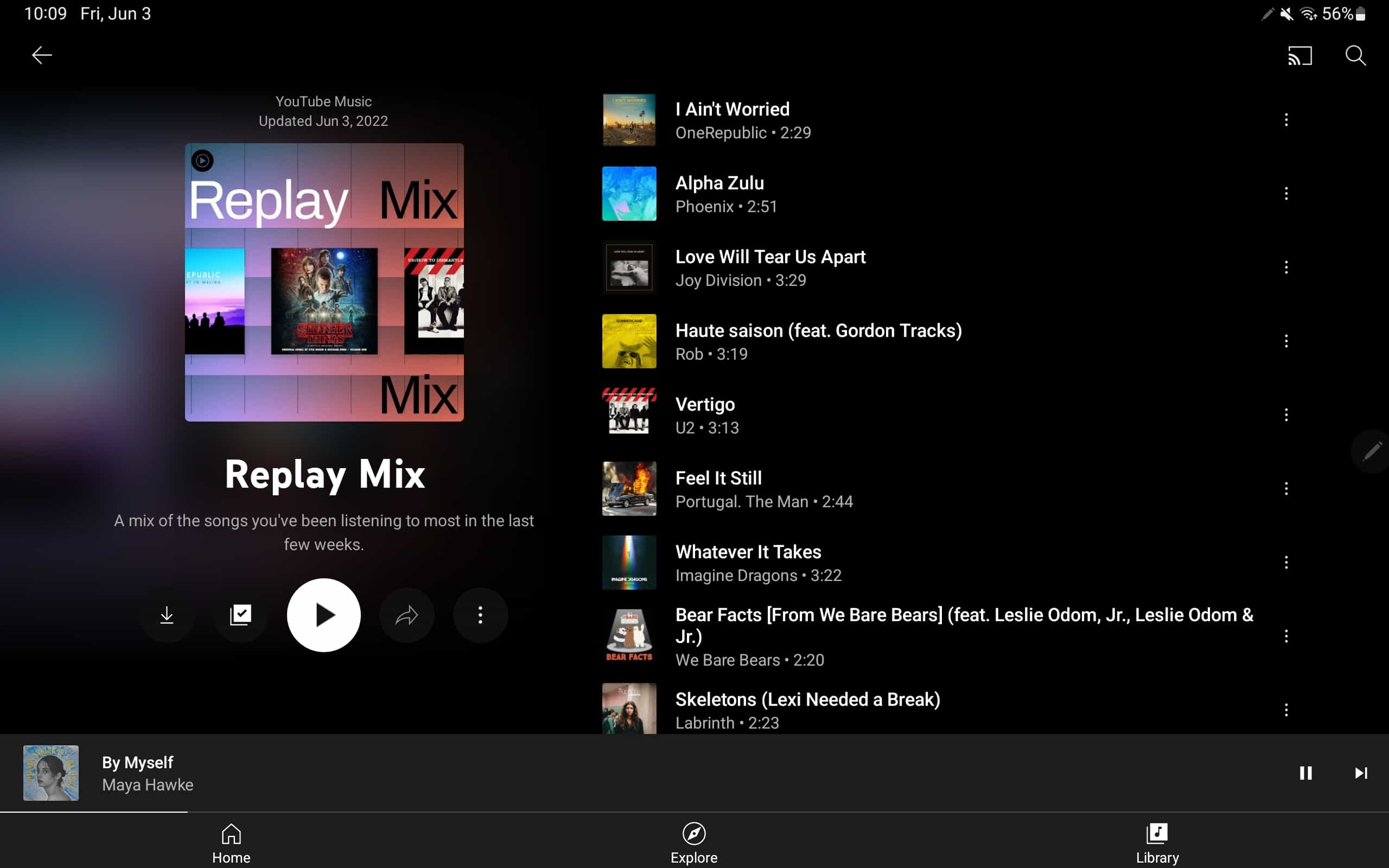
The portrait UI puts everything in one-column and features a shuffle FAB (floating action button) as you scroll down past the cover.
As of today, we’re seeing YouTube Music’s playlist redesign rolled out (version 5.08 and 5.09) on an Android tablet and the app running on a Chromebook. This visual revamp does not appear on any phones we checked, or the iPad client. It’s unclear whether it will expand to phones or album views.
Even before the developer conference, YouTube Music has been optimizing its mobile apps for large screens. The start of 2022 saw a Home feed that took better advantage of the extra screen real estate, while Now Playing has long offered a two-column layout. Meanwhile, app settings on Android were just streamlined this week.


More on YouTube Music:
- YouTube Music getting Spring Recap ’22 with playlist and shareable stats
- YouTube Music starts rolling out multi-select in the web app
- Google Play betas for YouTube Music, TV, Google News, Clock, and Play Books disabled [U]
- Comment: YouTube Music needs a more consistent UI, and carousel pinning is the answer
FTC: We use income earning auto affiliate links. More.

Comments