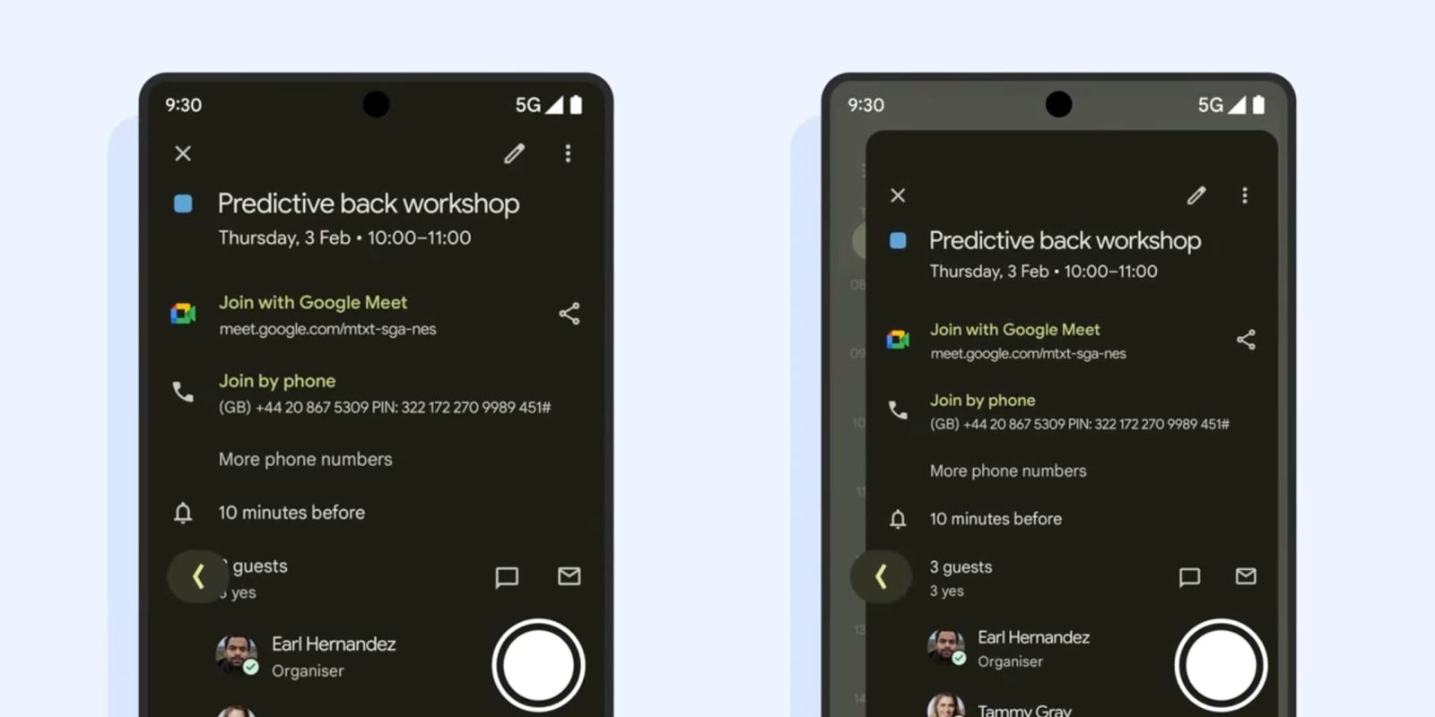
In Android 14, Google will roll out the new Predictive Back Gesture and its in-app version. Ahead of that, Google is surveying developers about it.
With Predictive Back, Android will show a preview of the homescreen as you swipe away from the edge and the current app window shrinks. Google wants to address how the current back gesture can result in “people leaving the app by mistake.”
You can test it in Android 13 today with supported Google apps by enabling Settings > System > Developer options > Predictive back animations (near the bottom).
Android 14 is set to enable Predictive Back Gesture by default. Google tells developers that the “new Predictive Back feature has been shown to outperform the current experience in end users’ task completion, preference, satisfaction, confidence, and premiumness.” It’s asking them whether the “costs of implementing Predictive Back will be worth it.”
The upcoming OS is also set to offer a “similar experience when [users] swipe within the app” across different screens and hierarchies.
Letting users know where back is going to take them by leveraging default or custom animations.
Top comment by Mckillio
I haven't used 14 yet but it's very frustrating when you swipe back, thinking that you're going to get taken somewhere within the app but instead get taken to the home screen. I'm looking forward to this functionality.
In the developer survey, we have the latest look at in-app Predictive Back (on the right). We see Google Calendar open to event details. As the back gesture is invoked, that fullscreen page shrinks, and you’re able to see the previous screen (Calendar’s Schedule list view). That is enhanced by an animation from Google Calendar that shows the event card shrinking.
Developers are asked whether “in-app Predictive Back will change how users navigate your app for the better or for the worse.”
One curious thing is how minimal — just the perimeter — your sneak peek of the previous screen is. Our Dylan Roussel brings up how your finger might also be physically obstructing the preview, especially given how small that area currently is.
This might provide enough of a preview for some users (coupled with muscle memory and familiarity), but it is not as obvious as iOS and its sliding pane metaphor when going back. Overall, Android’s approach is clearer when returning to the homescreen.
FTC: We use income earning auto affiliate links. More.


Comments