As we’ve been expecting, the latest Google app to get a tablet redesign is Contacts for Android.
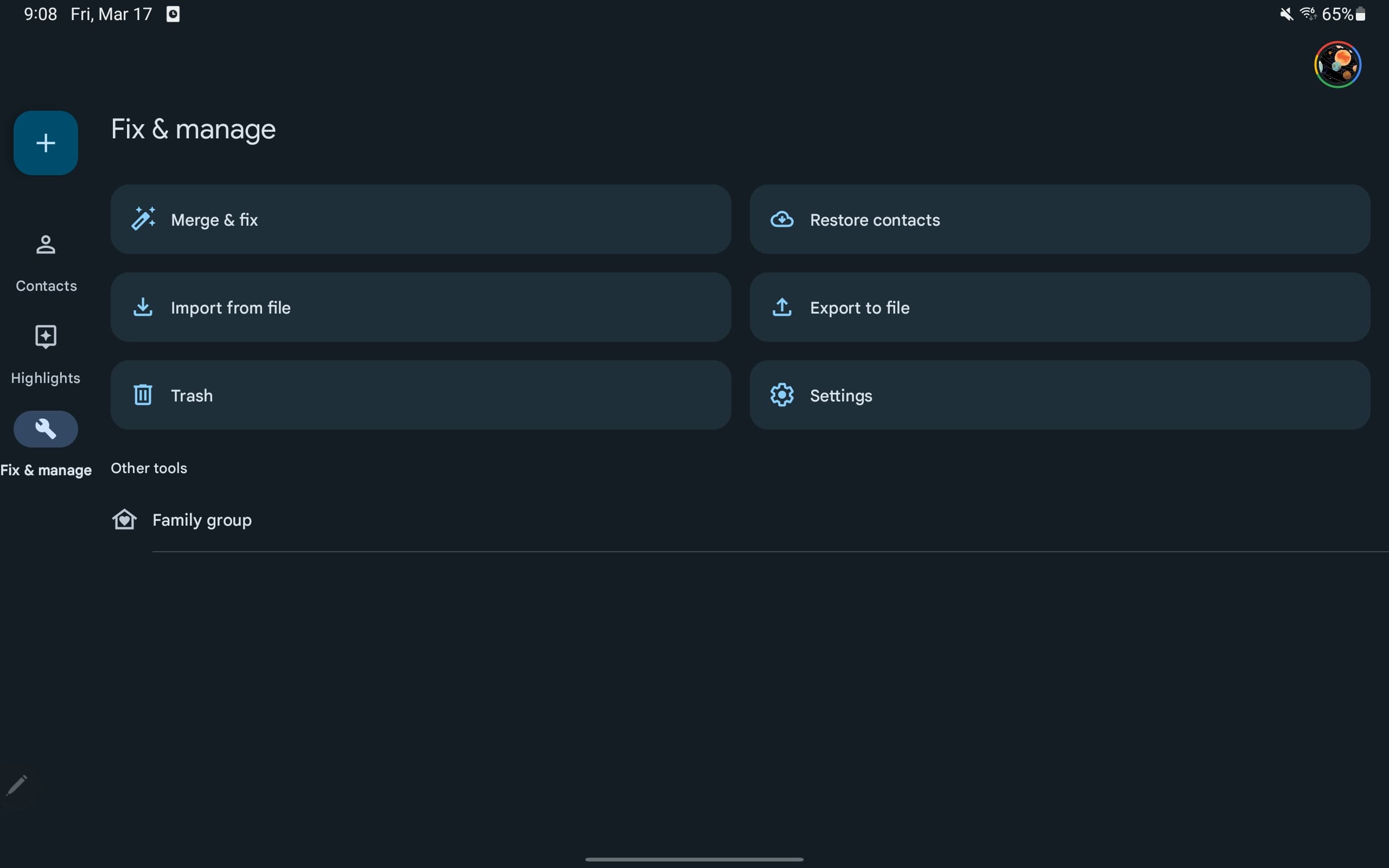
Google Contacts switches from a wide bottom bar that looked bad on landscape displays to a navigation rail. At the top is create FAB, with “Contacts,” “Highlights,” and “Fix & manage” following. These tabs are not horizontally centered to allow for more natural hand placement.
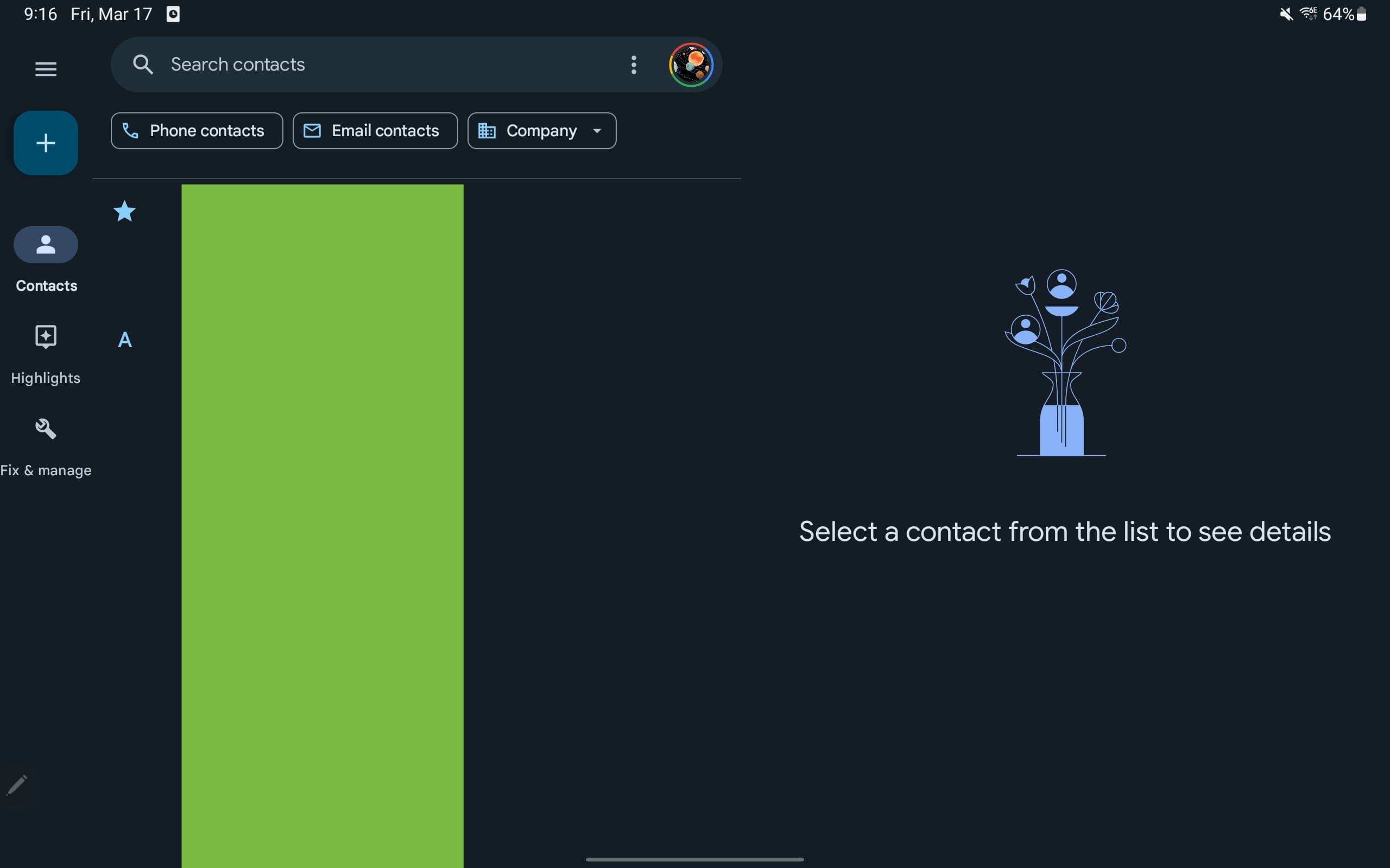
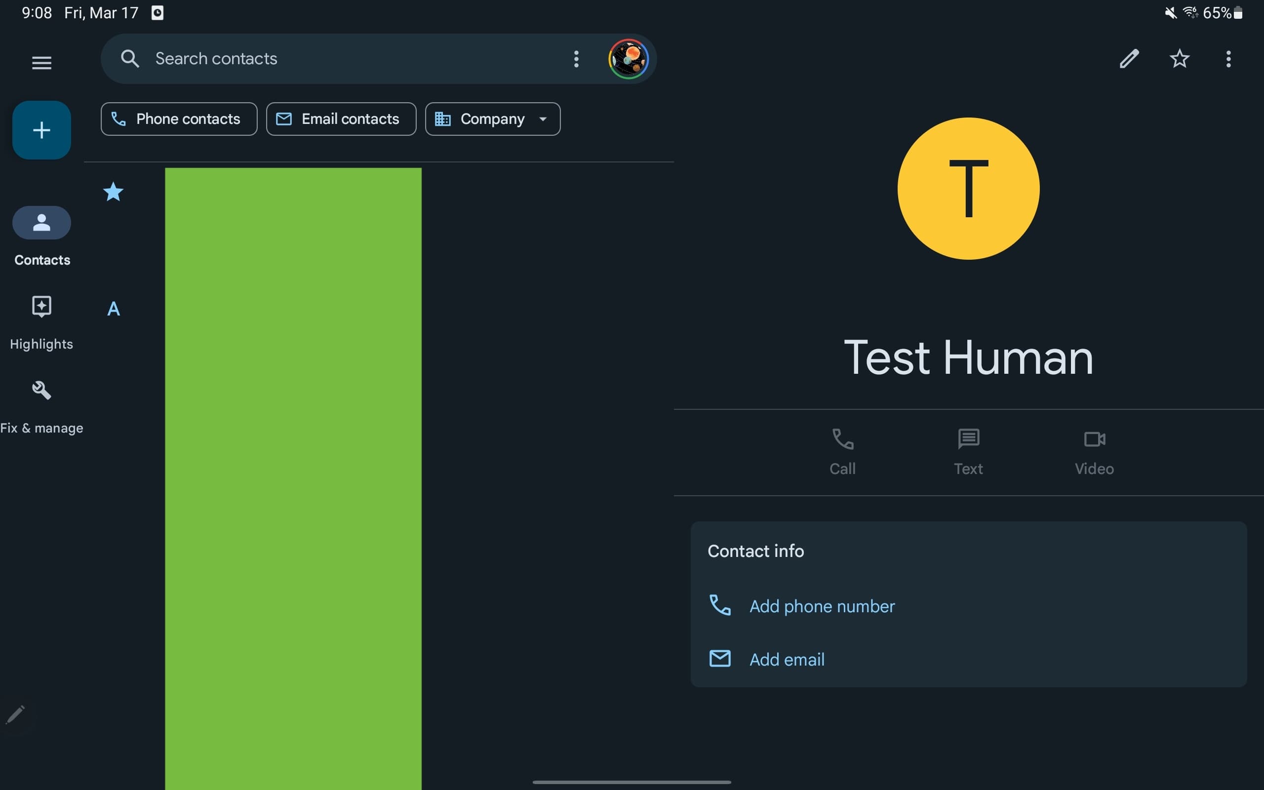
The app’s main view makes use of a dual-column UI where the contacts list is at the left and details appear at the right. On this page, the search bar at the top isn’t full width.
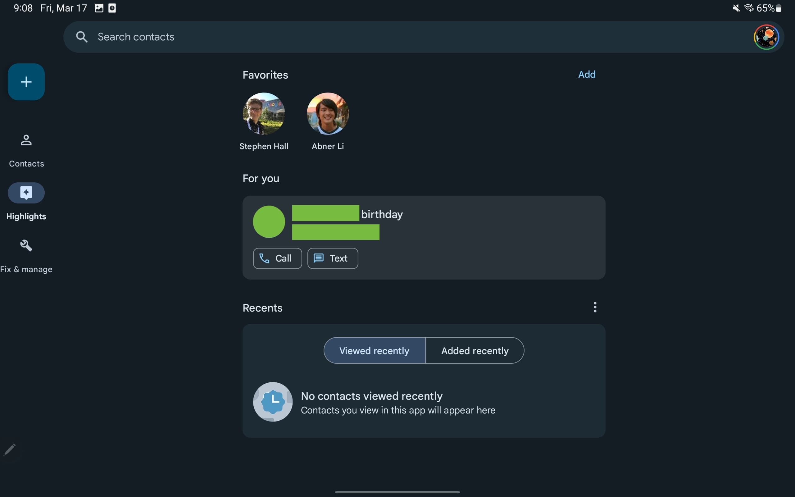
Highlights just makes use of a single, centered column with a lot of empty space to the left and right, as well as a wide search bar. The same can be said of Fix & manage.
We’re seeing the Google Contacts redesign rolled out with version 4.3. The service has seen a flurry of developments as of late, which started with a new Wear OS 3 app and Favorite contacts Tile last year. The phone application picked up a Highlights tab and is working on new homescreen widgets that look quite nice.
More on Google Contacts:
- Google Contacts feed highlighting upcoming birthdays with ‘For you’
- You can now edit Google Contacts directly from the Gmail sidebar
- Google Contacts preps new widget to pin favorites to your homescreen [Gallery]
- You can now set Google Illustrations in Contacts for Android
FTC: We use income earning auto affiliate links. More.


Comments