Android 14 DP2 has been out for a few weeks now, and our team is still managing to locate new features within. The latest is a new way to add more contrast to your Material You theme to make things easier to see and read.
Starting with Android 12, Google’s operating system took on a far more colorful look with the Material You redesign. Using the colors of your current wallpaper, Android can automatically generate a full Material You color scheme for your phone, theming significant parts of Android itself, many of Google’s apps, and even some third-party apps.
That automatic theme uses color science to ensure that there is sufficient contrast between the various things on your screen. For instance, if you put light-gray text on a white background, you’ll likely have trouble reading it.
For most people, the color selections made by Android and Material You have enough contrast to distinguish between cards, icons, text, and more. Over time though, people’s eyes have a tendency to degrade, and eventually, it becomes helpful to have a bit more visual contrast to stay productive.
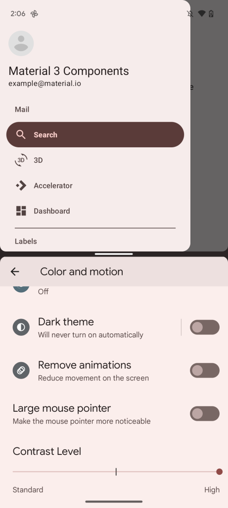
To that end, it seems Google intends for Android 14 to make Material You themes a bit more accessible. In the latest Developer Preview, if you open the Settings app and tap “Color and motion,” you’ll find a newly added slider called “Contrast Level.”
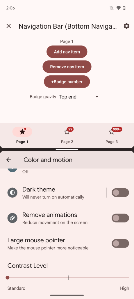
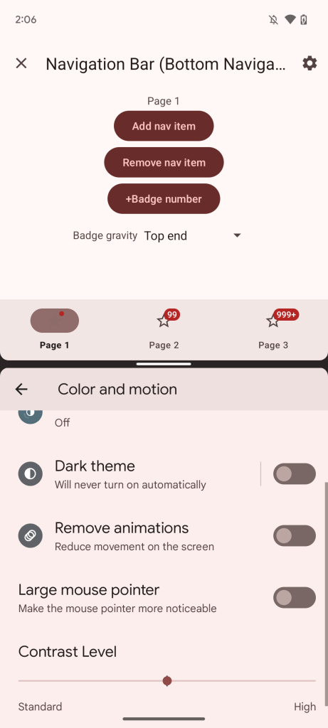
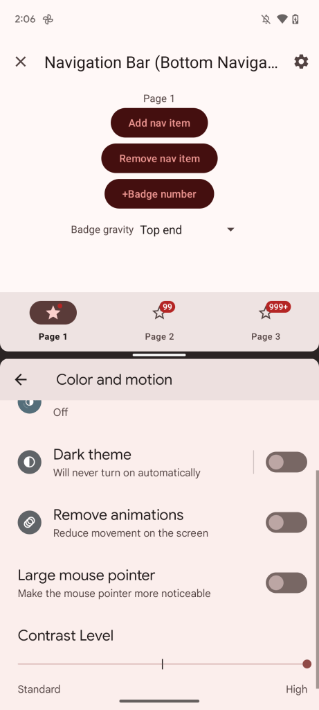
Weirdly enough, the slider doesn’t seem to affect the design or colors of Android itself, as turning up the contrast to the middle or highest settings causes no obvious changes. Despite that, certain apps built for Android 14 do respect the increased contrast levels, as seen below in Google’s Material Design Catalog demo app.
At first, it may seem like only some colors are changing, such as the shade used for things that are currently selected, but on closer inspection, quite a few colors are tweaked with each option. Almost everything gets a slightly different hue, from text colors and background shades to accents and selections.
Currently, there are three options for your Material You color contrast: “Standard” (the default appearance), “High” (significantly higher contrast), and a middle option that splits the difference. However, the middle option appears to be buggy for now, as some parts of Material You end up changing to be the same color.
In practice, Android 14’s adjustable contrast is quite welcomed and, if anything, speaks to the power and utility of Material You. Since the contrast is changing at the Material You level, any apps that fully adopt Material You can automatically benefit from the increased accessibility.
Dylan Roussel contributed to this article.
FTC: We use income earning auto affiliate links. More.


Comments