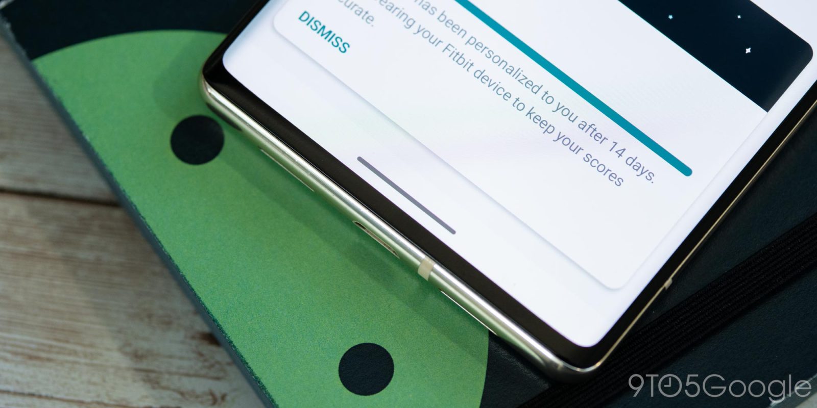
On-screen navigation is one of the things that made earlier versions of Android unique, and as time has gone on, that feature has evolved. In Android 14 Beta 1, Google is finally addressing a long-standing complaint with the navigation bar appearance that finally forces apps to have a “transparent” navigation bar.
Android’s navigation bar has, for years now, supported the ability to change its color to match the app on screen or to be completely transparent and show content that is “behind” the navigation buttons or gesture bar. But, in many cases, there are apps that will simply default to a black space around the buttons or gesture bar, which is a bit annoying in certain cases.
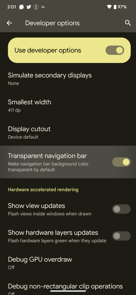
In Android 14 Beta 1, Google is introducing a new developer option that forces a “transparent navigation bar” across the system, making all apps change the color of the navigation bar to match the app itself. Google calls this a “transparent” bar, explaining it as follows:
Make navigation bar background color transparent by default
And in the right situation, that is what will happen. In our testing, though, this isn’t what you’ll usually see.
Flipping on this setting (Settings > System > Developer Options > Transparent navigation bar) will set the navigation bar on a system level to be transparent. But in most apps that lack this functionality already, it will simply match the background color of the current app. Toggling this setting won’t apply a truly transparent navigation bar because text and UI elements under the bar won’t show in that area. We believe that apps will behave in this way when a particular app is not designed to render edge-to-edge. And, frankly, it’s not surprising, given this is a developer option and not a user-facing feature.
As of Android 14 Beta 1, this setting doesn’t seem to work super reliably, but we were able to see it in action in the Fitbit app’s “Readiness” page, which usually defaults to a black bar, as well as the Sam’s Club app and UPS app. All of those usually have a black bar at the bottom with a white app interface, but this setting turns the navigation bar white on all three. Turning the toggle back off reverted all of them to that previous state.

It’s not entirely clear whether or not Google will carry this feature through the final release of Android 14 later this year, but with so many wishing for a true transparent navigation bar option, we hope this is one Google not only keeps but works to expand.
We’re still digging into the first Android 14 beta to see everything that’s new, so stay tuned to 9to5Google! If you find anything we haven’t, drop a comment below or let us know on Twitter or via email.
Dylan Roussel and Kyle Bradshaw contributed to this post.
More on Android 14:
- Google rolling out Android 14 Beta 1 for Pixel phones
- How to install the Android 14 Beta on Google Pixel
- Here’s everything new in Android 14 Beta 1 [Gallery]
FTC: We use income earning auto affiliate links. More.


Comments