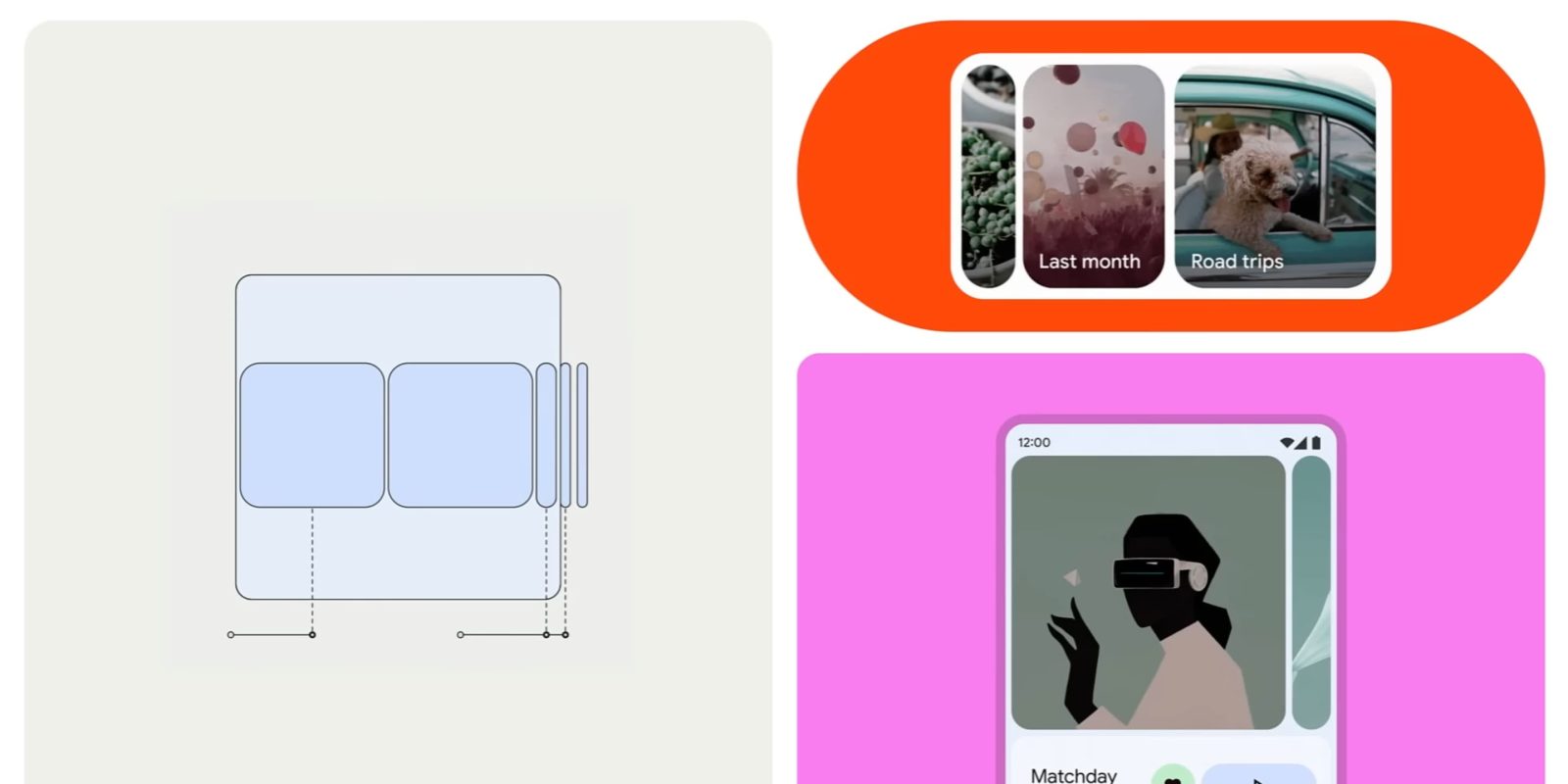
As work on Material 3 continues, Google now offers a delightful new carousel component. It might look like the wallpaper shortcut when you long press on the Pixel Launcher, but only the shape is similar there. The full carousel is quite animated.
Rather than having all the images in the carousel be of equal size, “items expand and shrink as they’re scrolled,” with their shapes changing from something close to a rounded square (large) to rectangles (medium) and vertical pills (small). Google emphasizes how developers should “avoid setting carousel items so small that the image isn’t recognizable,” with slivers discouraged.
After being scrolled, carousel items snap into place to maintain the same layout.
On mobile, you might see (from left to right) a large, medium, and small carousel item. On a tablet, it might be large, large, medium, and small.
Google notes how “carousel items move at a different speed than their content, creating a parallax effect,” and it supports an optional text label that’s just a few characters.
The Material team did a lot of testing; you can read about that here.
The team believes this new carousel leans into the most expressive parts — “Spirited” in the Making Material You series — of Material 3, including “drawing from the rounded corners of the Material shape system, and the smooth, responsive flow from the Material motion system.”
It uses adaptive shape morphing and dynamic scrolling to create a parallax effect to give users a unique and fresh experience for a familiar pattern.
Image carousels are the most obvious example, but Google mocked it up for news headlines and even music apps on now playing screens.
With Material Design Components for Android going stable this week, developers can more comfortably adopt it. In terms of first-party apps, the first implementation will be in Google Photos, presumably for the Memories carousel at the top of the app today.
FTC: We use income earning auto affiliate links. More.


Comments