Google Design has redone its website, and it is quite fun to explore. To mark the occasion, there is a series of short design films about “The Making of Material You.”
Revamped Google Design
It’s a cool website to play around with, replacing the old blog-style format. Just look at that circular cursor that changes the color of what’s being spotlighted. Meanwhile, moving the cursor to the top-right corner of the screen where search and the overflow menu are (or other buttons, like play/pause) will highlight it, similar to mouse/trackpad support on iPadOS.
Be sure to read the introduction letter that has some thoughts on what generative AI (and hyper-personalization) means for design:
Such unprecedented customization would redefine the individual’s relationship with products and services, granting them a profound sense of ownership and personal expression.
In this future, we designers invite AI and individual users to participate in the design process— relinquishing the control we once held solely. Which raises the question: what role will the designer’s unique fingerprint play in the creative process?
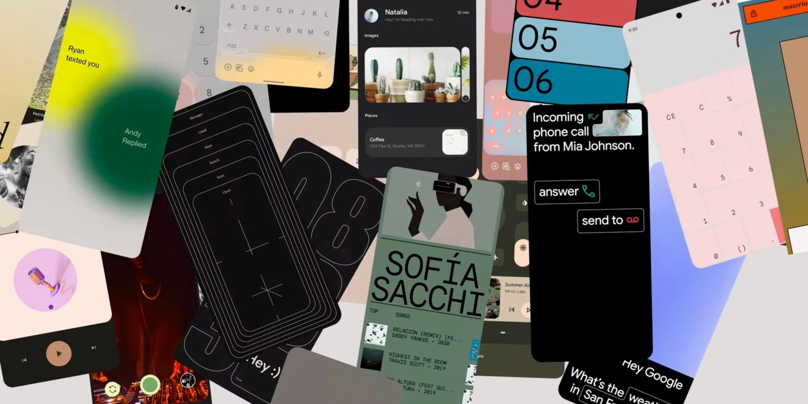
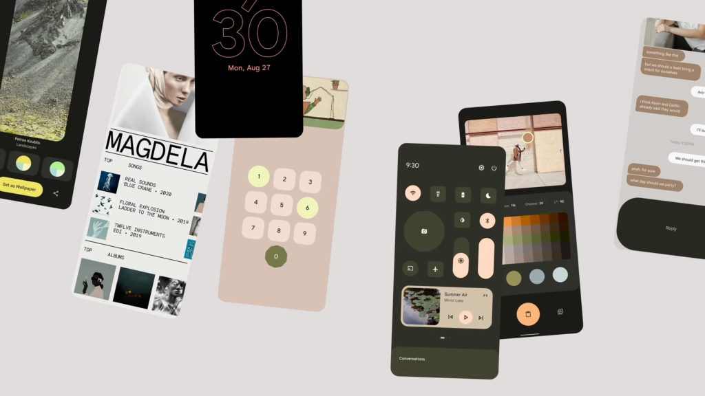
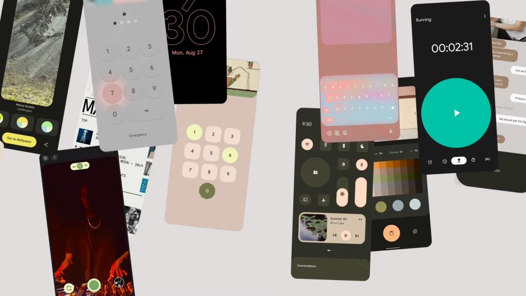
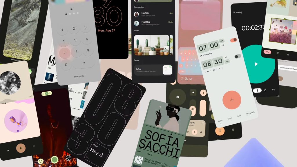
Making Material You
A film series exploring how Google is imagining an adaptive, personal, and expressive future for design
These short videos — the entire series is just over six minutes — reiterate what Google has previously said about Material You and provide a good overview.
In “Unexpected,” Google provides some insight into the start of the design process:
See, when we started drawing Material You, we were choking on our own rules. So, we loosened up. People started bringing their first ideas to the table. The big, never in a million years will we actually make these ideas. We loved it.
To be clear, these should be thought of as older concepts/mockups that helped eventually contribute to Material You. Some of the more interesting ones include:
- Grid-based Quick Settings with larger buttons for some shortcuts and sliders. It’s similar to the iOS Control Center, and you can see that the Media Player is integrated.
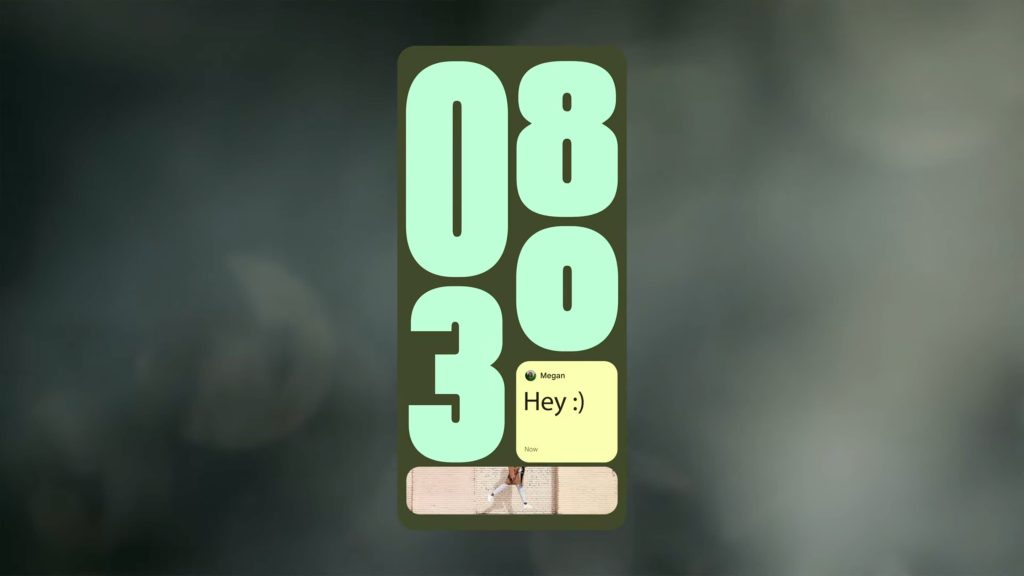
- Lockscreen with fullscreen clocks that shrink to make way for incoming notifications (messages)
- Other lockscreens with a novel way of showing notifications
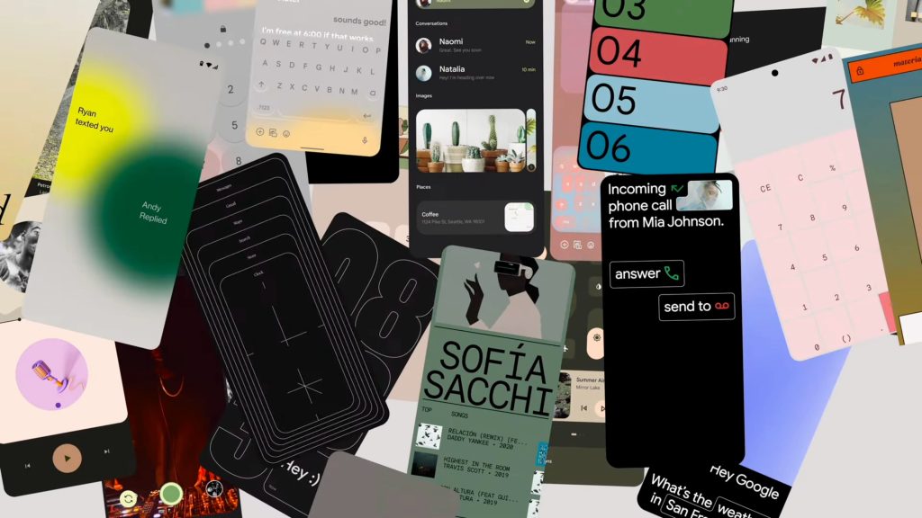
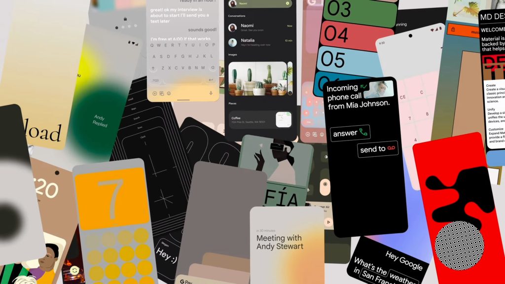
- Keyboard where app actions (emoji, photo picker, etc.) appear below the keys, while voice dictation is in the bottom-right corner like on iOS
- Very large buttons, including a Clock app that’s more or less like the one we have today
- Music/podcast app
- Fullscreen call screen
- What does it take to evolve a design system beyond the traditional rulebook? How do you make a system that creates space for interpretation and expression–space for coherence but not chaos? Can a system flex and bend without sacrificing values like consistency and accessibility? What if consistency didn’t have to mean uniformity–what if we can create a beat to build new rhythms on for the future?
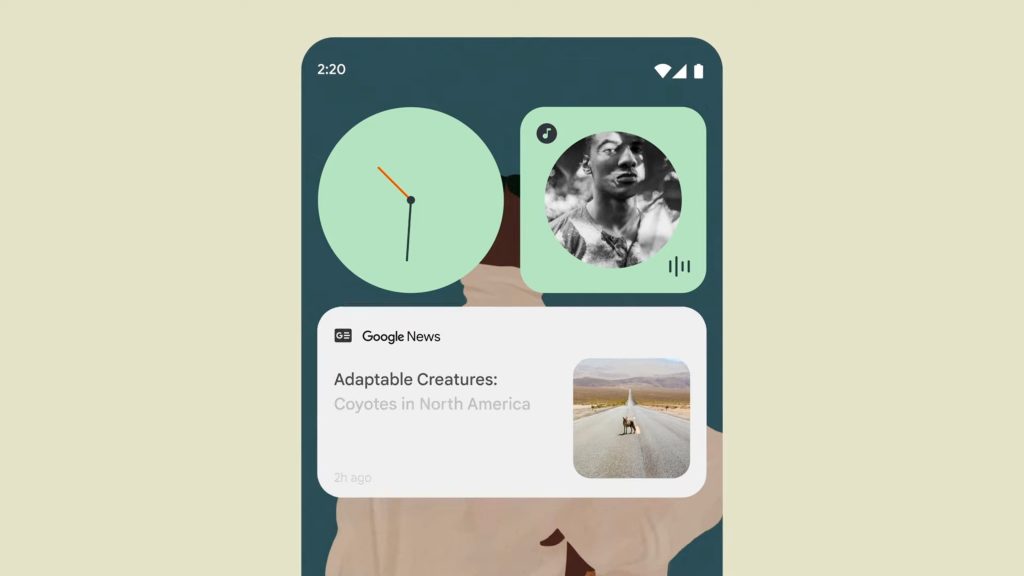
- How can the technology we live with feel more comfortable, or more like the myriad textures of daily life? How can designed experiences allow more room for feeling–expression, play, spirit–in personal devices and the technologies we surround ourselves with?
- When the team started adding up questions around color, perception, and preference–it became clear that the design decisions that work well for some users may not fit another group. That’s where it all started.
FTC: We use income earning auto affiliate links. More.


Comments