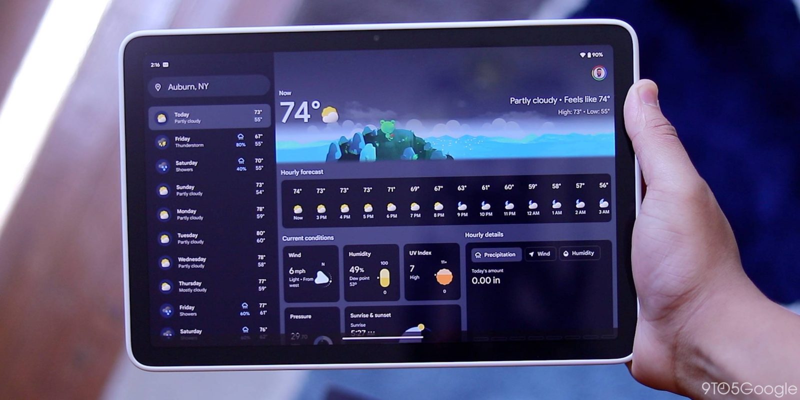
As teased at I/O 2023 last month, Google Weather is getting a Material You redesign, and it’s appearing first on the Pixel Tablet.
In reviewing the Pixel Tablet, Google’s redesign of the Weather experience has been delightful to use.
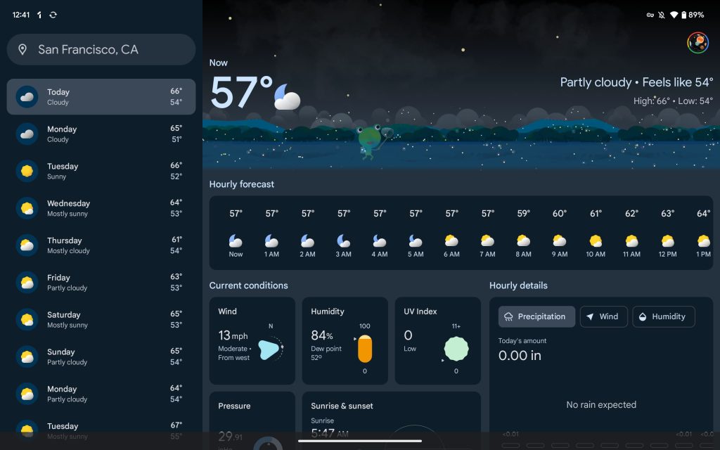
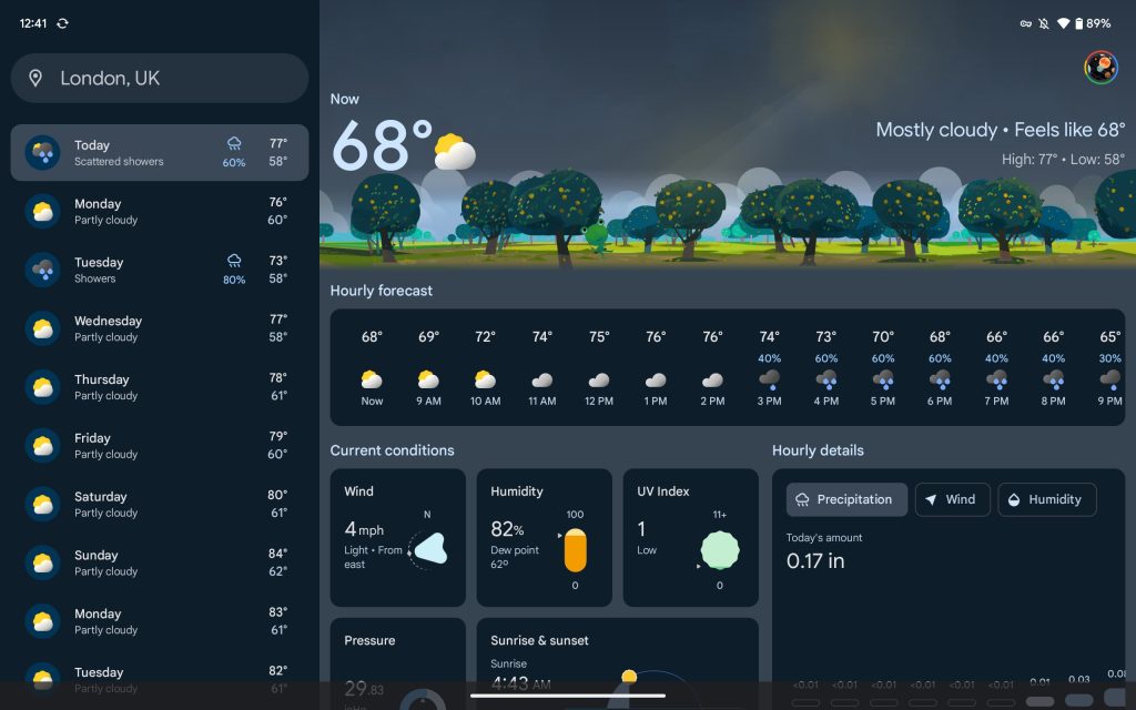
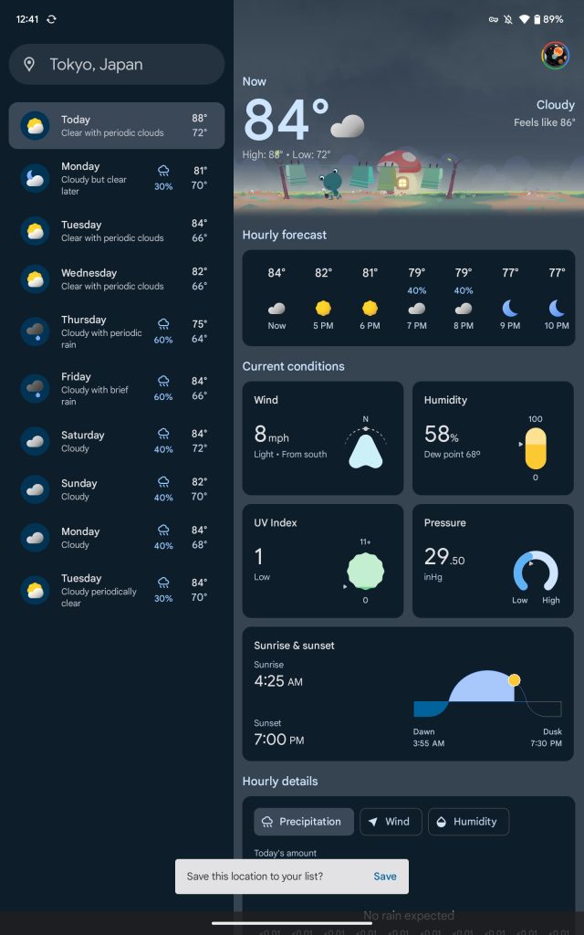
On large screens, Google Weather adopts a sidebar where the 10-day forecast appears. A pill-shaped search bar at the top shows your current location with a tap showing your saved locations.
You then get Froggy, Google’s weather mascot, with animated clouds and rays of sun at the top, depending on the current condition. It’s flanked on the left by the temperature, while condition, “feels like,” and high/low can all be found in the “Now” section.
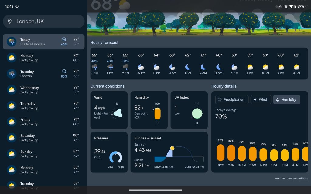
A 24-hour forecast carousel is next, displaying “Current conditions” featuring cards for Wind, Humidity, UV Index, Pressure, and Sunrise & sunset. On the right, you get “Hourly details,” including Precipitation, Wind, and Humidity.
The UI remains mostly the same in portrait orientation.
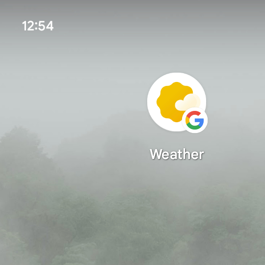
On the Pixel Tablet we’re using, this Weather experience is still part of the Google app. However, it features an updated homescreen shortcut icon that’s more modern than the previous one that’s also used by the Wear OS Weather app.
Every time you tap the shortcut, the Weather experience reloads. For example, if you were viewing a different day or city, opening the app from the homescreen will reset it to the current location/day. This issue is annoying, and we hope it eventually gets upgraded to the Google Podcasts experience, which is also powered by the Google app but doesn’t have this problem.
A dedicated app, which we believe is in development, would be the best possible solution and allow for quicker – if not more frequent – updates. The experience should be the same as the one shown above.
It remains to be seen how the new Google Weather will arrive on other devices.
FTC: We use income earning auto affiliate links. More.



Comments