Google’s large-screen push that started with Android 12L culminates with the launch of the Pixel Tablet and Fold. Now that it’s on shipping hardware, I think the tablet benefited much more than the foldable, with another Android optimization drive needed for the unique hardware form factor.
In using modern Android on the Pixel Tablet and soon the Fold, I have no idea when to split-screen multitask. This is despite the screen comfortably supporting two phone-sized apps side-by-side.
When I do want to multitask, it’s often not with a second app but rather with the notifications shade, which Android today treats as a fullscreen layer above the homescreen/apps.
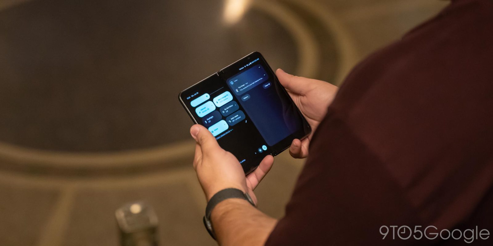
I’m imagining the ability to view and interact with the notification shade on one half of the display while the other shows an app. This is distinctly not possible at the moment, with entering split-screen for one application immediately requiring you to pick a second. Similarly, I want to have an app on one half while the other window is just a phone-sized homescreen, allowing me to browse/swipe through widgets.
That could be the first phase of things, but I’m envisioning something radically different for the future: an operating system purpose-built for Android foldables that breaks the homescreen and apps-as-silos paradigm by replacing it with an interactive and glanceable feed.
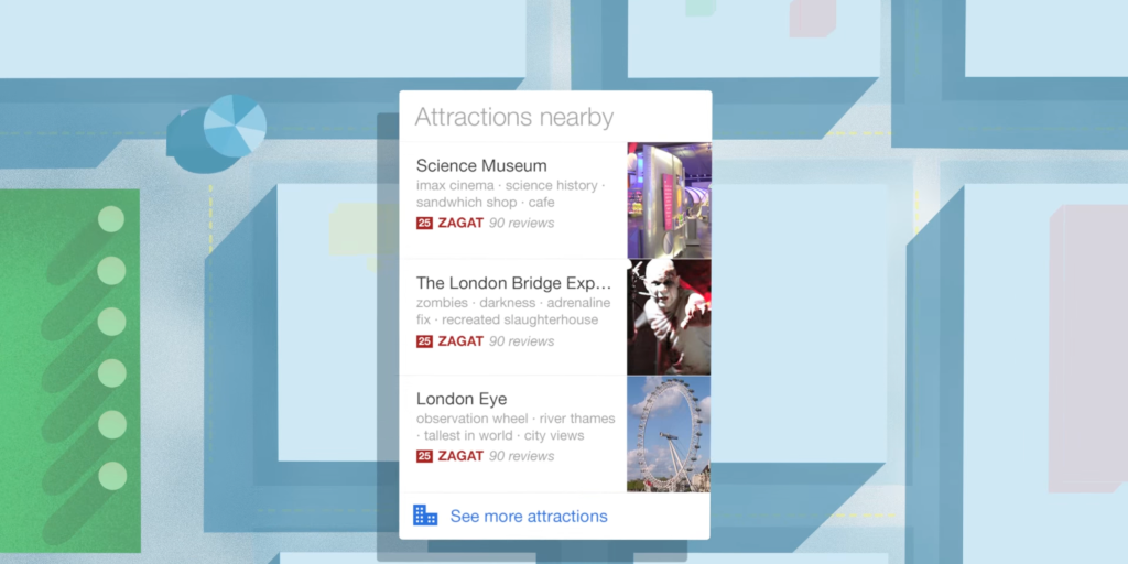
Ambitiously, Google Now
The feed I’m imagining is basically a combination of the existing notifications shade and Google Now.
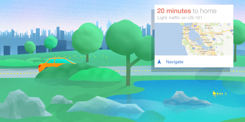
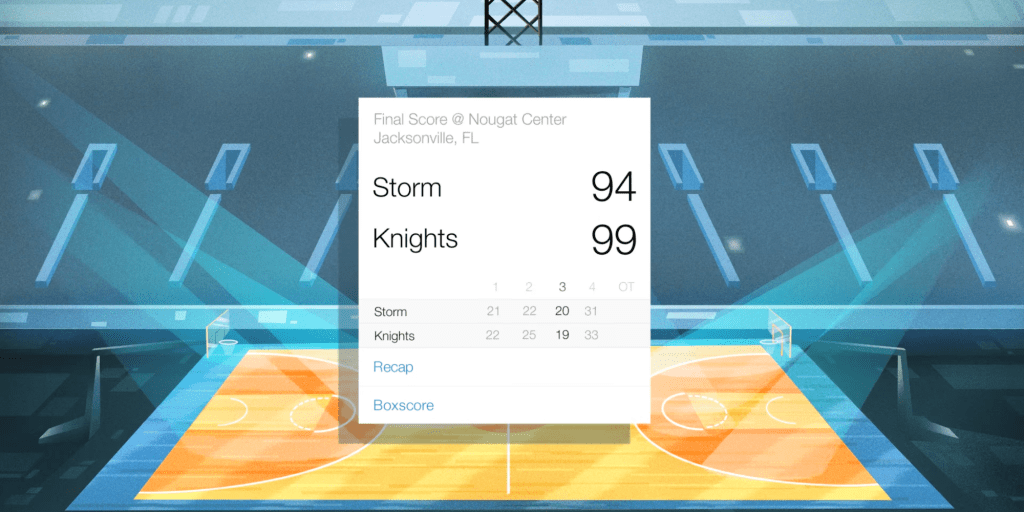
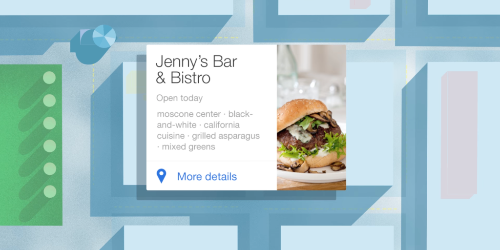
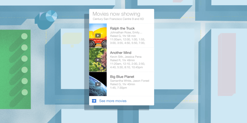
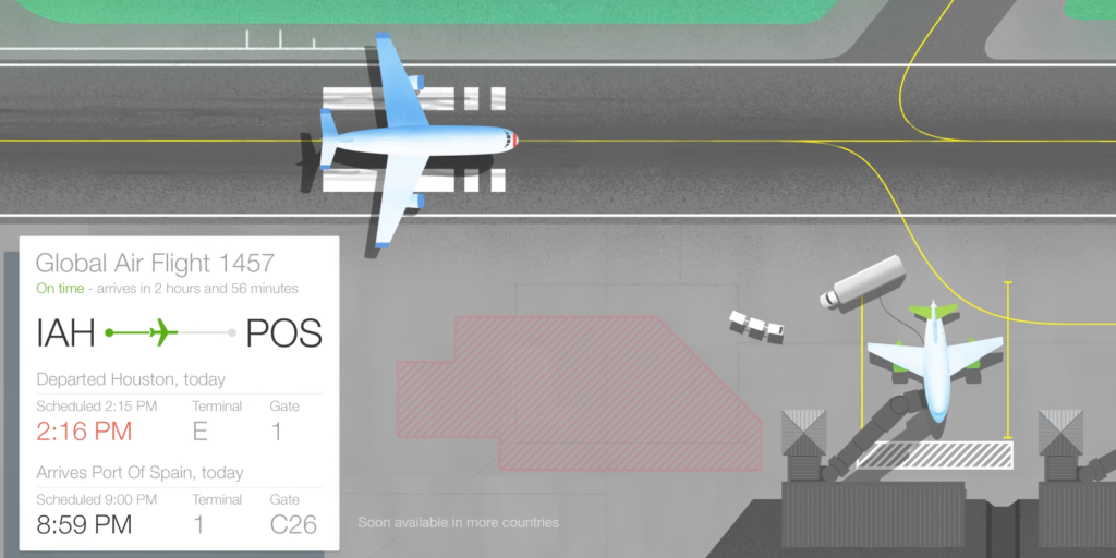
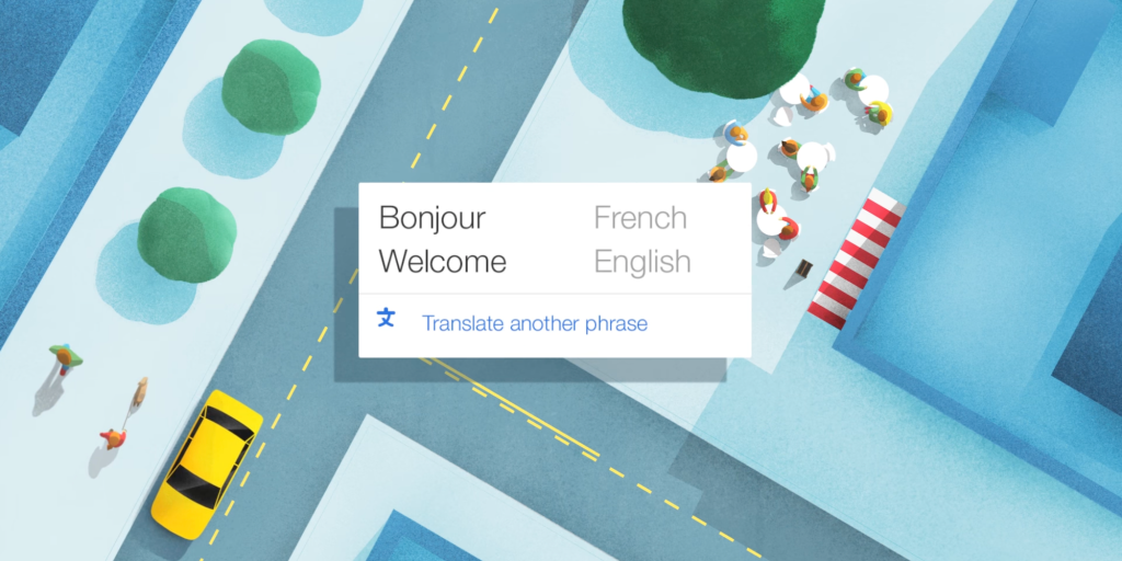
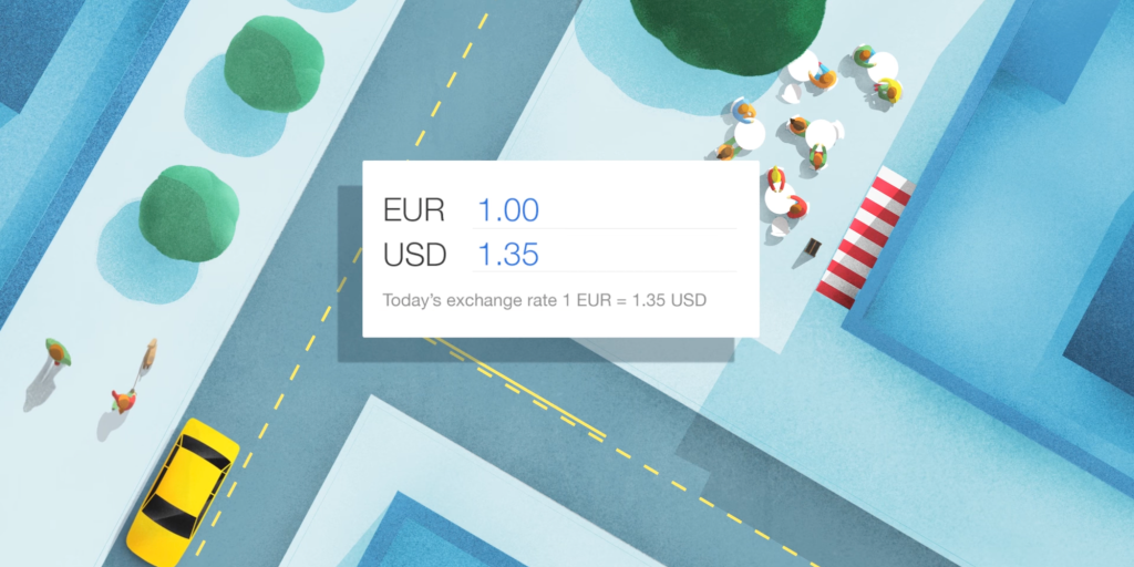
Google Now could have been the start of something radically different. Instead of apps with different layouts and behaviors, this feed surfaced information from first- and third-party sources with easy-to-digest cards. Instead of your data being siloed, Google Now curated it in one place with a consistent card-based metaphor that was easily accessible from anywhere in the OS.
I strongly believe this idea should be resurfaced. Instead of being beholden to apps, an operating system with a feed as the primary UI makes it easy to get to information that’s fundamentally yours.
For the past 15 or so years, the primary interaction method for smartphones (and tablets) has been launching an app from a grid of icons. (The only real break we’ve had from that is smartwatches, where the watch face with data-rich complications is the thing you primarily interact with.)
To its credit, the homescreen and using one app at a time is wildly simple, thus allowing Android and iOS to become the primary computing platform for most, but hopefully, we won’t stagnate there. Widgets have been one attempt to add more real-time information to the homescreen, but there will always be the need for a notification shade (and lockscreen) to deliver the most pressing alerts.
Google Now by way of the notification shade
The best place to build a modern Google Now is through notifications. Android alerts are already incredibly vibrant and actionable. I can reply to messages, which is especially easy with smart suggestions, and read most of an email to decide whether to swipe away for later or delete/archive.
I imagine notifications in a Google Now-influenced OS to be more than compact lines of text. There could be consistent templates for key notification types like upcoming events, tasks/to-dos, conversations, weather, upcoming flights, transit, news, smart home (doorbell) alerts, points of interest.
The key would be for notifications to be highly glanceable and actionable without having to venture into the full app to get tasks done. There could be mini-apps like media controls that allow for some browsing, browseable lists for upcoming events and reminders, or other complication-like experiences with live data that would not be too different from advanced widgets or could even be just that. There would have to be some sort of ranking system with conversations shown first, just like it is today.
While Google Now had third-party developer buy-in, notifications can serve as the fallback experience for services that don’t immediately adopt the new system. The advantage here is that Google could do a lot with the first-party apps it does control, from Messages to upcoming Calendar events and Tasks. The key, of course, would be taking email notifications from third-party services and making them more digestible.
Start on foldables
The best place to debut something like this is foldables. I’m specifically thinking of how the interior screen is physically partitioned by a crease that makes for a natural separator between apps and system screens.
I’m envisioning the cover display (of a Fold-like device) showing the typical homescreen experience. When unfolded, that would appear on the right half of the inner screen, while the left shows you the existing notification shade (with a row of Quick Settings at the top) by default. You can continue to open apps on either side, but the “home” state of that left side should be a feed of notifications.
Regardless of whether Google Now returns, I think something as vital as the notification shade should no longer be relegated to a swipe-down overlay. It’s as important as any app for getting work done and has the benefit of collating so many disparate sources.
That hardware distinction could familiarize people with the concept and is (in my opinion) a much better use of the foldable nature compared to just using the larger canvas for more or even bigger apps. Some apps truly benefit from adopting a two-column UI that lets you better interact with information, but I’m hesitant for Android to add some sort of floating window model (as Samsung has done).
There’s nothing inherently wrong with that, but it seems like wasted potential for expensive hardware if we just end up replicating windowing from desktop operating systems.
FTC: We use income earning auto affiliate links. More.



Comments