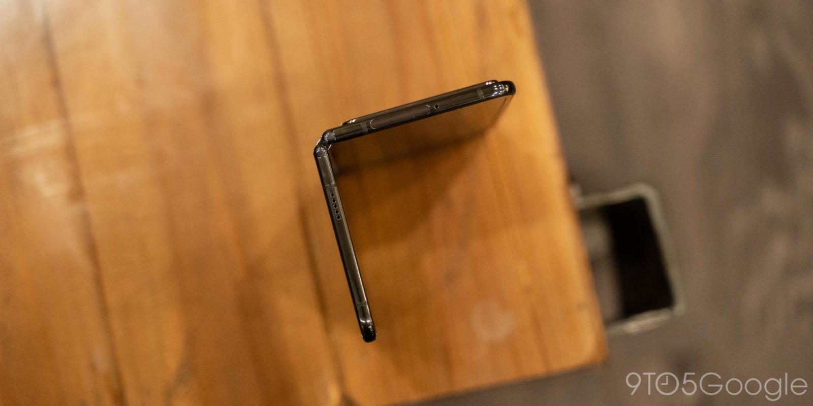
I think foldable screens are flawed as every fold wears out the display, but I do admit that the tech is getting good enough for that to not matter over the average lifespan of a phone. That said, I think there’s a more fundamental and conceptual question to be asked about today’s Android foldables: Does most large-screen content have to span the screen, and be physically connected when going from one half of a fold to the other?
In the case of watching videos, viewing pictures, and gaming, the answer is an obvious yes. In those moments, the tablet-like experience of a single, large screen is what you’d want most.
However, I’d argue that most on-the-go multitasking is not that well-served by a continuous screen given the hardware trade-offs, like durability, needed to get there. A connected screen is slightly more immersive, but the unavoidable crease is not particularly elegant and feels crinkly.
The alternative is an Android foldable comprised of two standalone screens connected by a hinge. In a way, I am describing the Surface Duo with its 360-degree hinge, but more so I’m thinking of a foldable that doesn’t close inward by default but rather folds outward, as seen in the right example below:
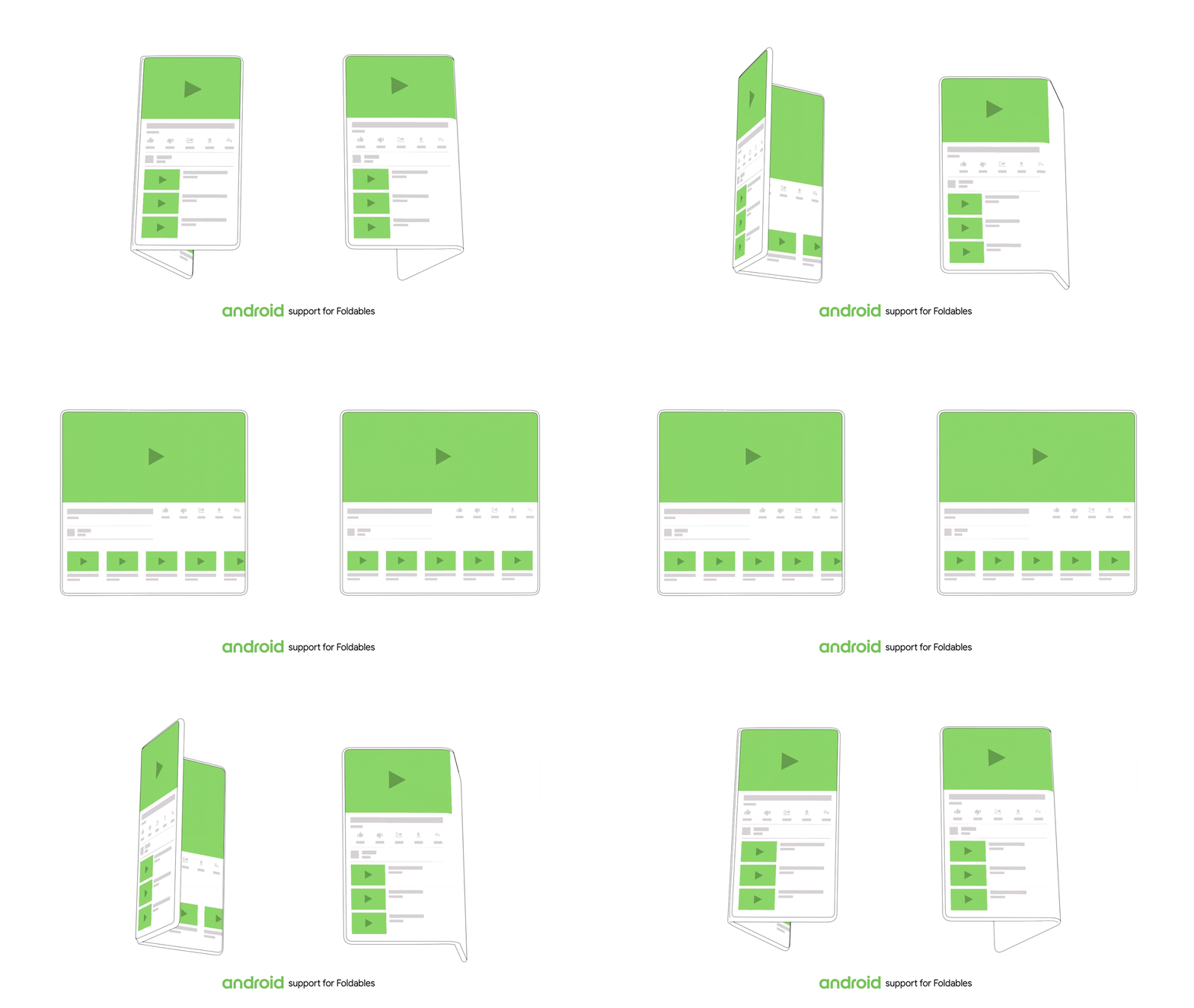
To me, this could be more efficient and affordable than having two disparate screens with one being inactive most of the time when the other is in use. Having one less screen also boosts affordability, while non-folding displays are cheaper and known components. Instead, more engineering time could be spent on the hinge, and reducing the gap between displays. Meanwhile, the default state of having a screen on the front and back means that you don’t have to open first before using your phone, which was the case of the Duo.
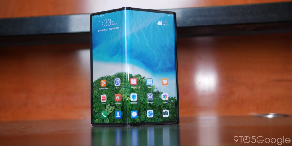
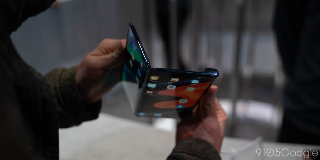
An early example of this would be the ZTE Axon M, while there’s the Huawei Mate X (shown below) and Xs that accomplished the same outward hinge with a foldable screen.
Again, this form factor is not ideal for media consumption, but I think it’s promising for a more productivity-focused device that could last much longer than something with a foldable display.
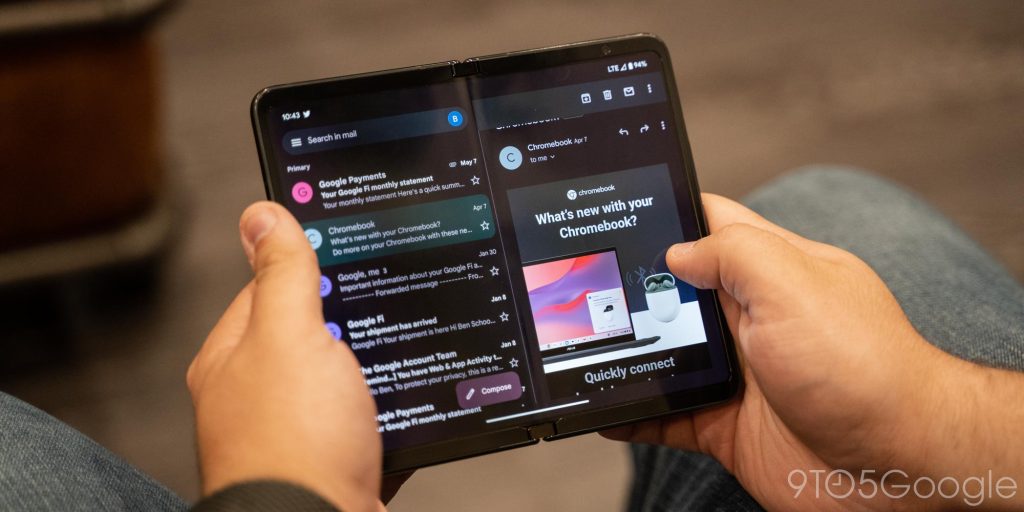
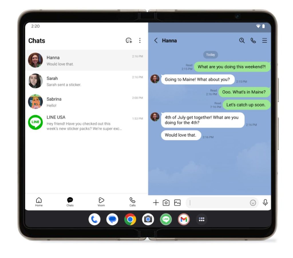
Some of today’s foldable apps are already well-suited for a dual-display device. Dual-column layouts, which make up the majority of large-screen optimizations and redesigns (at least Google’s), don’t need to span and be connected, with content working perfectly well by staying on the left and right sides.
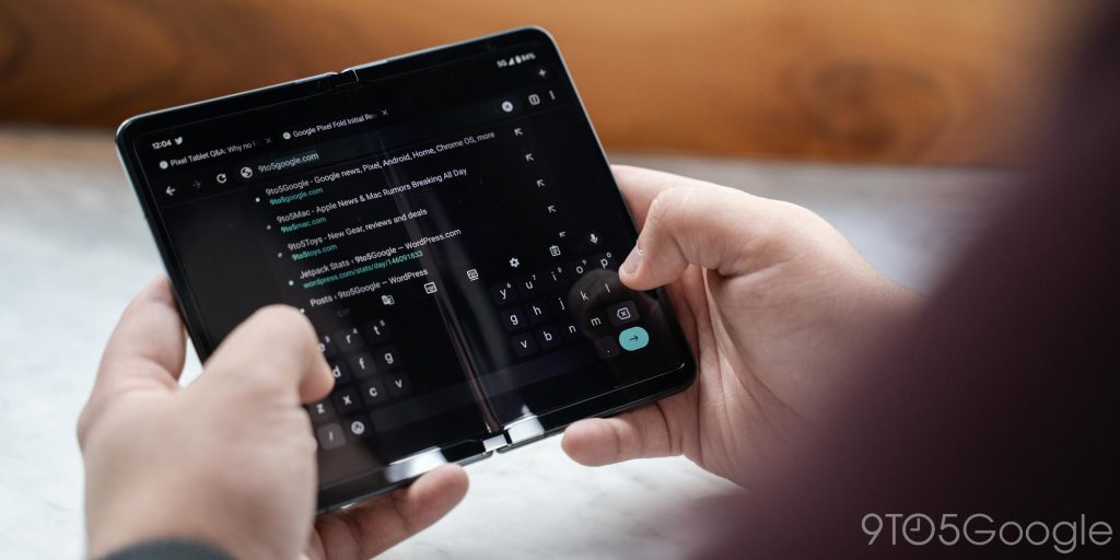
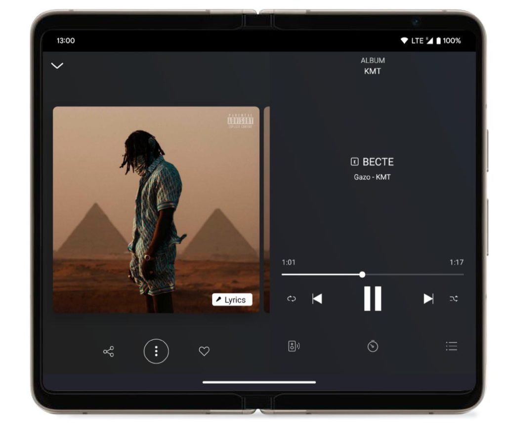
For example, the list of emails or message conversations can stay on the left, while the body or thread fits perfectly on the right. Another example is YouTube Music’s Now Playing screen on tablets featuring controls on one side and your queue on the other. There’s also Google Keep’s grid or list of notes and the actual contents, while the two sides of Gboard’s split keyboard don’t have to connect. When reading a book, a connected screen might allow you to do better page turn animations, but that’s far from necessary.
That said, not all large screen apps today are cleanly separated down the middle, as seen with WhatsApp and Discord. This would require another redesign if this style of dual-screen foldable ever took off.
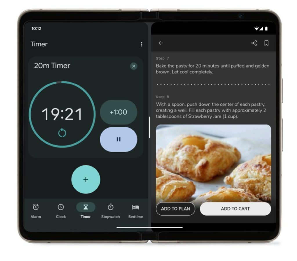
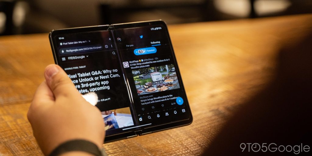
Meanwhile, multitasking that just involves two apps side-by-side already sees each window virtually partitioned. In fact, a physical gap could help separate and distinguish the two experiences further.
At this point, it seems pretty clear that Android OEMs are coalescing around two foldable factors: flips and folds. I hope there’s still room for hardware differentiation.
FTC: We use income earning auto affiliate links. More.


Comments