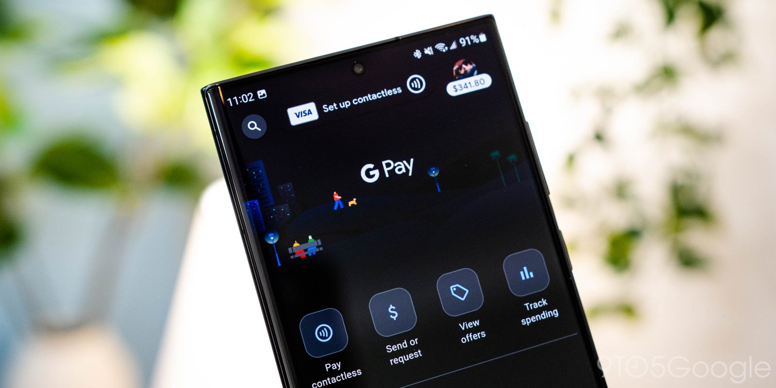
Following the Material You redesign, GPay is readying another change that consolidates the app to just two tabs in the bottom bar.
Update 8/7: After several months of testing, this small GPay redesign is more widely rolling out. (A bottom bar with only two tabs continues to look off.)
We’re seeing it with version 187.1.2, which is rolling out today, and there are some minor visual tweaks (outline-style cards) from earlier this year. You can find any “Activated deals” by tapping your profile photo in the top-right corner.
Original 2/24: Since launch, GPay has been organized by Explore, Pay, and Insights. That first tab showed deals, and it’s now just a card in the Pay tab that opens a fullscreen feed. This section is called “Top deals for you” and is “Based on your activity.”
You get cards (including “Sponsored” ones) with the merchant at the top and the deal summarized underneath. At the bottom are chips by category (e.g., Food & drink, Bills & utilities, Housing) and store name. These can be tapped to load a dedicated feed.
In a touch of fun, there’s an “I’m feeling lucky” button that gives you a random category.
It comes as Google in December announced that GPay (and Assistant) are losing “pay for gas” in the US and the ability to pay in-app for parking. With that removal, Gpay’s main feed is down to just Activity and Businesses, thus allowing for today’s addition.
This consolidation to two GPay tabs is not yet widely rolled out (with version 172.1.7) and has a server-side component.
More on Google Pay/Wallet:
- American Express cards can now use Google Pay’s virtual cards on Chrome and Android
- Android 13 QPR2 Beta preps ability to change the Pixel’s lockscreen shortcuts
- Google Wallet adds whimsical Pay animations for the holidays
- Here’s what a digital driver’s license looks like on Android in Google Wallet [Gallery]
Thanks Jondan!
FTC: We use income earning auto affiliate links. More.


Comments