Following Tuesday’s announcement, Meta is widely rolling out the Threads web app, and it offers a pretty straightforward translation of the mobile experience.
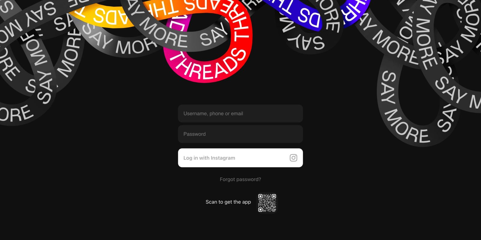
Once rolled out for you, visiting threads.net will show a “Username, phone or email” and password field where you enter credentials from Instagram, which is followed by 2FA.
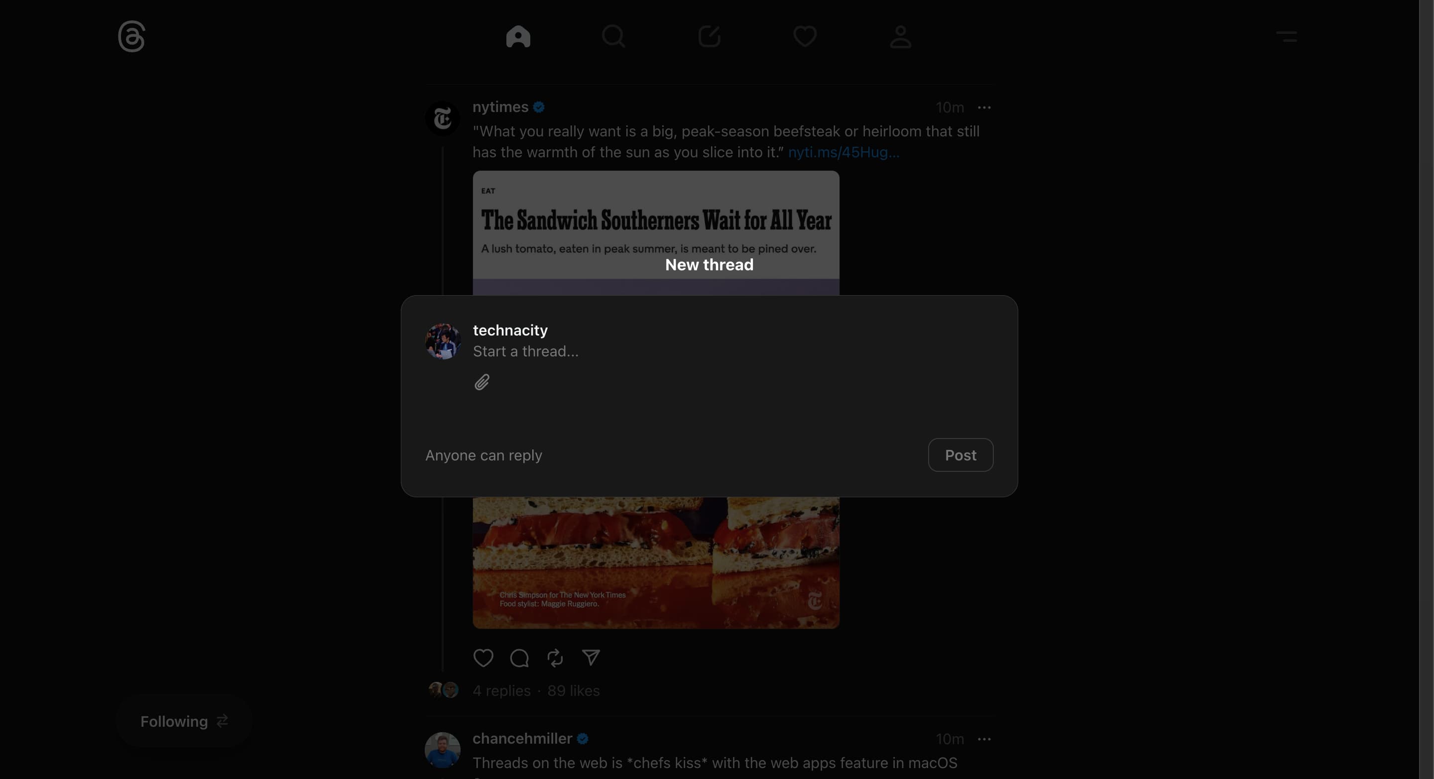
Threads on the web makes use of an app bar at the top with the same five tabs you get on mobile. An overflow menu at the right corner lets you switch between light and dark theme, see About, and log out.
On the Home tab, the “For you” and “Following” switcher is a FAB in the bottom-left corner. If you’re scrolled all the way up, you can “Start a thread…” there, but otherwise the post button in the app bar opens an overlay.
One way you can refresh your feed is by tapping the Home tab icon in the app bar. Otherwise, the UI is pretty close to the Android and iOS apps.
The website is responsive and shrinking the window to a column will get rid of the left/right padding and eventually the app bar. In the narrowest layout, the ability to post looks to be gone until you expand back out.
Compared to Twitter (now X) and Mastodon , the website feels simpler in a reflection of how the Meta competitor is still pretty barebones. That said, it’s more friendly, with X’s sidebar overflowing with icons.
More on Threads:
- Threads rolling out chronological ‘Following’ tab on Android
- How to use features in Threads you might not know about
- Threads readies handy explainer of Mastodon and the fediverse
FTC: We use income earning auto affiliate links. More.


Comments