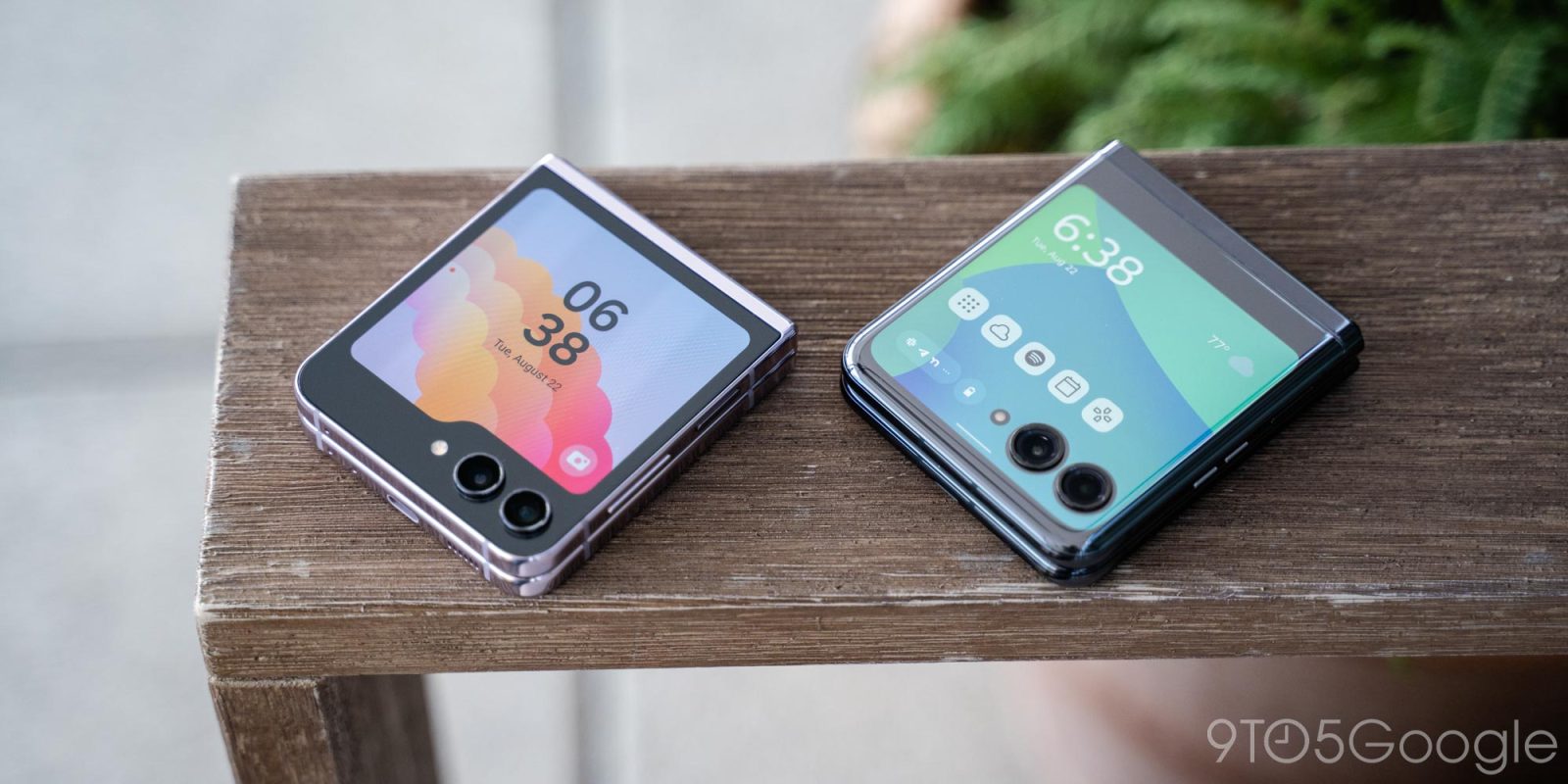
Foldable flip phones have proven to be a hit, and the two best options on the market right now are Samsung’s Galaxy Z Flip 5 and the Motorola Razr+. Both devices have a lot to offer, and it’s a tough call between the two. Here’s what you should consider when weighing things out between the two.
Galaxy Z Flip 5 vs Motorola Razr+ on paper
Foldable flip phones tend to share a lot in common on paper, and that remains true for the Galaxy Z Flip 5 and the Motorola Razr+. The two devices have similar displays both inside and out, similar cameras, and the same price tag.
- Galaxy Z Flip 5 Review: Near-perfect hardware just barely misses the mark on software
- Motorola Razr+ Review: The flip phone king reborn
Here’s a full breakdown of the specs.
| Galaxy Z Flip 5 | Motorola Razr+ | |
| Outer display | 3.4-inch | 3.6-inch |
| Inner display | 6.7-inch | 6.9-inch |
| Processor | Snapdragon 8 Gen 2 for Galaxy | Snapdragon 8+ Gen 1 |
| Storage/RAM | 256GB/512GB UFS 4.0, 8GB RAM | 256GB/512GB UFS 3.1, 8GB/12GB RAM |
| Hinge rating | 200,000 open/close | 200,000 open/close |
| Thickness | 15.1mm folded | 15.1mm folded |
| Battery | 3,700 mAh | 3,800 mAh |
| Cameras | 12MP/12MP UW | 12MP/13MP UW |
| Price | $999 | $999 |
There’s a clear winner on hardware
Foldable hardware is key to a good experience, and I think Samsung has the objectlvey better device.
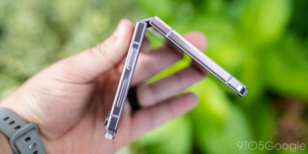
Galaxy Z Flip 5 has a fairly boxy design with flat sides and a glossy glass back. Genuinely, it’s not my favorite feel in the hand because it feels almost generic. But, what Samsung’s design has going for it is reliability. The hinge is especially important. The latest version of Samsung’s hinge keeps the phone fairly thin and it opens virtually silently, and holds its position well if you try to stand it up at an angle.
Samsung’s hinge, while still leaving a very noticeable crease on the inside, feels like how you’d expect a $1,000 folding phone to feel. It just works.
The Motorola Razr+, on the other hand, feels a little different in the hardware department. There are good parts, definitely. I like the curved edges and especially the rounded frame, as it’s easier to open up. I also like Motorola’s textured back because it feels unique and doesn’t scratch up – in only a few weeks with Galaxy Z Flip 5, there are scratches all over that glossy rear panel.
Motorola’s design falls short mainly with the hinge. There’s “texture” to the motion of opening it, almost as if components inside are crumpling to the new shape. I’ve felt worse in foldables, with Samsung’s last generation having been a mess here, but when you unfold a Razr+ and then unfold a Flip 5, the difference is massive. I’ve also noticed over time that the Razr+’s hinge has some horizontal give. The two halves can wiggle a little bit when the device is closed, something you absolutely feel when using the cover display. I don’t think there’s any structural problem here, but it also doesn’t instill confidence.
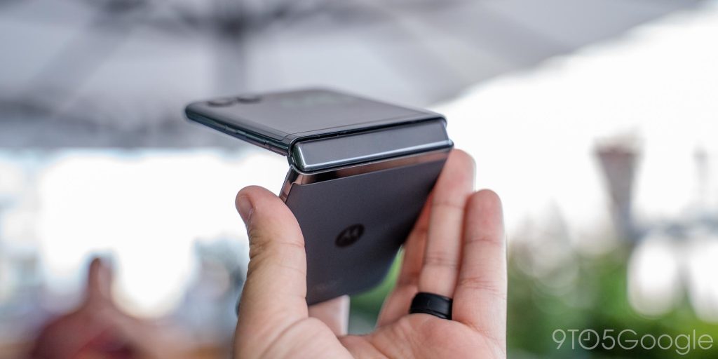
Samsung’s hardware is just polished compared to the Razr+. Motorola’s phone is by no means bad, it’s just not quite as good.
Neither camera is good, but one is consistently worse
One of the things that foldable phones have long struggled with is the camera situation, and nothing has changed on the Flip 5 and Razr+. Both devices have 12MP primary cameras and, well, they’re not good.
Compared to a traditional flagship Android phone at $1,000, or even something cheaper like the $600 Pixel 7, both the Flip and the Razr are very far behind. The cameras are noticeably worse.
Both the Galaxy Z Flip 5 and Motorola Razr+ tend to lack detail and suffer in low light. They also struggle if there’s any motion in the shot. Through my use of both devices, though, I’ve really found that it’s the Razr that fails more often. Both of these devices tend to skew towards mediocrity with their shots, but where I can get a shot I’m very happy with occasionally on the Flip 5, I’ve never been truly happy with a picture on the Razr+. Motorola’s device is just markedly worse in the camera department.
Here are a couple of comparisons from a trip to New York City this past week.




The cover display software is what matters
The Galaxy Z Flip 5 and Motorola Razr+ have basically the same outer display. The Flip has a 3.4-inch outer panel while the Razr+ is 3.6-inch. The difference is neglible, to the point where it’s really hard to say either is objectively better.
The main difference between the two is that, on the Razr, there are cameras in the way of the display. To me, that leaves a bit less usable space, as you’ll need to run a compact view of the app to access everything. But really, both have effectively the same amount of space.
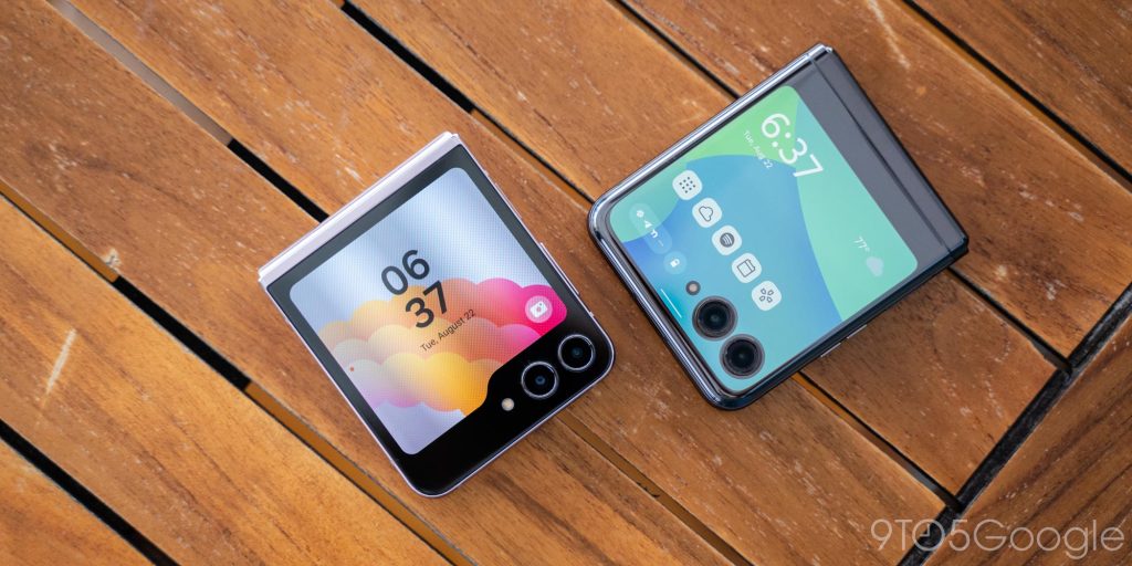
There’s an argument to be made for the software on both of these devices. Samsung’s One UI has a ton of features, including the “Flex Panel” that takes advantage of the Flip’s hinge to enable some extra app controls.
But the software conversation really just all comes down to the outer display.
Samsung’s cover display also has a lot more customization compared to Motorola’s. You can create custom presets for the “Flex Window” to adjust the look of the clock and more, much like you would for a smartwatch’s clock face.
Motorola’s cover screen experience, meanwhile, is less customizable. Like Samsung’s you can show a selection of widgets for the calendar, weather, and more, but the main clock face isn’t customizable at all. Samsung’s widgets also tend to be more information-dense and better-looking.
Then, of course, there’s the matter of apps.
Both the Motorola Razr+ and the Galaxy Z Flip 5 will let you run full Android apps on the outer display, though only Motorola allows that out of the box – no settings to toggle, no menus to dive through. Just pick the apps you want to use and you’re good to go.
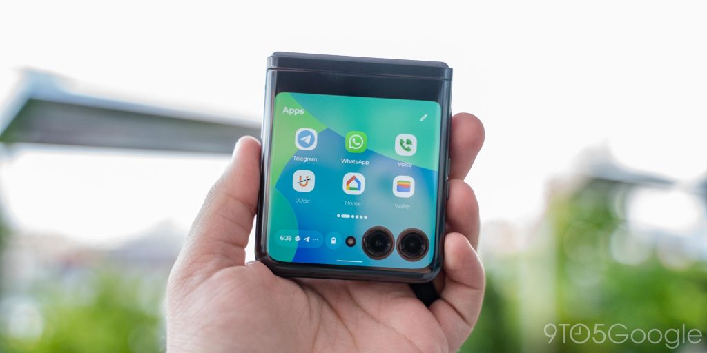
Enabling apps on the Flip 5 is a more advanced process, requiring users to enable a setting in the “Labs” portion of Samsung’s settings menu just to open a pre-selected list of six apps on the outer display. A further dive into “Good Lock” is required to run more apps, and even that still blocks some apps from working.
- How to run any app on the Galaxy Z Flip 5’s outer display with Good Lock
- Galaxy Z Flip 5 blocks the Google Wallet app on the outer display, here’s why
The Razr’s cover screen isn’t inherently better at running apps – in fact, because it has less actual space due to the cameras, it’s arguably a little worse. What Motorola does do better is everything around those apps. There’s of course the fact that apps are enabled out of the box, but also that the experience is built around that idea.
Motorola’s software has multitasking in mind. There’s a task switcher, so you can juggle apps as needed. Want to switch between Maps and Messages? On the Razr, that’s as simple as using a typical multitasking UX. On Samsung’s side, you have to entirely leave the app to grab the other, and repeat it all again to switch again. That’s frustrating!
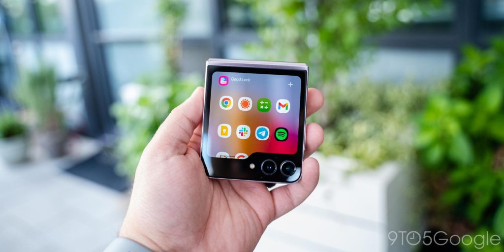
More impactful, I feel, is how you’ll access notifications and quick settings. On the Razr, you can access both of these without leaving your app, as you expect to on the inner display. But on the Galaxy, you have to entirely leave the app. That’s even more frustrating!
Motorola’s overall cover screen software feels better for apps, and that’s because it was built around that idea. Samsung’s handling of apps feels tacked on, and that’s because it is.
Why I’ll stick with the Galaxy Z Flip 5
The Google Pixel Fold is currently my main device, but my go-to companion at the moment is the Galaxy Z Flip 5. That really comes down to two aspects.
Firstly, Samsung’s flip phone just feels better to use. The sturdy hinge is comfortable to use, and the boxy frame feels safer in my pocket alongside a wallet and key fob. The Flip’s battery life is also better than the Razr in my experience, and Samsung’s camera is way more consistent than Motorola’s frankly bad shooter.
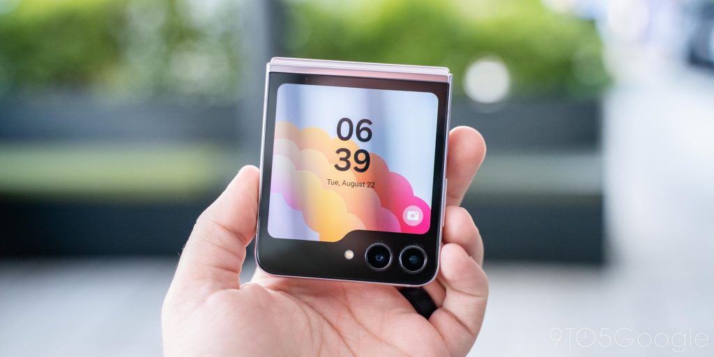
But, really, this is a close call. Both the Razr+ and the Flip 5 are excellent flip phones, and you really can’t go wrong with either one. As has always been the case on foldable flip phones, it’s all a matter of where your priorities lie.
More on Foldables:
- Pixel Fold vs. Galaxy Z Fold 5: Google’s flashy first attempt can’t beat Samsung’s experience
- Oppo Find N3 Flip is the first flip phone with three cameras, launches August 29
- Galaxy Z Flip 6 might finally bring a real camera upgrade
FTC: We use income earning auto affiliate links. More.


Comments