Instagram is one of the most popular social platforms in the world, but it has long missed out on a UI for tablets and other bigger displays. That’s finally changing…
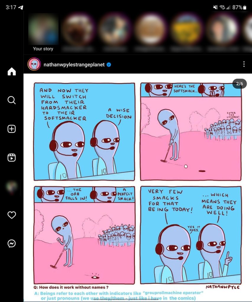
Rolling out over the past couple of weeks, Instagram for Android is picking up a new UI for big screens that’s better optimized to take advantage of the extra screen real estate on foldables and tablets.
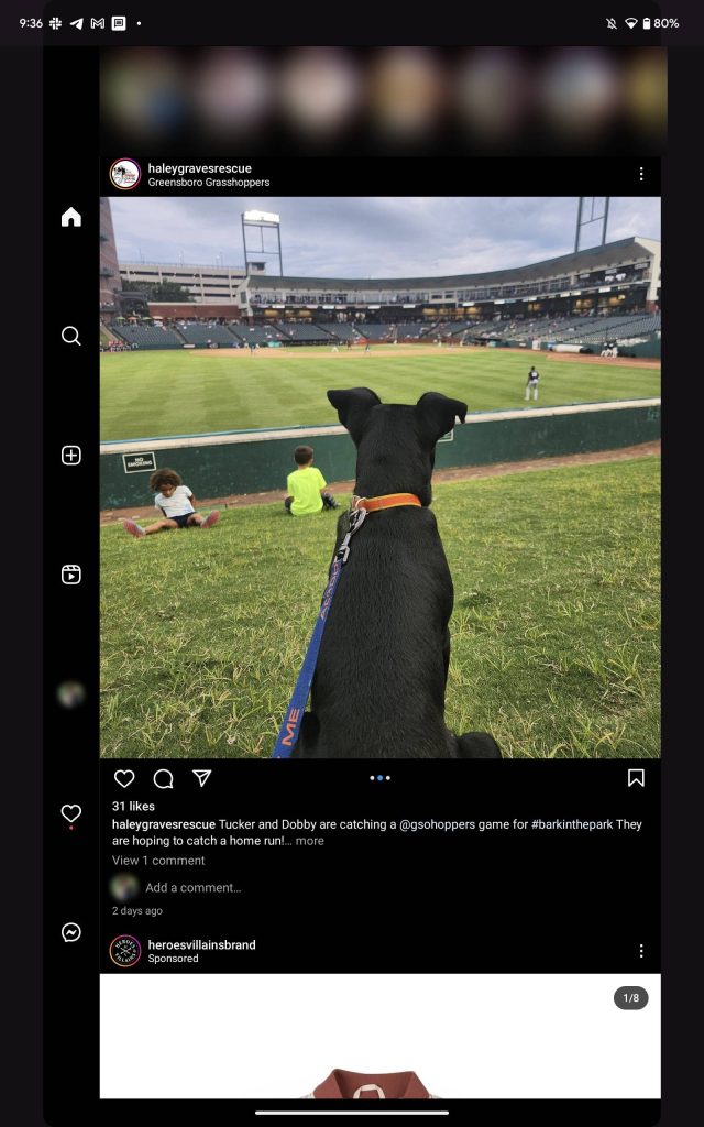
The new layout leaves Stories at the top of the UI and expands the feed out to either side of the display, all while ensuring Reels stick to a fixed aspect ratio with black bars for padding. The main change is that the app adopts a side-mounted navigation rail. Where Instagram usually shows buttons for home, search, new post, Reels, and your profile along the bottom bar, the new sidebar UI adds notifications and DMs to that list.
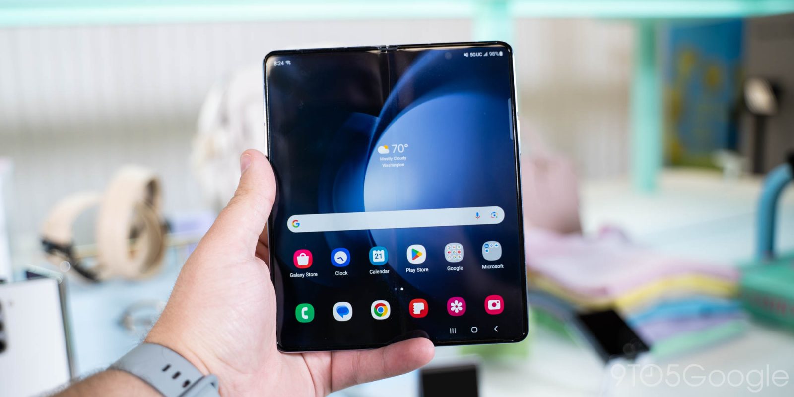
The new look feels much better on the Galaxy Z Fold 5 (and, in turn, the rest of the Fold series) but is rolling out quite slowly.
This update first showed up within days of Samsung’s Fold 5 announcement but seems to be rolling out on an account-by-account basis. In testing two of my accounts, only one shows the UI, and switching to the other account then removes it. It also seems this new UI is exclusive to the Galaxy Z Fold series, as it isn’t showing up on Google’s Pixel Fold or anything else. Luckily, it doesn’t appear to be exclusive to just the Fold 5.


Update 9/1: We’ve since confirmed that this layout is not exclusive to Samsung’s foldables, as we previously thought. In fact, it also works on Google’s Pixel Tablet when using the tablet in portrait mode. When using the tablet in landscape, the app shows its normal layout in a heavily letterboxed view, but when rotated, the tablet UI appears.
Hopefully, Instagram will continue to work on this layout to better support wide screens. As it stands today, the UI still seems to be very limited in availability, and despite working on Google’s tablet, I still can’t get it to trigger on Pixel Fold.


Google has been pushing for better support for big screens among the increasing number of foldables and the revival of Android tablets, and it’s great to see Instagram getting on board. It’s also quite ironic to get this optimization on Android first, given the ongoing outcry for an iPad-optimized interface for Instagram on Apple’s tablets. This UI seems like it would translate quite well to tablets, but it’s unclear if Instagram will ever get around to that.
More on Foldables:
- Where to pre-order Galaxy Z Flip 5 and Galaxy Z Fold 5 and get the best deal
- So, what’s stopping you from getting a foldable? [Poll]
- Honor teases launch of two new foldables coming at IFA 2023
FTC: We use income earning auto affiliate links. More.


Comments