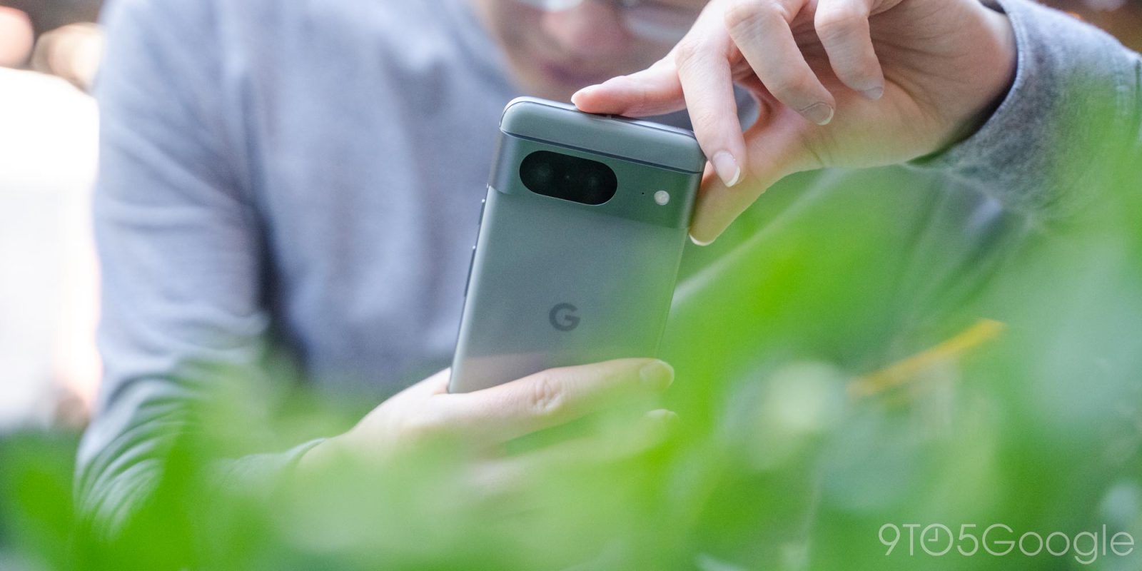
Before the Fold, I used the Pixel 7 daily because it was the smallest phone Google put out. That device, frankly, lacked a discernible personality and did not feel more than the sum of its parts. With the Pixel 8, Google designed something so entirely different – and good – that the whiplash is truly profound.
Why an initial review? 9to5Google was granted six days of early access to the Pixel 8 ahead of today’s review embargo, not nearly enough time to reach a final verdict, especially in regards to Tensor G3, battery, etc. But with sales set to begin on October 12, we’re sharing our thoughts so far and will have a full review in the coming weeks with further thoughts.
Table of contents
Design
Before this year, I considered the Pixel 3 to be Google’s most compact and comfortable phone, with the Pixel 4a, 5, and 6a being next on the list. The Pixel 7 felt unwieldy, which conditioned me to grip it tightly at all times and resulted in the corners, though rounded, digging into my palm. I also felt the phone was top-heavy.
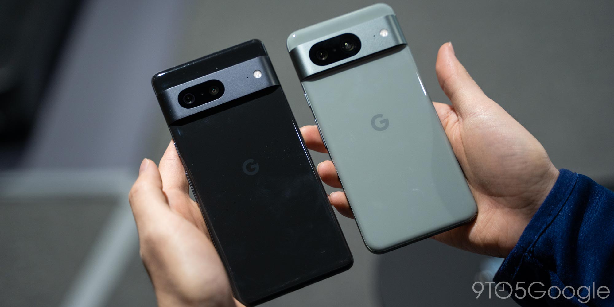
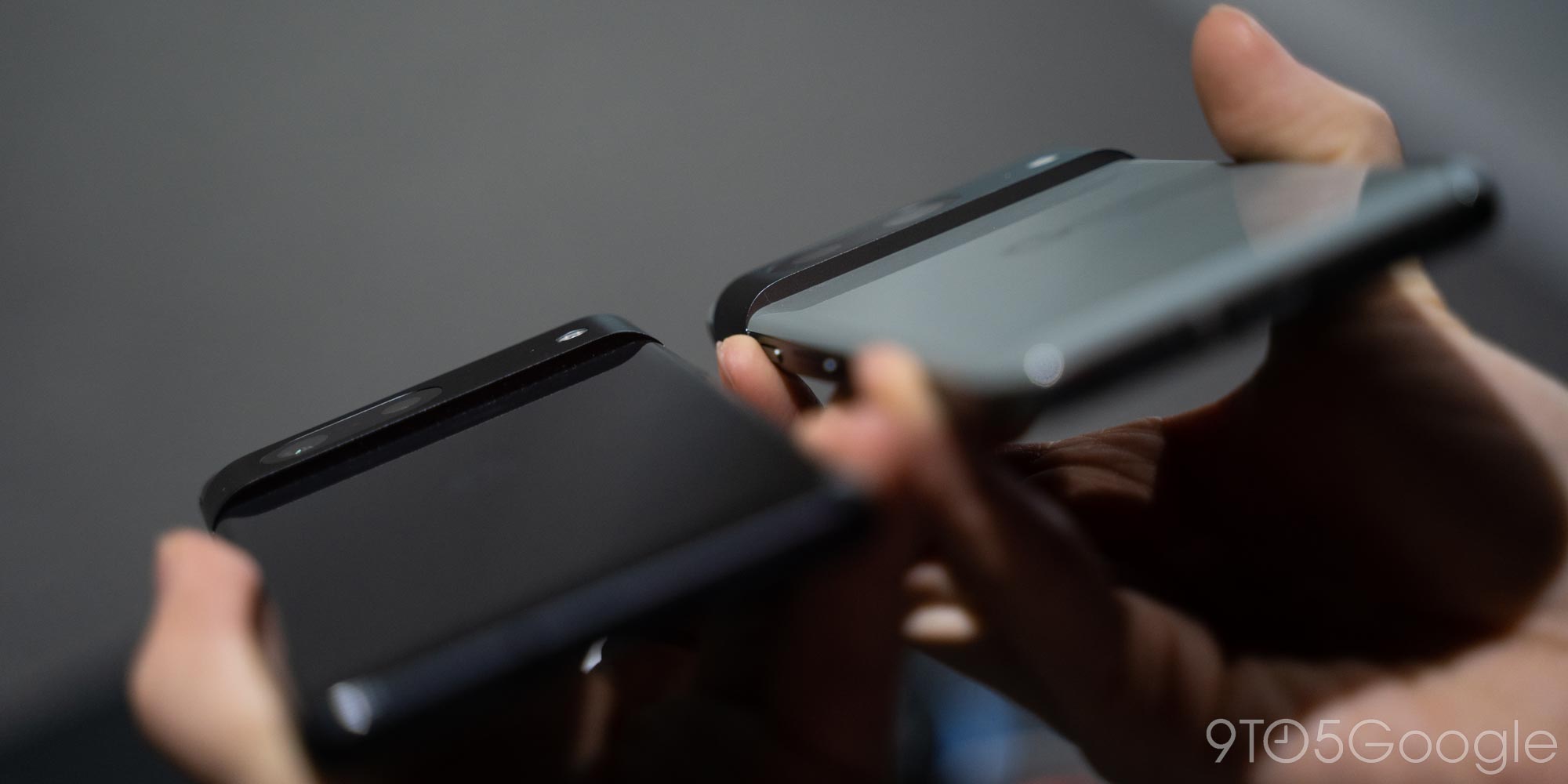
While you can see the lineage and generational evolution, the Pixel 8 feels shockingly different. It’s just plain comfortable to hold and feels smaller than it actually is. Everything from the corners to the aluminum frame are more rounded, with the latter change making the Pixel 7 feel like it has flat rails in comparison. A neat trick employed is having the frame slope into the rear glass and screen so it feels continuous. In fact, when you’re swiping down for the notification panel and accidentally hit metal before glass, it feels like your finger’s velocity is being boosted.
Pixel 7 vs. 8
Since I used the Pixel Fold and its polished aluminum frame just before, I can say the matte finish of the Pixel 8 results in a nicer tactile feel that’s ever so slightly more grippy, and less fingerprint smudges. In all, this is the first time with this design language that a Pixel phone hasn’t felt like it could slip out of my hands.
Based on appearance alone, I’ll be the first to admit that it shouldn’t feel that different, but the Pixel 8 just is in a way that you have to try out to fully grasp. The change in dimensions – 0.2″ (5.1 mm) shorter and 0.1″ (2.4 mm) narrower – doesn’t capture how compact this phone feels in the hand. The Pixel 8 is also 0.3 oz (10 g) lighter than the Pixel 7. It’s a minute difference, which means I don’t have to place the side of my pinky finger on the bottom edge (where the USB-C port is) to support the phone. Instead, I get to place my forefinger underneath the Camera Bar, with the grip only improving as that gets thicker.
That said, the problem of dust collecting just above and below the Camera Bar continues. It’s somewhat annoying and always comes back to the point that wiping it off is a pointless endeavor. But it’s also something that virtually any smartphone will have trouble with, to some capacity, at this point.
My only wish on the design front was that the Pixel 8 came in actually good colors. You would think a “Hazel” phone has more green, but this is gray through and through, with the green tone only coming out in some lighting. It’s dull, unappealing, and not chromatically attractive. If you want a colorful option this year, go for Rose, which has a really nice light pink tone. Meanwhile, the power button should be larger, especially if this is how Google wants you to launch Assistant. (I’m still using the bottom corner swipe, personally.)
I thoroughly enjoy picking up this device every single time, and I cannot say that’s happened with any other phone recently. There’s a tactile personality to this phone that I can’t say existed with recent Google phones, especially since the visual reboot that was the Pixel 6. Google Pixel already has a signature trait in the Camera Bar, and I hope all future phones continue to prioritize comfort as a core design trait.
Screen
The Pixel 8 has a pretty standard 6.2-inch screen that’s only 0.1 inches smaller than last year but contributes to the compactness. I prefer smaller displays and don’t personally prioritize (or really use) the additional screen real estate when mobile. Even with the Pixel Fold, I generally only used the device for its small outer display.
The truth is the vast majority of people like big screens. When a manufacturer releases an actual small phone, not enough people buy it, with the iPhone 12 and 13 mini proving this out. I don’t think Google is going to put out a smartphone (excluding foldable cover screens) with anything significantly smaller than what we have with the Pixel 8 today. There’s no just mass appetite for it, despite the vocal minority that claims to want it.
Meanwhile, I do notice and appreciate the thinner bezels that look uniform to my eye. I wasn’t particularly asking for this change, but it does contribute to a more premium feeling, especially after seeing the iPhone 15 Pro. The bezels on the smaller Pixel 8 are slightly less uniform compared to the 8 Pro, but the difference is only noticeable side-by-side, and even then barely visible.
As for the actual “Actua” display, it works as advertised. The 2,000 nits of brightness make a difference in sunlight compared to the 1,550 nits that the Fold offers. Indoors, I mostly didn’t notice a difference except when viewing Ultra HDR photos. There’s a noticeable increase in screen brightness when opening an image in Google Photos that was shot by the Pixel 8. This sudden boost takes a literal second and borders on distracting. In theory, this should also happen in third-party apps, but it doesn’t seem all that common yet.
Do I think it’s different enough to warrant its own branding? Not really – seriously, “Actua” – but there’s no downside either (and everyone else does it too).
I personally didn’t notice the difference between 60 and 90 Hz on the Pixel 7. The Smooth Display at 120 Hz is much more obvious at times, but I really can only tell when comparing two screens side-by-side.
Camera
Besides using the Pixel Fold because it has Google’s smallest (cover) screen, the other reason I like it is the telephoto lens.I use it constantly for taking pictures of faraway signs and screens. I think all phones should have one as part of a standard three-lens complement, but the Pixel 8’s 8x Super Res Zoom does suffice in ideal conditions and carries some sharpness improvements over the Pixel 7:
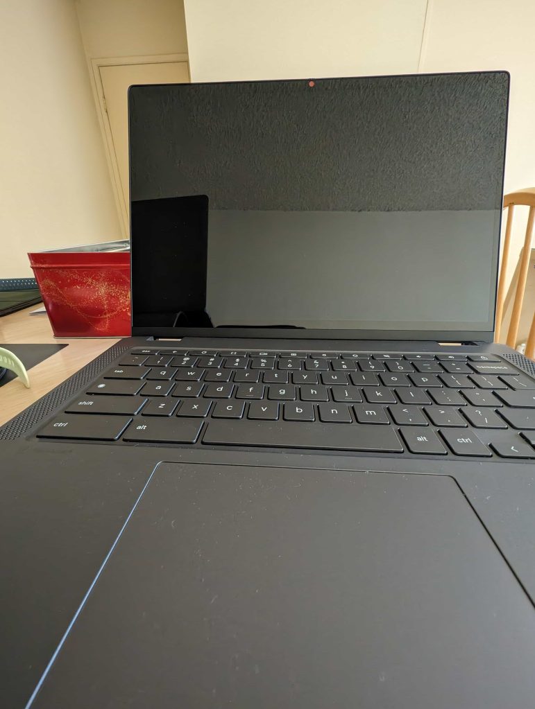
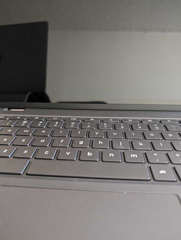
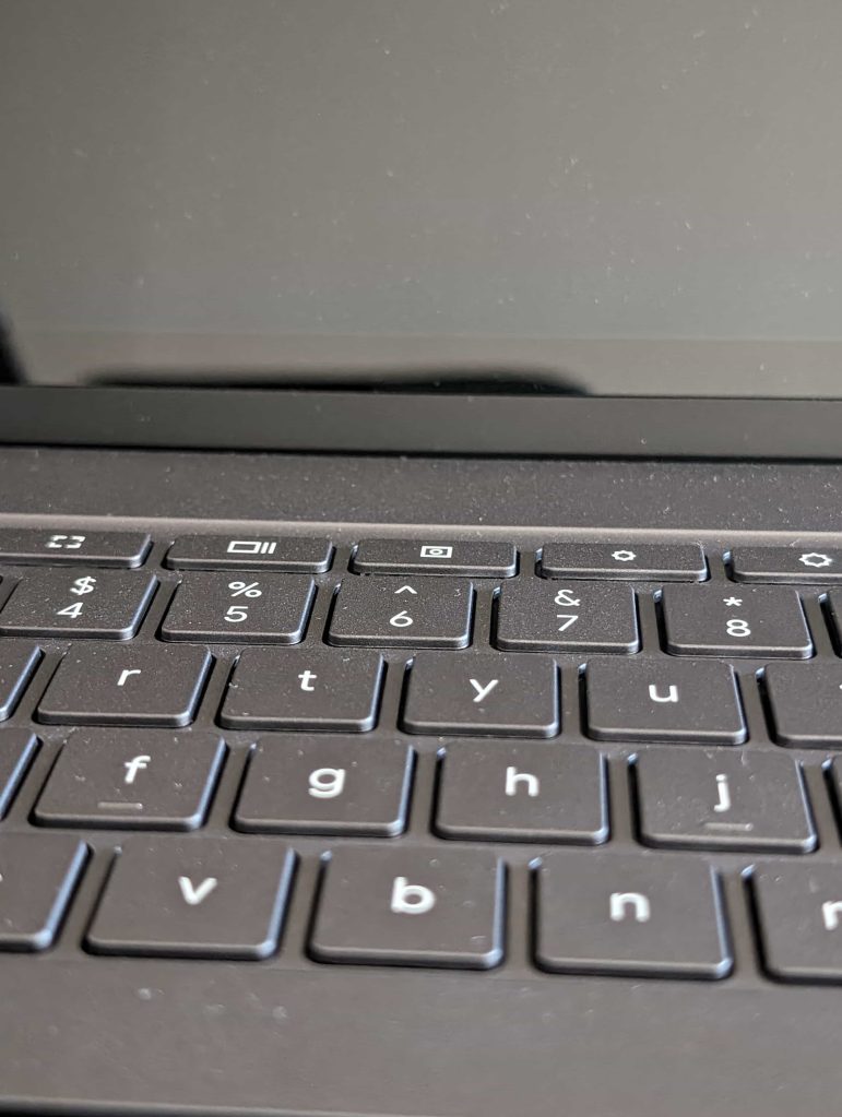
Pixel 8: .5x, 1x, 2x, 8x
Pixel 7: .7x, 1x, 2x, 8x
What we do have is an ultrawide that I do admit most people will prefer for group shots or bigger landscapes. The 125.8° field of view on the Pixel 8’s ultrawide (versus 114° on the Pixel 7) is something you’ll notice, being 22% larger. I am using that hardware for Macro Focus shots and it is nice. You can get as close as 3 cm (2 cm on the Pixel 8 Pro).
In my week of usage, I can’t say the new main sensor is drastically different from what came before (probably because it isn’t). Photos taken with the Pixel 8 remain excellent, like all other Google phones before it. Meanwhile, the Google Camera app greatly decluttered the viewfinder by moving the Brightness, Shadow, and White Balance sliders from the left and right edges of the UI to a panel that you open from the bottom-right corner.
Performance + Battery
Tensor G3 continues to work like all modern chips in the past few years. There’s no performance lag to speak of. While the experience is beyond snappy today, I can’t say that will be the case in 2030 when the phone is scheduled to get its last Android update. That promise across OS, security patches, and Feature Drops from Google is inherently ambitious, but I am surprised that the Pixel 8 didn’t get hardware future-proofing in the form of more RAM.
When I started using the Pixel Fold, I didn’t think 12 GB of RAM would make a difference in day-to-day usage. I was wrong and definitely noticed apps going out of memory less often compared to the Pixel 7 and now the Pixel 8, each with 8 GB of RAM. If the difference is already somewhat detectable today, it will only become more obvious going forward.
Meanwhile, not to discount the people that have had or experienced heat-related issues, but my Pixel 7 and Fold never got hot enough to the point where I could not use it. That remains unchanged with the Pixel 8, though it still gets warm with extended usage.
I get a full day of usage with the Pixel 8’s 4,575 mAh battery, nothing more, nothing less. My typical routine sees the phone at 100% at 7 a.m. and end under 30% by 11-12 p.m. The Pixel 7 would be closer to 20% with similar usage for a 5% difference, give or take 2%.
Face Unlock
Face Unlock on the Pixel 8 can be used to authenticate Google Pay/Wallet NFC transactions for a more seamless experience. That being said, I’ve found in the past year that tapping your finger as needed for tap-to-pay was not really a nuisance. On that note, the performance of the under-display fingerprint sensor feels mostly unchanged from last year. It’s the same sensor (only four fingerprints can be stored), but Google touts “upgraded” display hardware that improves the unlock experience, as well as “many software refinements” for increased reliability.
Instead, the bigger addition this year is using Face Unlock for signing into apps, like banking and medical, as well as credential managers. This is a more common hour-to-hour occurrence. When the Pixel 8 is trying to authenticate you, a ring appears around the front-facing camera. With the Google Password Manager, there’s also a short bottom sheet that has a pulsing face icon as it works to verify you. Other apps will just show the fingerprint sheet without acknowledgement of Face Unlock beyond the ring that appears around the camera.
Behind the scenes, the Pixel 8’s face authentication meets Android’s highest biometric security class. I really hope Google will offer an in-depth explanation of how Face Unlock works this year beyond just crediting “new machine learning advancements.” For instance, setting it up by tilting your head up and down feels too simple to the point of implying inaccuracy. The company needs to show its work and testing stats.
Face Unlock UI on Pixel 8 Pro
Overall, it’s impressive that Google is able to do this. However, the software-only approach (with dual-pixel auto-focus for depth maps, presumably) just doesn’t work in low-light conditions, and I’m not sure that can be overcome without IR sensors. Again, using your fingerprint is far from annoying, but it doesn’t make for a consistent, around-the-clock experience when the sun goes down or you’re in a dark room.
Last on the unlock front is how I thoroughly enjoy that Android 14 added the ability to skip hitting enter after entering your 6-digit (or higher) PIN. It’s a tremendous time saver in aggregate and honestly one of my favorite features in this year’s release.
Android 14 + Pixel software
Speaking of the new OS, the Pixel 8 is the first device to launch with Android 14. It’s certainly an incremental update in terms of user-facing features. I ended up not using the lockscreen clock that shows the weather prominently and am still on the default choice as I want a large double-line clock, and it’s the most aesthetically pleasing font. Lockscreen shortcuts are something I use more with the previous Wallet option – which I always found unnecessary since most people just tap-to-pay with their default card – immediately banished in favor of the camera.
Elsewhere on the software front is how the old “new Google Assistant” is growing long in the tooth, and the three features added with the Pixel 8 to hold it over until “Assistant with Bard” are a mixed bag. The ability to ignore “umm” and other natural pauses hasn’t really changed my interaction with the voice assistant. If anything, I’ve conditioned myself to give short, terse commands when I use Assistant while on the go. That feature would be more useful on home devices.
Meanwhile, the Pixel 8 uses the “same text-to-speech model that Google uses in data centers” to “read webpages aloud, and even translate them into a different language.” The underlying functionality is nice to have, but the implementation leaves much to be desired. It only works in Chrome, meaning you have to stay in the app – though you can visit other tabs – for the TTS to continue.
If you close the browser, the playback will stop, and you have to entirely restart it. However, you can hit the power button, and the audio will keep running with media controls appearing. In short, to get a much more polished experience, you should instead download the Reading mode app Google released for all Android devices.
Then there’s the Summarize feature that generates bullet points. It, along with Read aloud, is blocked on sites marked by publishers as needing a subscription (even if you have one). In that regard, it’s quite limited.
Continuing on the Assistant front, At a Glance will look at Gmail to show train updates (platforms and departure times), and event tickets with start times and locations. You’ll also get a weather forecast for tomorrow every night. Similarly, Assistant voice typing in Gboard now supports detecting multiple languages (up to three).
Generative AI wallpapers are pretty limited given that you have to select one of 12 themes, which then determines the prompt structure. This Mad Libs-esque fill-in-the-blank system only lets you choose from predefined options. While there’s a wide variety, I just want to manually type things in and think people have been conditioned to open-prompt image generators.
Top comment by insomniac
I hope they go back to "Pixel & Pixel XL" formula. Why limit a device depending on it's size? This phone would be perfect if it had all the Pro features & cameras.
Other changes include the free Google One VPN no longer featuring a persistent notification beyond the key icon in the status bar. This is due to the fact that it’s no longer part of the Google One app but rather integrated into the system with a “Pixel VPN by Google One” app that’s updated individually and has its own settings page.
The compact Android phone to get
The Pixel 8 puts Google’s software experience and AI features in a compact form factor. I honestly thought we’d have to wait for a “Mini” variant – which I wasn’t realistically expecting – for that to ever happen.
At the keynote, Google said that the “Pixel 8 and Pixel 8 Pro are the most beautiful phones we’ve ever made.” I thought that was typical on-stage hyperbole, but after living with the phone for just a few days, I can confirm it’s no exaggeration. Most phones have felt the same to me, and the Pixel 8 is the first device to break that for me.
Is the Pixel 8 worth the $100 price increase over last year’s equivalent? For the design alone, which Pixel 7 owners have to try for themselves, I say yes. It’s a really comfortable phone that looks nice, and there are no obvious hardware regressions. You’ll notice the brighter screen and updated Face Unlock that makes things a bit more seamless. Then there’s Tensor G3, the new main camera sensor, and Macro Focus. But again, it’s the design of the Pixel 8 that will pull you in.
Where to buy Pixel 8
FTC: We use income earning auto affiliate links. More.







Comments