With the addition of Magic Compose, we noted how the Google Messages text field was getting too cluttered, but a redesign is now on the way, while each contact’s profile page is also getting overhauled.
About APK Insight: In this “APK Insight” post, we’ve decompiled the latest version of an application that Google uploaded to the Play Store. When we decompile these files (called APKs, in the case of Android apps), we’re able to see various lines of code within that hint at possible future features. Keep in mind that Google may or may not ever ship these features, and our interpretation of what they are may be imperfect. We’ll try to enable those that are closer to being finished, however, to show you how they’ll look in case that they do ship. With that in mind, read on.
Today, you get a “plus” shortcut at the left followed by Gallery and Magic Compose. The RCS/Text message field is next with right-aligned buttons for emoji and voice messages.
The latest Google Messages beta (version 20231117_01_RC00) reveals work on a redesign that moves the compose field to the left and starts with an emoji shortcut. This is followed by Magic Compose at the right, as well as Gallery with a new icon and the plus menu.
Old vs. new
Meanwhile, Google has separated voice messages into its own button, which is larger and better conveys how you can tap to launch a new recorder UI, with the ability to long-press remaining.
As you start typing, the text field opens in a new line above the dedicated row of shortcuts that you can access all the time. Today, plus, Gallery, and Magic Compose are automatically hidden.
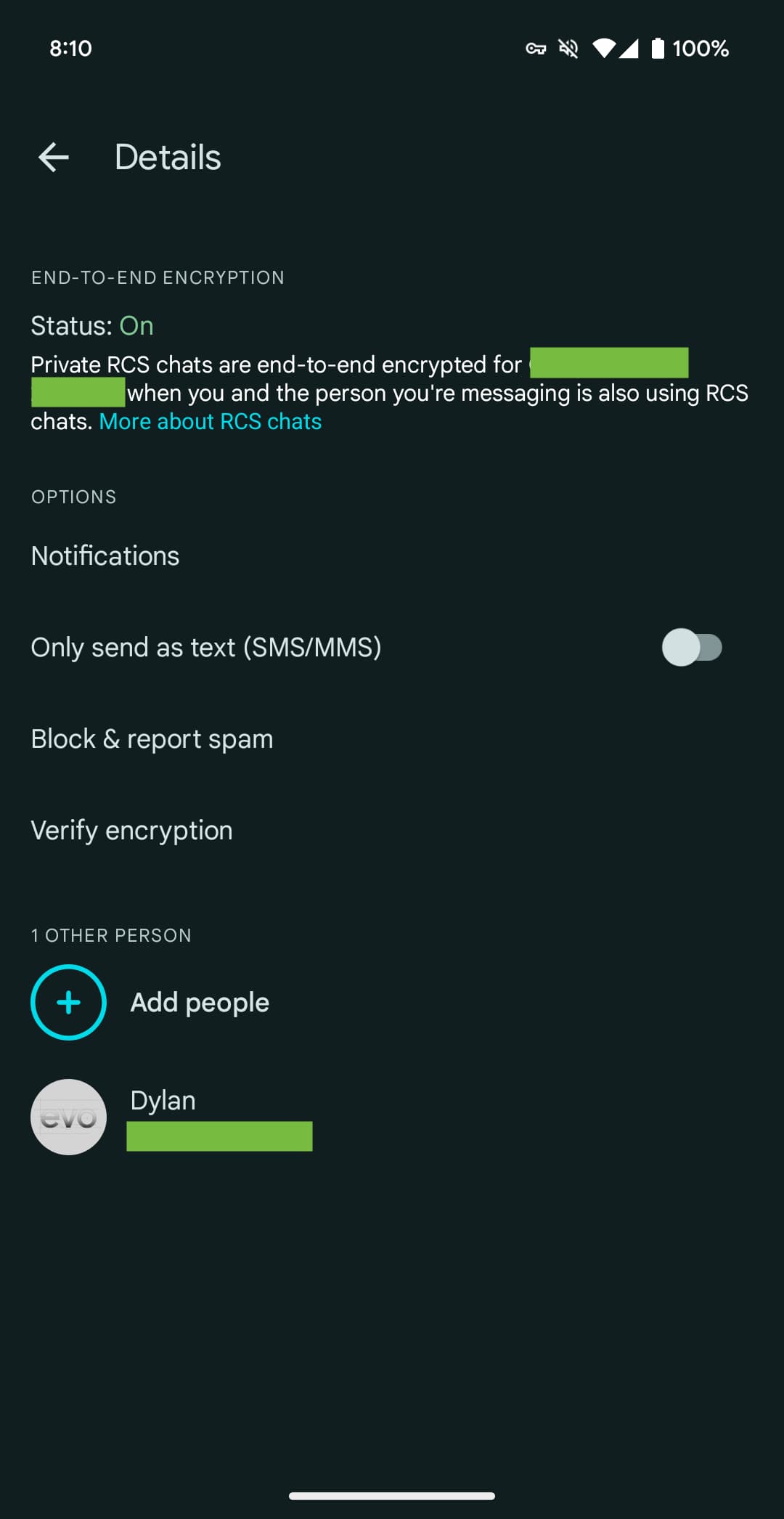
Meanwhile, in this release, there is a new contact page UI that might go hand-in-hand with Profile discovery. Instead of opening Google Contacts, this in-app page shows your picture, name, and phone number with a row of shortcuts to call, video chat, the full Contacts page, and search at the top.
Next is a gallery card for Images, as well as the ability to see “Videos, links & more.” Today, this can be accessed by opening Search (from a conversation’s overflow menu).
Top comment by Robert Castles
Imagine if messages could remember the group names I created and let me find them quickly. Imagine if it wasn't so difficult to send a message to more than one person quickly. Imagine if you could add a person to a new thread. Imagine if the messages on your tablet were immediately in sync with your phone and didn't keep alerting you to old messages. Imagine.
Then there are settings like Notifications, “Only send SMS & MMS messages,” and Block & report spam. Google tells you about the status of End-to-end encryption and lets you “Verify encryption,” which is currently also part of the overflow menu > Details.
We enabled both of these features, but neither is live yet. The redesigned compose UI follows the homescreen redesign that has already rolled out.
Thanks to JEB Decompiler, from which some APK Insight teardowns benefit.
Dylan Roussel contributed to this article.
FTC: We use income earning auto affiliate links. More.


Comments